- Introduction
- Understanding Color Psychology in Logos
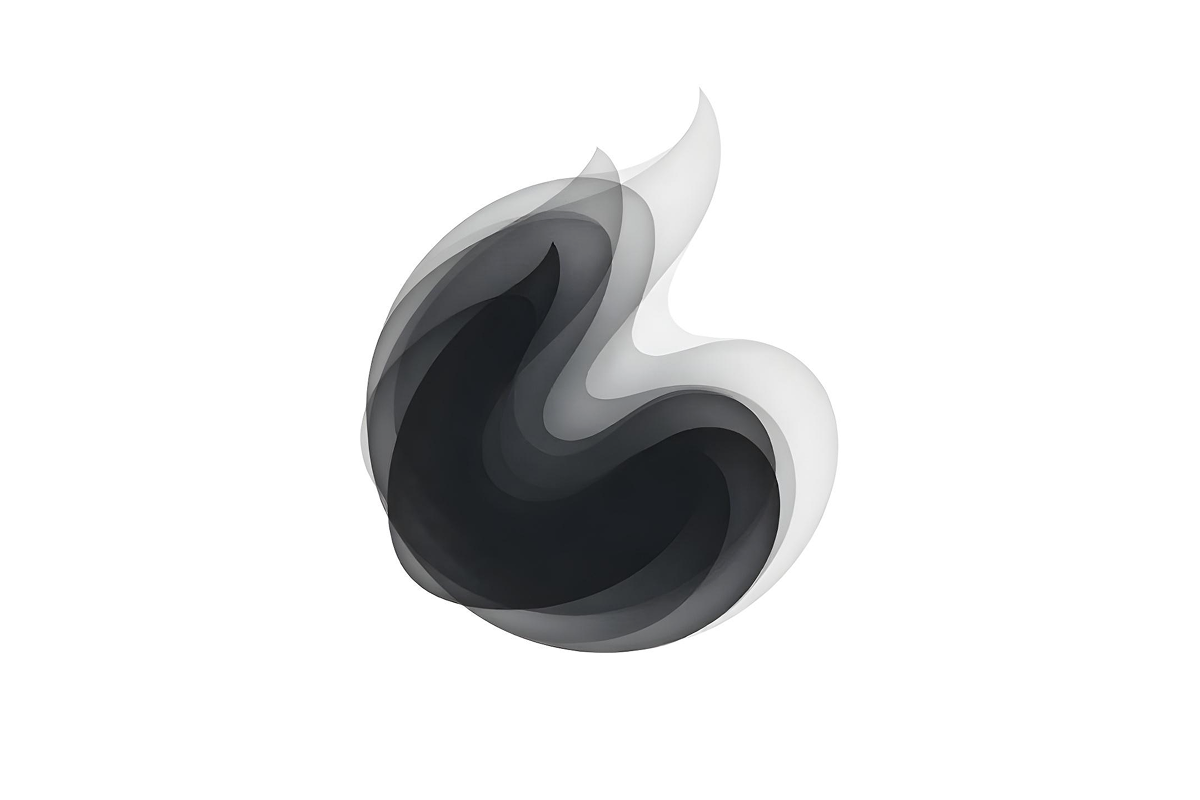
- Black & White
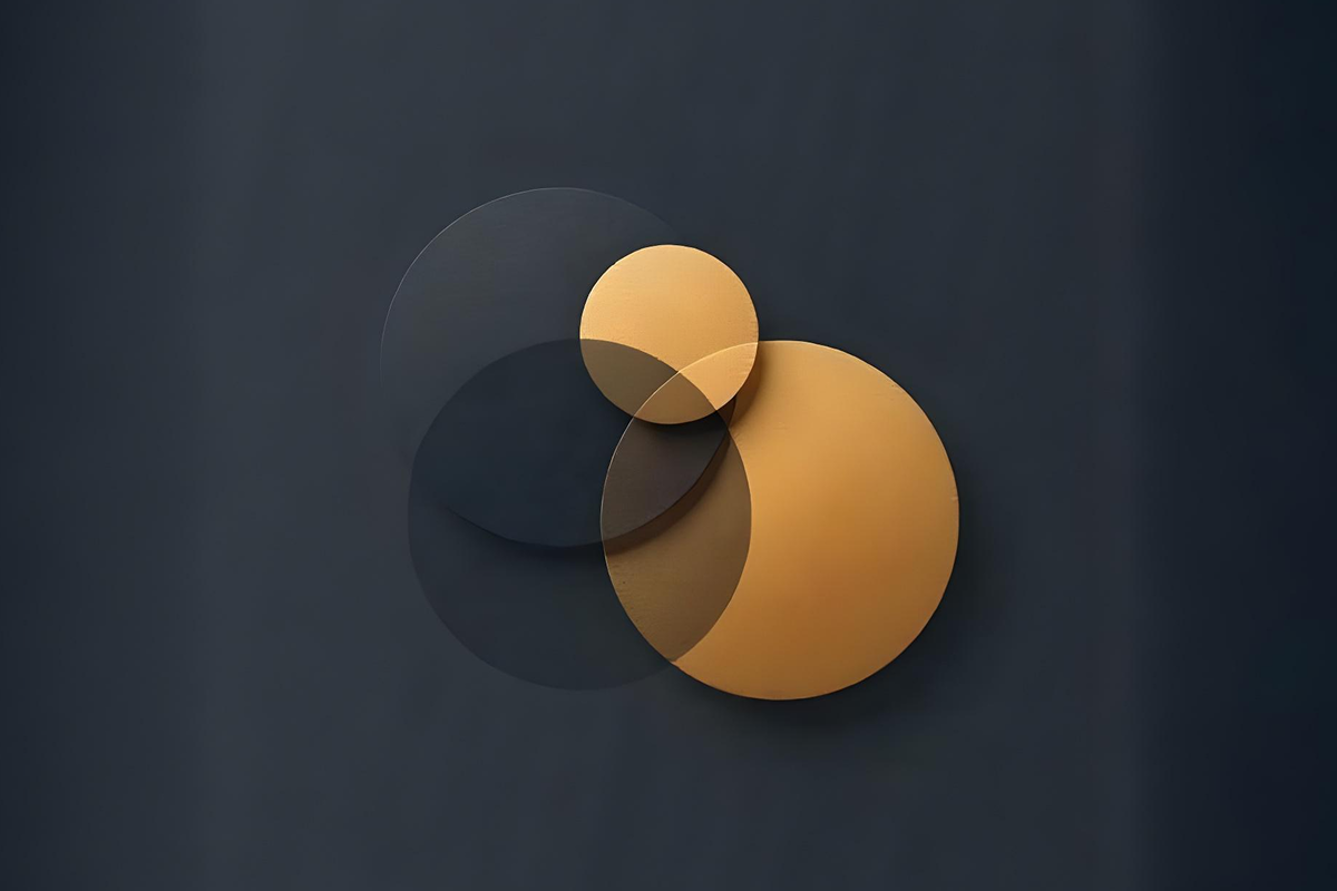
- Navy & Gold
- Red & White
- Blue & White
- Gray & Black
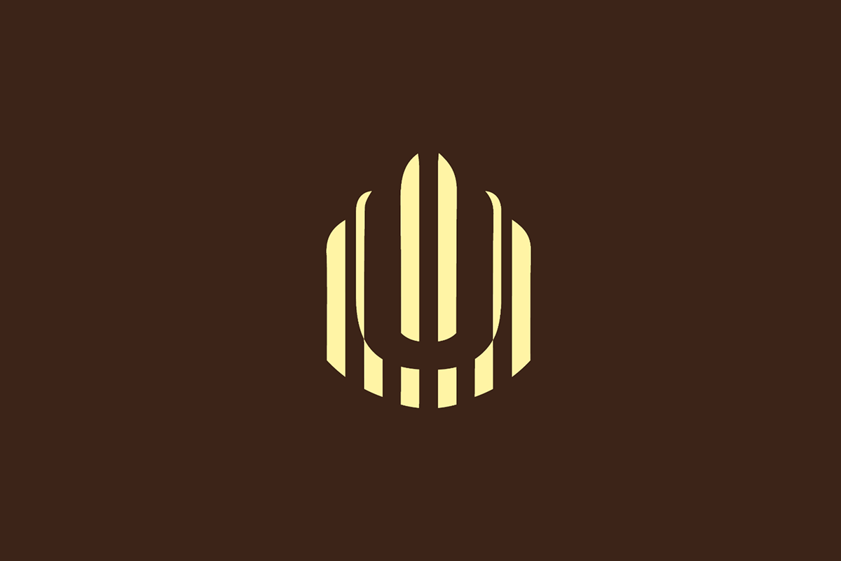
- Brown & Cream
- Red & Yellow
- Orange & Blue
- Black & Yellow
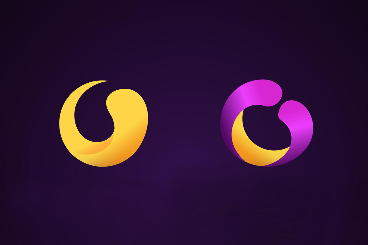
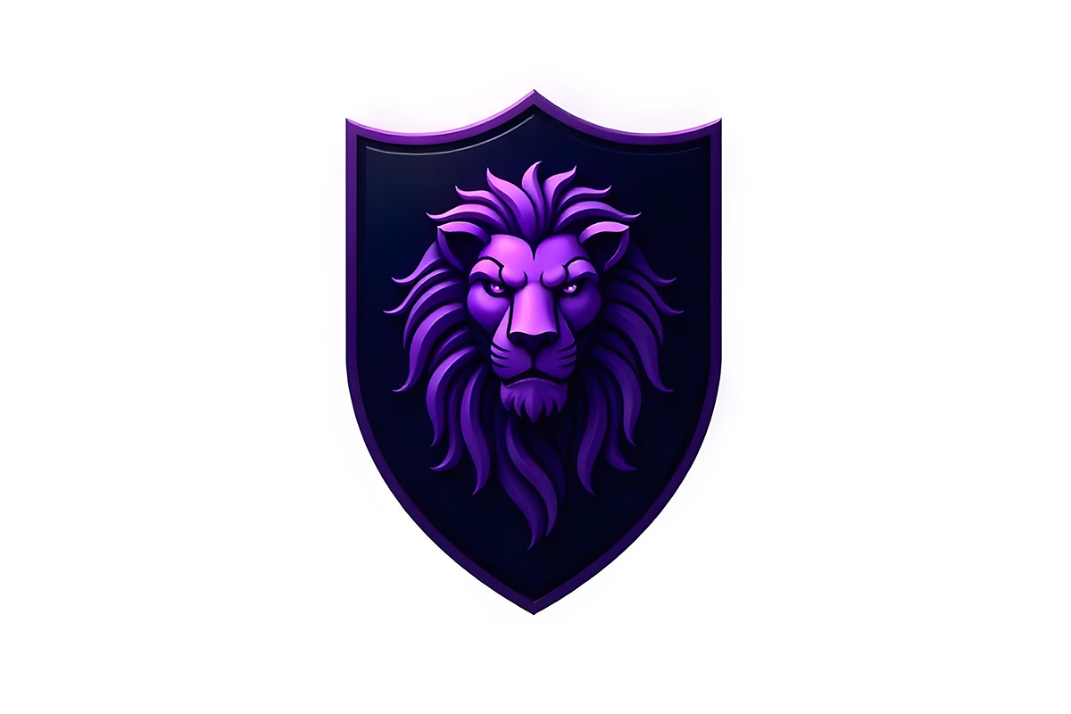
- Purple & Gold
- Teal & Orange
- Pink & Black
- Blush Pink & Gray
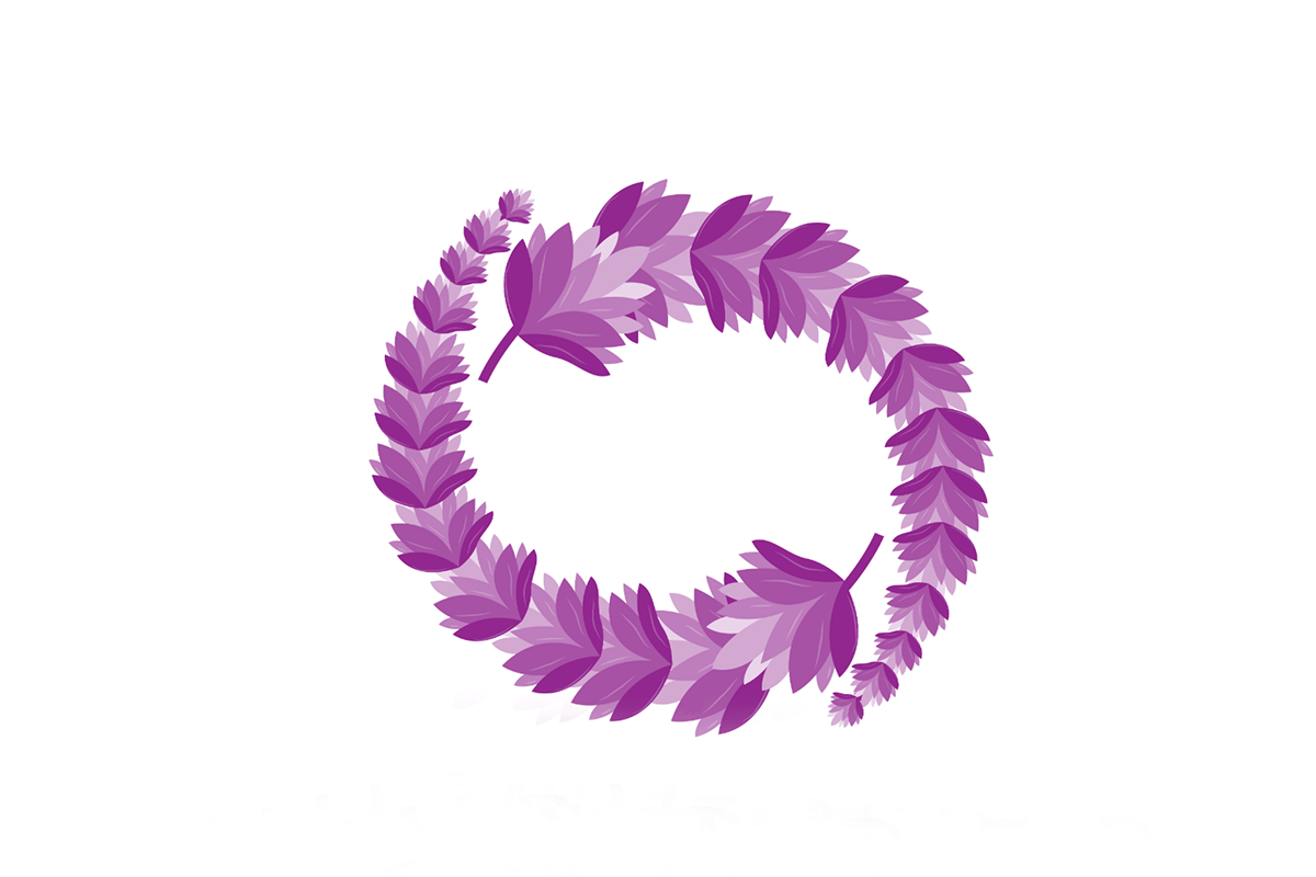
- Lavender & White
- Champagne & Rose Gold
- Mint Green & White
- Peach & Light Gray
- Ivory & Peacock Blue
- Forest Green & Tan
- Olive Green & Mustard Yellow
- Sage Green & Peach
- Terracotta & Cream
- Brown & Gold
- Turquoise & Sand
- Steel Blue & Charcoal Gray
- Cobalt Blue & Silver
- Royal Blue & White
- Ice Blue & Navy
- Dark Teal & Light Gray
- Midnight Blue & Emerald Green
- Coral & Aqua
- Lemon Yellow & Sky Blue
- Magenta & Lime Green
- Bright Red & Neon Blue
Introduction
Brand identity strongly depends on selecting appropriate logo color combinations. Color psychology is a real thing. Colors deeply impact human emotions. This is why selecting the right logo color combinations is important to see how consumers react to different brands. All businesses from startups to established brands must choose the right color combination in the logo design process.
Logo is your visual identity that draws customer’s attention to your brand. In this blog, we will study the 52 influential logo color combinations and reveal their emotional influence. This blog also discusses the use of log-in successful branding. At the end of this blog, you will have multiple logo color combinations that can help you create an eye-catching design.
Understanding Color Psychology in Logos
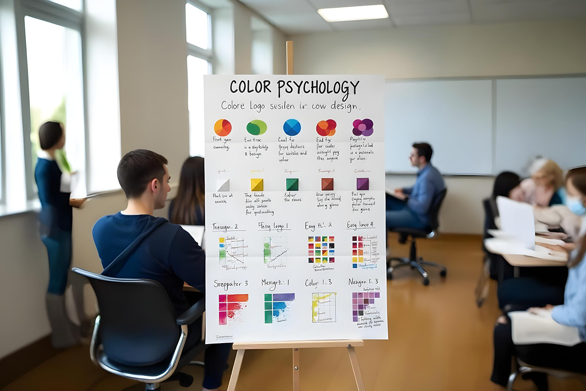
It is essential to first understand the concept of color psychology. Once you grasp it, move forward to different logo color combinations. Colors trigger different emotional responses. They shape how consumers behave and react to products. For example, red shows passion and energy. It matches brands that wish to seize viewers’ attention. Blue represents trust and professionalism. It is suitable for corporate and technical businesses. Green is for companies that focus on sustainability and wellness. It communicates growth and nature. The yellow color expresses positive and creative emotions. It is a happy color that shows has cheerful feel.
Black is used by luxury brands as it shows elegance and power. White shows simplicity and purity and it is for brands who want minimalist aesthetics. Purple acts as a symbol of luxury and creativity. Due to its mysterious nature, it is used by beauty and luxury brands. Orange is an ideal choice for brands who want to give a friendly and approachable feel. Using orange in the logo will display enthusiasm and warmth. Knowing the psychology behind these colors will help you decide what color to choose. Using these colors in combinations will help you create customized logos. With the right choice, you will be able to reach your target audience effectively
Black & White
A black-and-white logo color combination looks sophisticated and polite in every context. It provides a logo with a timeless aesthetic appeal. Black symbolizes elegance and power and white brings clarity. This logo color combination adds balance to every other element in a design. Large brands including Chanel, Nike, and Apple use this logo color combination. The simple and contemporary feel of this combination works across various platforms including websites and outdoor advertising. Due to its timeless appeal, it is an ideal choice for brands looking for a classy appearance throughout time.
Navy & Gold
When navy blue combines with gold, it produces an exclusive and elegant logo color combination. To achieve a strong brand identity, brands can choose their color combination. In this combo, navy blue communicates confidence and gold brings elements of luxury. This is one of the logo color combinations that is suitable for firms like banks, law firms, and other high-end brands. Businesses like Rolex and Ritz-Carlton find this combination a perfect fit for them. It is mainly for brands seeking an upscale appearance like Goldman Sachs. To remain professional, powerful, and luxurious, add this color combination to your logo design.
Red & White
Companies can design customized logos using red and white color combinations. Use as complementary colors, red and white is visually appealing and can quickly grab attention. Red provides strong energy and white brings clarity. To have an element of passion and strength, this logo color combination can work exceptionally well. It is the best fit for businesses looking for rapid decisions and energetic branding. If you are a sports brand or a fast-food outlet, use this duo to remain reliable. Do you know that brands such as Coca-Cola YouTube and Toyota generate excitement in their audience using this combination? It is this combination that generates a powerful work well in both winter and spring color palettes.
Blue & White
Brands aiming to build trust and professionalism often choose specific brand identity color combinations that communicate credibility and purpose. A classic example is the pairing of blue and white—blue represents stability and intelligence, while white adds clarity and simplicity. Together, they create a clean, business-like appearance that’s especially popular among healthcare companies, banks, and tech giants like Facebook, IBM, and Pfizer. According to color theory, this duo belongs to the winter palette, offering a sleek and modern feel that enhances brand credibility and fosters smooth communication with the audience.
Gray & Black
Using grey and black can help you design a sleek, sophisticated, and timeless logo. Using this logo color combination can help brands showcase strength and intelligence. Black adds depth and mystery and gray softens the contrast. Together, they offer a balanced and refined look. Different architecture, corporate, and tech brands can use these analogous colors to achieve a modern and professional look. I bet you can recall the Audi, Apple, and Sony brand logos. They have used gray and black logo color combinations to remain impactful and elegant. This helps the brand reflect innovation, resilience, and high-end craftsmanship.
Brown & Cream

Choosing a brown and cream color combination is best to elicit a warm, natural, and cozy feel. This is one of the logo color combinations that we commonly see in coffee shops. Brown brings reliability and trustworthiness while cream adds a soft and simple feel. This color combination is best for bakery and other sustainable brands. This color duo will create an attractive inviting atmosphere for your audience. Big brands like Starbucks, Hershey’s, and Whole Foods use brown and cream in their logo. It has a friendly and artistic appeal which works well for their branding. The brown and cream combo highlights their quality ingredients and commitment to quality.
Red & Yellow
The combination of red and yellow creates high-energy and exciting logos. Red colors deliver bold emotions as they excite passion and hunger. Yellow brings warm-heartedness, happiness, and friendly vibes. The combo proves successful for major fast-food corporations like McDonald’s and KFC. It draws immediate attention while pushing consumers to make rapid decisions. Yellow and red serve as more than just colors for food branding. These colors bring a high-energy feel. This works well for kids, entertainment, and promotional brands. If you pair red and yellow, you will create a logo that is vibrant and impossible to ignore.
Orange & Blue
Looking for logo color combinations that balance excitement with reliability? Orange and blue offer the ideal pairing. A combination of orange with blue stands as an absolute match. When you use orange in your branding, you provide creative energy with warmth. On the contrary, blue brings professionalism, trust, and stability. Sports brands such as the New York Knicks rely on this color combination to create a strong brand image. This warm and cool color contrasts create a strong yet balanced appearance. It is an excellent choice for brands who want an energetic and innovative look. If you are a start-up, try this duo.
Black & Yellow

The combination of black and yellow creates a powerful visual statement that demands immediate attention. Black brings sophistication but yellow provides both brightness and urgency. If you want a bold appearance that is impossible to ignore, use this color combination in logo design. Luxury brands like Lamborghini use this kind of logo color combinations to stand out. You can also find this combination in different caution signs and hazard warnings. Black and yellow provide your logo with a bold presence and clear readability. It makes you instantly memorable for all audiences regardless of your brand type.
Purple & Gold
If you want your brand to portray a rich creative tone, then purple and gold are the perfect logo colors. A royal combination of purple with gold in logos creates an elegant visual statement. Purple displays royalty and wisdom while gold reflects success and elegance. This logo color combination is perfect for fashion and other luxurious brands. Hallmark and Los Angeles Lakers have this color duo which makes them look prestigious and elegant. If you are a jewelry or a cosmetic brand, purple and gold can help you look refined. This can easily attract a target audience and help you stay memorable.
Teal & Orange
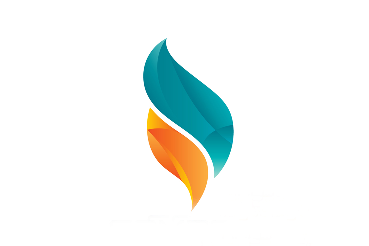
Brands seeking to add professionalism with fresh and fun appeal in their logo design must consider this color combination. The Teal and orange logo color combinations can be innovative as well as exciting. It is due to teal that adds serenity and orange that has exciting energy. Creative logo designers suggest fashion brands and technical agencies opt for this combination. This color combination can deliver a modern logo design with vibrant creativity and professionalism. Marketing companies can easily appear daring and sophisticated. This combination has an amazing branding appeal. The contrast looks attractive with its modern look and motion.
Pink & Black
Add pink and black colors to your logo design to create an expressive brand identity. Pink brings forward a bright playful appeal yet black provides an edgy sophisticated charm. The combination of pink and black attracts fashion brands and cosmetics companies. Brands like Victoria’s Secret use this combination to remain stylish and dominant. This also suits nightlife businesses and luxury beauty brands due to its trendy and appealing feel. Choosing pink and black colors will help you build a bold modern brand. Add this combination to your logo design and leave a lasting impact on your audience.
Blush Pink & Gray
The blend of blush pink with gray produces a logo color combination. This combination excels in both elegance and sophistication. The blush pink provides gentle feminine warmth while gray maintains a sophisticated look. It works exceptionally well for beauty brands together with wedding planners and luxury skincare brands. Lifestyle brands typically choose this color pair to express their long-term quality. This color combination is ideal for businesses that need to project an elegant and subtle presence. You can use this in packaging and social media to deliver a sleek finish to branding.
Lavender & White
The combination of lavender and white creates a peaceful and welcoming aesthetic. The soft nature of lavender is an ideal choice for a wellness brand logo. White provides a simple look that stays clean and fresh. Businesses focusing on skincare can choose this color combination for a gentle and trustworthy image. For businesses targeting a light and airy brand image, this logo color combination can work exceptionally well. A combination of these two colors generates a cleansing atmosphere. It is suitable for any brand focusing on wellness and self-care. It offers an effortless but high-end appearance.
Champagne & Rose Gold
The combination of rose gold and champagne is a unique symbol of luxury. It creates a look that remains elegant throughout time. Being effortlessly classy, it’s ideal for jewelry and boutique brands. Wedding planning services also use this combination to reflect celebrations, luxury, and warmth. The soft elegance in champagne combines with the luxury touch of rose gold to deliver a high-end appeal to designs. This combination can transform any brand design. It delivers a premium-level quality feel that can easily resonate with your target audience. If you want class, exclusivity, and warmth all at once, use this logo color combination in your design.
Mint Green & White
Mint green with white can help in powerful branding. It delivers modern freshness which can excite audiences that are into sustainability. The freshness in mint green makes it the perfect choice for brands that sell organic products. If you are a wellness or a skincare brand, using this combo will be the right choice. White color maintains a clean aesthetic which strengthens feelings of purity. These two colors are soothing to the eyes and reflect nature. Use this combination in your minimalistic logo design to deliver a soothing visual impact. Customers love a refreshing vibe and you can stand out using logo color combinations like this.
Peach & Light Gray

This is one of the logo color combinations that can offer the two most important things that any brand needs. Professionalism and warmth. You want a soft, friendly, and modern look to connect with your audience, this combination can help you achieve your goal. The peach and light gray strike the perfect balance. Peach creates a lighthearted mood through its playful nature while light gray maintains a neat appearance. If your business belongs to boutique cafes or lifestyle brands, you should choose this color combination. It will create a balanced mix of fun elements with sophisticated appeal. The combination is an excellent choice if your brand identity needs a fresh and welcoming feel.
Ivory & Peacock Blue
The combination of ivory peacock blue creates a refreshing and elegant feel. Using this combination will help you develop an eye-catching aesthetic. You cannot go wrong with a combination if you aim to stay premium. The combination of ivory peacock blue represents luxury brands. Different creative agencies and high-end fashion brands can use this to reflect confidence and an inviting feel. Ivory uses its delicate nature to temper peacock blue. It adds warmth and appeal to the design. This logo color combination can create elegant logo designs. You can use this option for branding, packaging, and digital media projects. This combination won’t disappoint you with its classy, modern, and timeless appeal.
Forest Green & Tan
The combination works together to produce an approachable and aesthetical natural atmosphere. Forest green color conveys sustainability and tan delivers warmth. Both colors create an excellent match for outdoor and eco-friendly businesses. This combination also works well for an agriculture brand. You can use this logo color combination for nonprofit organizations and gear brands. It does its job as it builds deep connections to nature.
Ready to create a logo that truly represents your brand?!
Dive into our step-by-step guide on mastering the logo design process?
Olive Green & Mustard Yellow
Olive green and mustard yellow give this vintage but also modern appeal. It is best for brands looking to deliver authenticity. Olive green represents nature and harmony. Whereas, mustard yellow brings energy and warmth to designs. This logo color combination works best for home decor brands. However, different gardening businesses can also use it. It has a timeless appeal with fresh modern touches which makes you stand out.
Sage Green & Peach
The color sage green and peach blend together to create a soothing and welcoming brand identity. Sage green offers natural freshness while peach introduces gentle color contrasts. The color palette works stunningly well for wellness businesses. Different boutique eateries and fashion brands can also use this color to pop out. Choosing this color combination is great for brands that offer relaxation, self-care, or the use of organic products.
Terracotta & Cream
This is one of the logo color combinations that work best for brands that want to deliver an earthy, rich, and soft feel. Using this combination in logo design will help you deliver a warm and nostalgic vibe. This combination creates rich tones filled with expert craftsmanship. Terracotta provides strong depth while cream creates an elegant lightness. Combining both will result in both modern and nostalgic impressions. This suits brands that sell handcrafted products, pottery designs, and vintage fashion labels.
Brown & Gold
Brown and gold together create a sophisticated color combination. The one that delivers luxurious warmth with timeless appeal. Brown delivers reliable depth and gold presents an exclusive touch. The combination works perfectly for premium chocolate brands. You will also see this combination in whiskey distilleries and luxury bakeries. It has an attractive and upscale setting. The combination delivers an elegant look that is perfect for luxurious coffee and candle brands.
Turquoise & Sand
The combination of turquoise blue and sand creates a fresh beachy experience. It feels both exciting and calming. Turquoise invites thoughts about tropical oceans while sand creates feelings of warmth. Sand has its balanced energy which complements the refreshing energy of turquoise. The combination of both works best for travel brands. Beach resorts and eco-tourism businesses use this duo to create instant beach vacation vibes for viewers.
Steel Blue & Charcoal Gray
The pairing of steel blue and charcoal gray delivers a modern brand identity. An identity that is both dependable and professional. Steel blue establishes trust and innovation while charcoal gray brings authoritative qualities. The combination suits tech companies and SaaS brands. Most startups also use this duo to deliver trustworthy innovation.
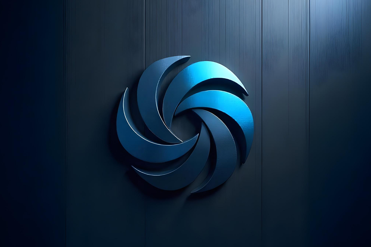
Cobalt Blue & Silver
The pairing of cobalt blue with silver creates an innovative look. It has a modern and high-tech appeal. Cobalt blue delivers confidence and intelligence and silver creates an elegant and precise look. Such logo color combinations work for automotive sectors and tech startups. The combination has an innovative look that prioritizes digital transformation. It is an excellent choice for smart gadget businesses.
Royal Blue & White

The combination has a clean and timeless appeal. It conveys trust and professionalism. The combination works best for institutions that need to deliver authority but want to keep things minimal. Royal blue and white maintain a fresh clean aesthetic. It stands out for financial, healthcare, and government organizations as they need to establish trust and reliability. If you are looking for a duo that is minimal and has a trustworthy and authoritative vibe, this combination is for you.
Ice Blue & Navy

The combination of ice blue and navy brings a calming and sophisticated feel. Using this combination in a logo makes the brand reliable to its customers. Ice blue reflects freshness and clarity while navy adds depth. Together, the combination works well for insurance and consulting firms. Ice blue and navy has a very cool and composing vibe. It can be used by different health brands to show a calming presence.
Dark Teal & Light Gray
Sleek, versatile, and modern—dark teal and light gray offer a fresh take on professional branding. The combination of dark teal together with light gray achieves both creative depth with professional polish. This color combination suits startup fitness brands and online service providers since it delivers modern and vibrant branding. Digital agencies personal coaching brands and innovative apps all benefit from this color combination because it delivers cool professional features combined with dynamic style.
Midnight Blue & Emerald Green
The duo of midnight blue and emerald green has deep sophisticated tones. The combination brings elegance and prestige to the design. Midnight blue creates a mysterious depth and emerald green projects a vibrant feel. It is commonly used by finance companies to establish a classy image. These two colors establish an atmosphere that feels elite and sophisticated. Use this combination to add mystery and depth to your logo designs.
Coral & Aqua
It is one of the logo color combinations that adds an energetic feel. The combination helps logo shine with enthusiasm and joy. Coral generates warm feelings whereas aqua establishes fresh and cool elements within designs. The energetic color duo fits brands seeking to communicate joy through their identity. Such color combo fits brands targeting children plus summer brand fashion and event planning businesses requiring energetic brand visibility.
Lemon Yellow & Sky Blue
Lemon yellow and sky blue generate happy vibes. Both colors provide positive energy and sunny delight. The energetic yellow tone generates enthusiasm and positivity. The light blue creates a soothing environment. Brands that wish to express optimism through adventure can use this color combination. It targets youthful audiences which makes it suitable for travel sectors and fitness industries.
Magenta & Lime Green
Magenta and lime green represent a powerful logo color combination. It stands out to create attention immediately. Magenta has a passionate tone that pairs with lime green’s energetic feeling. This bold color pairing works best for creative brands to produce memorable visual effects.
Bright Red & Neon Blue
The combination of bright red and neon blue unites to form an intense visual presentation, It keeps viewers completely engaged. The red signals vibrant energy and neon blue provides modern innovative vibes. Gaming brands, nightclubs, and tech startups can use this combination to stand out. The combination delivers an amazing attention-grabbing visual identity that keeps the brand alive.
Purple & Turquoise
Both the purple and turquoise offer an artistic blend. The combination is unique, creative, and mystical. It presents both creativity and uniqueness with undeniable style. Purple brings feelings of luxury, mystery, and imagination. Whereas, turquoise adds vibrant freshness. The color pairing works especially well for beauty salons and art brands. It can be used by influencers who need their branding to deliver both visual impact and creative design.
Hot Pink & Orange
The combination has a playful, youthful, and fun feel. Together, the combination creates an exciting and energetic brand identity. Hot pink adds vibrancy and orange adds warmth. The combo has a friendly and fresh feel. It can be used by different social media and cosmetic brands. If you are an influencer with a personal brand, use this to remain trendy. The combination has fresh, modern, and engaging appeal.
Mustard Yellow & Burgundy

The combination of mustard yellow and burgundy give a vintage feel. It also has a rich and full-of-character feel. The combination of both creates a warm and nostalgic feel. Mustard yellow has a bold and earthy tone, while burgundy has more depth. This combination is commonly used by classy restaurants. Different food brands also use this combination to stand out. The combination has a classic yet exceptional look. Whether you own a coffee shop or a vintage clothing brand, add a statement to it using this combination.
Plum & Copper
Copper and plum together have a deep, warm, and luxurious feel. It creates an extremely refined and elegant feel to the designs. Plum adds creativity while copper adds warmth and a metallic edge. This combination is ideal for luxury furniture brands and boutique businesses. Different home decor companies can use this combination that showcase elegance. With a modern twist. Whether used in branding for a high-end candle company or an artisan jewelry store, this pairing radiates exclusivity and charm.
Mint Green & Burgundy
The combination has a refreshing and bold appeal. It is full of contrast. Mint green and burgundy create a striking yet balanced logo color combination. Mint green feels fresh while burgundy adds a rich, traditional touch. The combination is used by different floral brands and event-planning businesses. It has a unique and stylish aesthetic. Use this combination if you are designing a logo for your wedding planner start-up. With its trendy, floral, and artistic appeal, you can use this combination in your logo design without a doubt.
Deep Red & Slate Blue
Elegant, moody, and artistic—deep red and slate blue create a refined yet dramatic look. Deep red is passionate and powerful, while slate blue offers a cool, modern contrast. This combination is perfect for photography studios, branding agencies, and bookstores looking to evoke a sense of creativity and depth. Whether designing a minimalist logo or a bold storefront, this pairing adds a sense of sophistication and storytelling.
Electric Purple & Neon Green
The combination is innovative, bold, and full of high energy. Electric purple and neon green create a vibrant and amazing visual identity. Electric purple shows creativity and innovation, while neon green adds a sense of excitement. This combination is ideal for sports, music, and tech brands. Use this combination to stand out in a fast-paced digital world. If you’re building a brand that covers younger audiences, this duo is an electrifying choice.
Dark Olive & Rust Orange

This is one of the logo color combinations that has a warm and rustic feel. The combination will give your logo design an exceptional depth. Dark olive and rust orange create an earthy yet sophisticated palette. In this combination, the dark olive represents nature and stability. Whereas, rust orange adds a touch of vintage charm. It works beautifully for handcrafted brands and vintage shops. Different home decor businesses use this combo to show authenticity and craftsmanship. If you own opening a coffee shop and want to deliver a cozy café vibe, this combo will work for you. Using dark olive and rust orange in your logo will make you timeless and fresh.
Charcoal & White
With the simple, timeless, and elegant appeal, charcoal and white stands out. It has a classic yet minimalist appeal. In this combo, charcoal adds depth and authority, while white brings balance and clarity. The combination is used by different fashion brands. Moreover, different consulting firms use this combination. If you want a sleek and professional image, use this combination without any worry. It can add a clean and refined look to your brand logo easily.
Soft Beige & Warm Gray
This combination is very understated. Soft beige and warm gray with their modern, and effortlessly chic appeal can easily attract your audience. Together, they can make a soothing and contemporary color palette. Beige has an approachable feel while warm gray keeps things refined and neutral. This combination is perfect for different lifestyle brands. Different social media influencers and creative logo designers use it to display a soft yet professional feel. Use it in your minimalistic logo design and deliver a modern and inviting feel.
Jet Black & Royal Purple
The bold, powerful, and luxurious feel of jet black and royal purple is something you should know. The combination creates a striking combination that oozes sophistication. Black represents strength while royal purple brings a regal and premium feel. This is ideal for luxury products, finance firms, and high-end modern brands. If you want to appear exclusive, use this combination to stand out. This is one of the logo color combinations that you won’t see generally. However, the duo does make a strong and confident statement.
Snow White & Cool Gray
This combination has a clean, professional, and sleek feel. The combination of snow white and cool gray creates a trustworthy brand identity. White adds purity and clarity, while cool gray adds a modern vibe. This combination is perfect for tech companies, hospitals, and legal firms. If you need a polished and dependable look, use this combo in your logo design. This combination communicates precision and trust.
Ash Gray & Deep Blue

This color combination makes logos look sleek, modern, and smart. Ash gray and deep blue create a strong yet approachable brand aesthetic. Deep blue adds confidence and intelligence, while ash gray adds a modern and balanced touch. This combination is great for real estate agencies, tech companies, and software startups. If you are looking for a refined yet engaging look, use this combo to make your brand professional and edgy.
Graphite & Gold
The combination looks very luxurious. Graphite and gold create a striking visual contrast and are perfect for brands that want to display wealth and refinement. Graphite’s dark, muted tone brings a sense of sophistication, while gold adds a touch of prestige. This pairing is ideal for watches, fine jewelry brands, and premium product lines that want a timeless appeal.
Holly Green & Cranberry Red
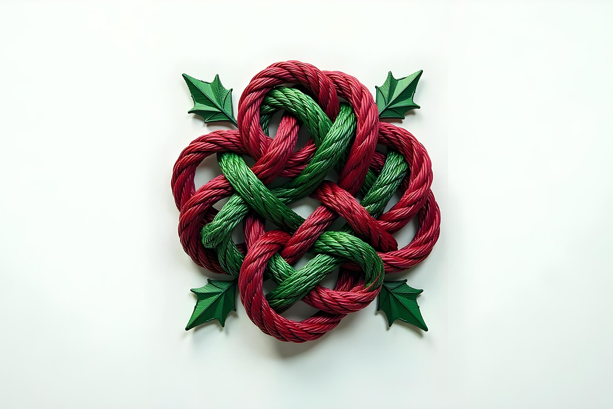
The combination is not very common but does have an exceptional appeal. It is festive, warm, and full of holiday spirit. The combination of holly green and cranberry red is seen in the Christmas season. I bet you can recall now. Holly green represents nature, renewal, and festivity, while cranberry red adds warmth, energy, and tradition. This classic combination is ideal for festive packaging. You will find this combo in gift wraps and other marketing campaigns. Due to its joy and nostalgic appeal, brands use it to stay memorable.
Pumpkin Orange & Dark Brown

With the cozy and rustic feel, pumpkin orange and dark brown capture the warmth and richness of fall. Pumpkin orange represents warmth and creativity, while dark brown has a deep earthy tone. This combination is perfect for cafes, Halloween events, and fall fashion lines. If you own a cozy autumn clothing brand, use this combination to deliver the seasonal aesthetic. This combination is perfect to deliver warmth and nostalgia.
Sky Blue & Soft Yellow

This is one of the kind of logo color combinations that has a fresh, airy, and uplifting feel. Sky blue and soft yellow bring a bright and cheerful springtime feel. Sky blue delivers openness, and freshness, while soft yellow adds warmth and positivity. This combination is great for florists, wedding planners, and skincare brands. They are often used to create a light, welcoming vibe to the logo design. If you want a flower shop, a bridal boutique, or a natural skincare line, use this duo to deliver happiness and beauty.
Dark Red & Warm Gold

Three words to define this combination would be elegant, festive, and luxurious. Dark red and warm gold create a rich and sophisticated feel. Dark red symbolizes passion while warm gold adds a touch of wealth. This combination is perfect for high-end alcohol and formal wear brands. It adds a sense of individuality and opulence to logo designs. The combination can capture the excitement and glamour of New Year’s festivities so use it well and stand out.
Conclusion
Out of these different logo color combinations, you can choose one based on your brand. Make sure the combination works perfectly to reflect your brand identity. Choosing the right color combinations can elevate a brand’s appeal and make it memorable to your target audience. Therefore, investing in the logo design process is essential. If you aim for engaging and effective outcomes, the cost of logo design should not be a concern, though it may vary depending on the elements used.
Color can evoke emotions—it speaks directly to your audience. Whether you prefer classic, bold, soft, nature-inspired, or trendy palettes, the blog has covered every possible option. The right color combination is key to an effective logo. This is where color psychology comes into play. For businesses in hygiene and cleaning services, leveraging sanitation industry branding solutions ensures that your brand conveys cleanliness, trust, and professionalism. Use the right colors and create a customized logo that leaves a lasting impression.
Frequently Asked Questions
Color psychology is a real thing. They have the power to generate emotions and feelings. Each color has a different feeling and vibe to it. For example, the color blue generate trust and the color red is for power or motivation. Color psychology assists in determining the immediate perception people have towards your brand. The appropriate colors have an impact on association and recall.
Select colors which are contrasting but complementary. Use a primary color and secondary accent. Test their appearance across various environments such as web, print, and merchandise.
Yes! Blue is used by tech brands, warm colors by food companies and green by eco brands. This color thing has been tested by many brands and now audience recognize brands and their personality based on their brand colors.
It is better to stick to 2 colors but if you want you can manage between 2 to 3. Use one color as your primary and the other as complementary. There is another science to colors, for example, if you want to gain visibility, use bright colors and if you want to be subtle, go with light color tones. But remember to stay in sync with your brand voice.
To see if the color combination you have chosen actually work on real world application, test them. Apply them and do the mockup testing. See how they look on business cards, screens, logo design and packaging print materials. Also, you can take feedbacks to have a better idea.

Hafsa Hanif is a talented content writer at WebnHubs, specializing in topics such as graphic design, web design and development, logo design, and animation. With her deep understanding of design principles and creative processes, Hafsa crafts engaging, informative, and SEO-optimized content that resonates with readers. Her expertise in SEO ensures that her articles not only captivate audiences but also rank well on search engines, helping businesses boost their online presence through compelling design-focused narratives.
