
Introduction
Color is no longer just seen as a perception of the eye, a visual phenomenon, or an aesthetic experience. It is a tool that has the power to inspire and influence. Color can bring out strong emotions, persuade decisions, and convey messages. In graphic design, understanding color theory is the primary aspect. It is as fundamental as air for us to breathe. It can create breathtaking visuals and eye-catching graphic interfaces that will remain alive in the viewers’ minds. Color theory is simply the baseline of understanding how colors relate, what each color means, and how it should be used within your designs. By using this magical tool, one can reach out to a larger audience and capture their attention. In this blog, we will look at the essential tricks for mastering color theory and its crucial role in the design process.
What Is Color Theory? A Foundational Overview
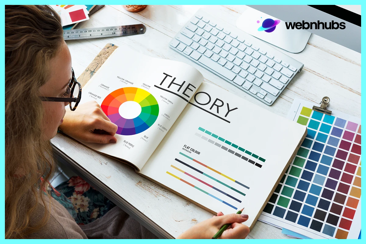
In its essence, color theory is a concept that defines colors and their compatibility. The idea can be traced back to 1666 when Sir Isaac Newton developed the initial color wheel. He developed the first wheel of color and formed the basis of current color ideas. The color wheel is a circle with colors arranged in a format that interlinks primary, secondary, and tertiary colors.
Primary Colors
Primary colors are colors that cannot be made from the other two colors. They are Red, blue, and yellow.
Secondary Colors
They can be made by the combination of primary colors, hence, called secondary colors. For example, green is a combination of blue and yellow. Orange is a blend of red and yellow color and purple is an admixture of red and blue color.
Tertiary Colors
They are a combination of primary and secondary colors. They are crucial for any design as they enable graphic designers to build harmony and balance in their projects.
Consequently, the principles of color theory in graphic designing will help the designer achieve the right emotion or nurture the right response from the target group.
The Color Wheel: A Designer’s Best Friend

The color wheel is one of the most valuable tools of any designer. It shows the user in a clear manner what shade belongs to which hue, and thus allows you to pick the correct colors for your project. Here’s how the wheel is organized:
Analogous Colors:
These include the family of colors that are located adjacent to the wheel such as blue, blue-green, and green. Analogous color combinations are quite balanced and the most preferred in branding and logo design for companies seeking to create calmness and harmony.
Complementary Colors
These are those colors that are diametrically opposite each other on the color wheel like red and green. While similarly using them, they offer unmatched contrast where one makes the other pop out. This is ideal for high-impact graphical applications where certain areas are of critical concern and require attention.
Triadic Colors
It is the scheme that applies three colors in equal intervals of the color circle (for example red, yellow blue). The triadic schemes usually match high contrast while at the same time ensuring the achievement of harmony and balance which are seen in the creative designs.
While color has a major impact on the aesthetic of design, knowing how to use the color wheel can make your designs better. Choosing related or harmonious colors helps to create an appealing set of colors that amplify the viewer’s experience and fit into the objective of the design.
Color Harmony: Hitting the right balance in design
Articulating a friendly color combination is very important to help come up with friendly designs. When chosen properly, the combination of colors should not be distracting and add to the overall appearance of the design. Harmonious color makes the audience feel comfortable being a guest in the design space, hence being able to navigate it easily.
There are various ways to achieve color harmony in color theory:
Monochromatic Scheme
Applying as many variations of a hue as possible. This approach gives depth to the design and is usually applied in professional and sleek logo designs.
Analogous Harmony
Recall that analogous colors are located side by side with each other in the color circle, and the close tones ensure that the effect is calm. It goes well with graphic design as it doesn’t call for attention to itself while at the same time unifying all elements.
Split Complementary Harmony
The scheme covers a base color and the two hues located on the color circle next to the complementary color. It gives an opposite appearance to the intense complementary color schemes that are usually applied in advertisements or branding.
Tetradic Harmony
This scheme employs four colors that are next to each other from the color wheel in the shape of a rectangle. It’s a general approach but at the same time it is very delicate and requires a lot of attention to avoid the situation when two colors are contrasting, It is most often used for experiments and in very non-traditional projects.
A good designer understands how to use these harmonious principles to elicit emotions, communicate the brand message, and other social relevancy when the viewer is designing and attaches his or her attention to specific areas of the design.
The Psychology of Color: Emotional & Cultural Relations

Colors do not just enhance or add beauty to our environment; they work on the mind. The perception individuals form about a brand is often shaped by shades that are either dark or light. In color theory, understanding the psychological impact of colors is essential to creating designs that resonate with the target audience. Designers working on branding elements—or something more specific like a car wrap color theory guide—must consider how each hue influences perception, emotion, and decision-making.
Red stands for energy, enthusiasm, and passion. It is often used in designs that command attention or inspire immediate action. Blue represents trust, serenity, and professionalism, making it a popular choice in the tech and finance industries to evoke a sense of reliability. Yellow symbolizes joy and optimism and is commonly used in youth-oriented or creative brands. Green conveys nature, health, and growth, making it ideal for organic products, eco-friendly companies, and wellness-focused organizations. Black, on the other hand, signals sophistication, authority, and exclusivity—frequently used in luxury branding and minimalist graphic design.
Color perception, however, can vary significantly across cultures. For instance, white is viewed as a symbol of purity in Western cultures, but in many Eastern traditions, it signifies mourning. This cultural nuance highlights the importance of understanding color psychology from a global perspective. Designers who are well-versed in color theory can adapt their choices thoughtfully, ensuring that the final design resonates with diverse audiences. For deeper insights into packaging, consider learning more about how color psychology impacts packaging, especially when visual appeal and emotional influence directly affect consumer buying behavior.
Contrast and Readability: The Key to Visual Clarity
Hence the correct use of contrast is another major principle of color theory. The use of high contrast between the features can lead to better legibility by highlighting sections of the design. In design projects such as websites or presentations, contrast helps to differentiate. It differentiates between similar data and makes the material clearer. For example, a combination of simple black fonts on a white background provides the best contrast and optimum readability. When it comes to designing the logo or branding elements, contrast is either going to make or break the visual. However, if there is low contrast, the design will look unclear or will be unattractive. Whereas, if there is high contrast, the focus will be disruptive. Getting the balance right makes sure that it is possible to pass on the message. At the same time, it also guarantees the effectiveness of designs.
Neutrals In Design: Color With A Subtle Psychological Power
Isn’t it boring, you might ask? Well, black, white, and gray might be less stunning than orange or yellow. They are still very important to tie color schemes and add elegance. For graphic designers, neutrals offer a sense of timelessness. Selecting colors in logo designing, neutral colors come up with simple yet meaningful logos. Just like Apple or Nike brands, which employ black and white to restate the main concept of simplicity and elegance. These colors make logos easily identifiable, irrespective of the medium in which the logos are used. They also work as an anchor. With neutrals, it is possible to notice brighter accent colors without completely dominating the sight of the audience.
Warm vs Cool Colors
A very important aspect of interior design that designers mostly tend to overlook is that of setting the mood of the design. It is very important, especially when dealing with health-conscious people. Comparing a warm color with a cool color helps one establish the direction of a design. It is clear that warm colors, the reds, yellows, and oranges, stimulate energy, excitement, or even urgency. These shades are often employed in sales or marketing promotions since interaction is a priority. Still, the cool colors such as blue, greens, and purples cause relaxation. They are mostly applied in corporate graphic design or in brands that relate to wellbeing, as trust is relevant there. It is therefore crucial to understand when and how to apply these colors to evoke the right emotion.
Practical Tips for Using Color in Graphic Designing
Now that we’ve discussed the foundational elements of color theory, here are some practical tips. With these tips, you can create magic with every graphic design.
Limit Your Palette
While it is practically possible to use any number of colors, it is recommended to select only 3 to 5 to make a more professional-looking color scheme.
Use Accent Colors
The remaining other colors are then used sparingly to accentuate the main items. These colors should then be different from the base color to highlight the design without compromising it.
Test on Different Devices
Different tones can be seen differently on digital devices as well as written or printed on paper or other surfaces. The best thing you can do is to always pre-apply your designs to the various platforms. It is to bring unity in appearance.
Keep Accessibility in Mind
People are different and do not perceive color in the same manner. It is important not to forget about colorblind people to provide sufficient contrast or supplemented by other audible and/or tactile signals.
Creating Depth and Dimension with Color
It is also possible to use color in a way that will make the viewer see depth and dimension in the flat graphic. Color theory is a valuable tool that can enable a designer to advance and regress objects. This is by the darkness or brightness of the colors, respectively. It is best illustrated where multiple layers of color are used in designs. For example, web designs and logo designs where otherwise the designs are flat. Using shadows, gradients and values can make designs pull things apart visually or add depth to the most basic concepts. This use of color can make all the difference, going from a dull design to something that catches the eye and can draw one’s sight in a certain direction.
Color in Digital vs Print Design: Key Considerations
The use of color concepts in designing digital media and print media is slightly different. When it comes to color in digital design, colors are given in RGB red, green, and blue. The design’s vibrancy depends on the type of color. This means the designers must ask themselves how these colors look when the software is ported across different devices. One that is widely used for print design is CMYK, which stands for Cyan, Magenta, Yellow, and Black. While working on print designs, the designers have to consider the impact that the color will have once it is printed. However, in both cases, color theory is susceptible to playing a major role. It assesses if the used color looks satisfactory or not. These and many other subtleties of color application in these different types of media are important for keeping continuity.
Color Trends in Design: Remain Relevant in a Growing Industry
Like fashion, colors in designs also vary from time to time. It depends on ever-changing factors such as culture, technology, and others. Starting with the soft pastel shades of the 1980s to the aggressive neon look of the 21st century, trends have been central to graphic design. Today, most brands have incorporated the new flat design. More vibrant designs. This is opposed to some brands that have used gradients to make their design look more dimensional. The integration of color theory with such trends helps to maintain the viability and add aesthetic value. Maintaining a gaze on these trends is helpful if a designer wants his work to look contemporary. This is particularly essential for designers working on new logo designs to keep them up-to-date. A credible designer with knowledge about color trends will keep an edge in designing aesthetics.
Color and Branding: Establishing Identity Through Color

Hues are particularly important to brand image. Just like Coca-Cola, which associates the particular color red. Facebook links to the color blue and Starbucks, which is associated with the color green. They speak to people and give out feelings that are associated with a brand’s campaign. For instance, red causes such emotions as excitement or urgency. Blue shows feelings of trust or reliability. When designing a logo or working on garment printing design techniques, there are color options that can better portray the personality of a certain brand. Hues such as red and orange can indicate energy and affection, whereas hues such as blue and green depict calmness or reliability. The choice of color should be in harmony with the core message of the brand. A correct choice of colors not only helps reinforce brands but also strengthens customer loyalty.
Common Mistakes to Avoid When Applying Color Theory
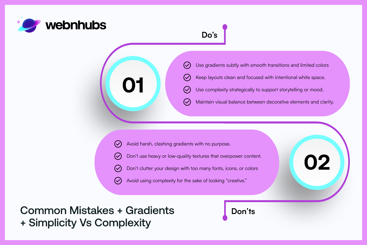
Professionals can also fail when it comes to the application of the theory of color. Such mistakes include overemphasizing the use of complementary colors and failing to select suitable ones. One must choose them from the perspective of the target group, or light/dark-shadow contrast, litmus image tests. In graphic design, color choice in particular can make a design look like a mess. It can become a distraction from the intended concept. In logo design, choosing an improper color is deceptive to the brand and may not meet the expected brand image.
Choosing the right color palette for a design
Selecting the appropriate colors for a project is typically as easy as it is crucial. It can take account of the first and foremost consideration when developing a project. The choice of the palette may determine how one judges the brand, product, or message. The choice of colors can change the perception that the audience has of the brand, product, or message. This makes color choice an important decision for any brand. When it comes to web design, creating a logo, or conceptualizing the theme of your site, color combinations can do wonders. It can get you a failure or a pleasing and powerful design. There are design tools such as Adobe Color or Coolors that can help designers create a color palette with the proper combination from the color theory.
Gradients and Textures as a Way to Expand Your Color Palette
The use of gradients and textures helps blend up the courses you choose and make your piece distinguishable. One has to understand that volume is not necessarily the answer to creating a visually compelling image. It is possible to make the picture look exciting and intriguing with some careful color transitions within the picture. Keeping in mind the texture additions, which must not overpower the viewer. Color and texture theories determine the right color mix and where to apply them in transitions to avoid creating a speech-like effect. This technique is most helpful in web design and logo manufacturing since designers want to leave a grand impression in a limited area. Correctly using subtle blends, gradients, and textures helps you to achieve depth and contrast. It gives your designs an added touch of professionalism.
Simplicity vs Complexity: When to Use a Minimalist Color scheme
Though, some of the most effective logos are made up of one or two colors only. It shows that often few is more. Some of the principles of color theory stand in line with this notion suggesting that simplicity in color choice can get the message across without distracting. But of course, there are cases where it is suitable to have multiple colors. In graphic design, identifying the success of when more or less complex color combinations should be used. This art of knowing can enhance a project. With the help of the color theory, designers can create visuals that will have that necessary wow factor. Whether the picture is minimalist or complex, it is possible to attain a perfect equilibrium for any graphic design project.
Conclusion: Mastering the Use of Color in Graphic Design
One of the most impressive things a designer can achieve is mastery of color theory. Proper usage of color can either make a design ordinary or extraordinary. Whether it be logos, text effects, or working on a detailed graphic design project, understanding when and how to apply these all can add a punch to your designs. When progressing further with your skills in design, one should always focus on color theory. It is not a limitation of a certain picture but instead, it is a tool that can help in provoking emotions. Color theory helps in passing intended information while also grabbing immense attention. If one remembers the principles of color theory, one can easily achieve aesthetically appealing designs. The ones that send out the right message to users.
Frequently Asked Questions
Begin with one dominant brand color which defines your personality and supplement them with complementary and accent colors. To do so, you can make sure of tools like Coolors or there is Adobe Color as well that help you experiment with different color combinations. Rest you can decide which suits you best.
That’s true, colors do play with psychological mindset. Different colors generate different feelings and emotions and when you add them into your brand identity, be it logo or design, you basically generate that emotion into the audience. This is one of the main reasons why choosing the right color or color combination is important to help people perceive your brand how you want.
They both differ in terms of the kind of design you’re opting for. If you opting for digital designs, then use RGB because in digital design, the light comes in contact with the screen. Whereas, you should go for CMYK in print designs as it deals with ink.
Keep the ratio of contrast high and apply accessibility options such as the Contrast Checker at WebAIM. Do not use color to pass information exclusively, employ labels or icons as well.
The commonly occurring mistakes are use of excessive color and lack of contrast. While choosing colors, do not go for what’s trendy even if it is disregarding your own brand identity. Always go with your brand identity and brand guidelines, but play around with the definite colors.
