Introduction
Graphic design basics are fundamental for any communication strategy. It is important to learn the essential graphic design basics to create compelling designs. For beginners as well as professionals, it is crucial to be familiar with these graphic design basics in order to achieve successful design outcomes. The general principles include understanding color schemes, use of typography, spaces and the layout. Graphic design companies nowadays have a hold on these principles which is why they are able to produce persuasive yet effective graphic designs. Graphic design remains crucial, as it is fundamental to brand marketing strategy, client interaction and user experience. As we move further, we will talk about basic elements of graphic design. This blog will educate you on how to form a firm foundation for your brand in this ever-evolving digital world.
Significance of the Graphic Design
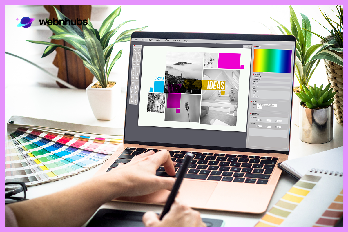
Graphic design is important as it assists different organizations and brands in how to market themselves to the audience. With proper understanding of graphic design basics, brands can deliver their messages easily on different platforms. This includes both digital and printed media, billboard and product labeling. Effective graphic designs help capture people’s attention, help customers seek faith and confidence in the company. These principles help build designs not just for the aesthetic value, but to elicit a certain reaction of the audiences. Once these designs are successful to attract target customers, it encourages engagement which leads to them making a purchase. Understanding the basics of graphic design is must to meet brand objectives and build meaningful communication between a brand and its audience.
Importance of Color Theory in Graphic Design
Understanding color is one of the important graphic design basics. Colors are one of the most critical factors in order to make appealing and persuasive designs. Designs that drive audiences emotionally and intellectually. Color theory provide specific guidelines to designers about how a general tone will affect intended design. In color cycle, primary, secondary, tertiary colors, complementary and analogous colors provide distinct contrast or unity in a design. Knowing color theory is crucial not just because it makes the design aesthetically pleasing but also meaningful and purposeful. Whether you are creating a logo, a website or a marketing campaign, color is an essential aspect of graphic design basics. It can improve legibility, direct attention and create desired emotional responses in your audience.
Typography – Important Element of Graphic Design
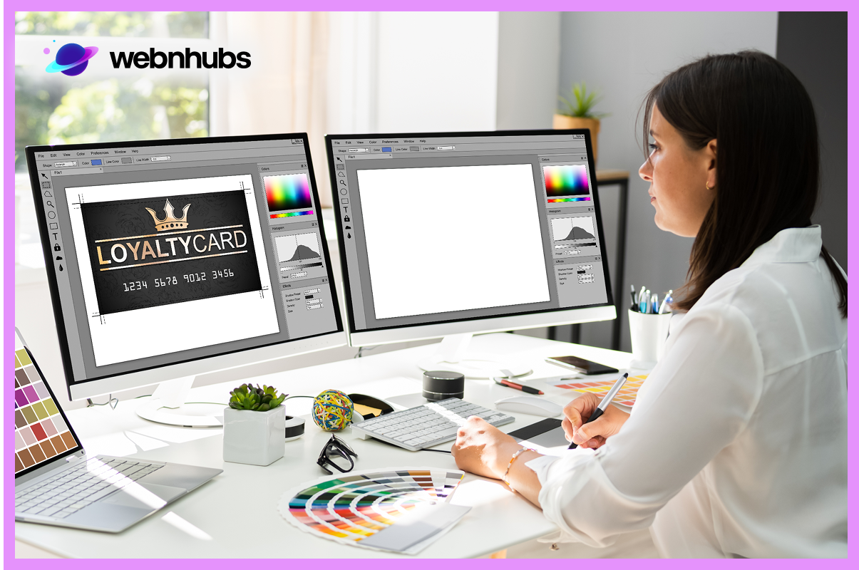
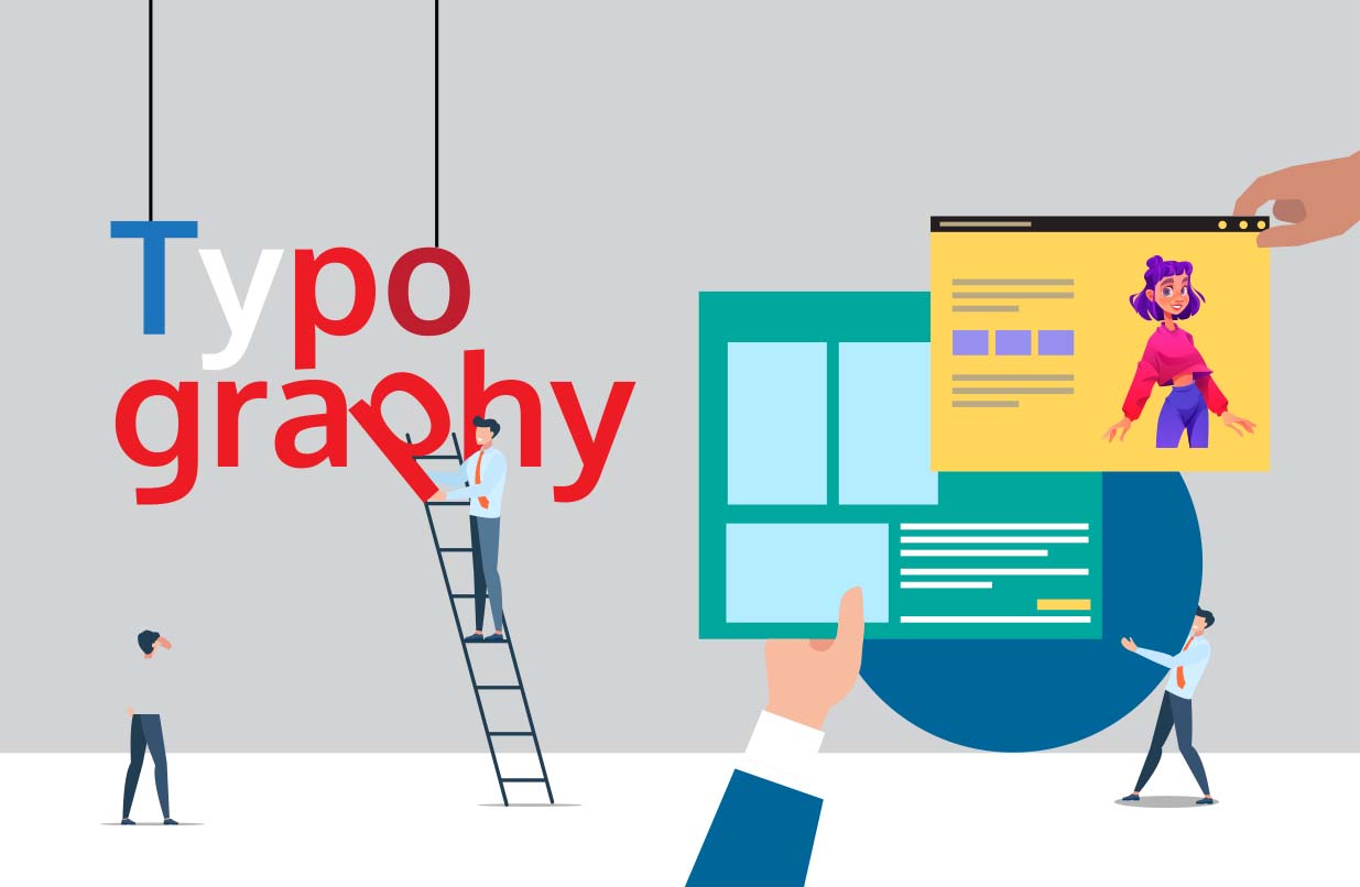
Typography holds an important position in the graphic design basics. It defines whether the script is readable and has an attractive appearance in a design or not. The types of fonts include serif fonts, sans-serifs, scripts, and decorative. Each type has its own character and helps dictate the overall mood of the design. Creative graphic design also benefits from suitable typography that backs up a branding voice, cue, and character. Even in more formal design applications—like how typography impacts resume effectiveness—font choice and structure play a crucial role in leaving the right impression. Having a compelling graphic design is much more than finding the right font. It includes font type, size, weight, and the distance between the letters that leads to a perfect product layout. Typography must always be in proper harmony with other components in order for it to create clean, yet professional layouts. It is every shining component of graphic design and is an area that any designer ought to consider as important.
Layout, A key Component in Graphic Design
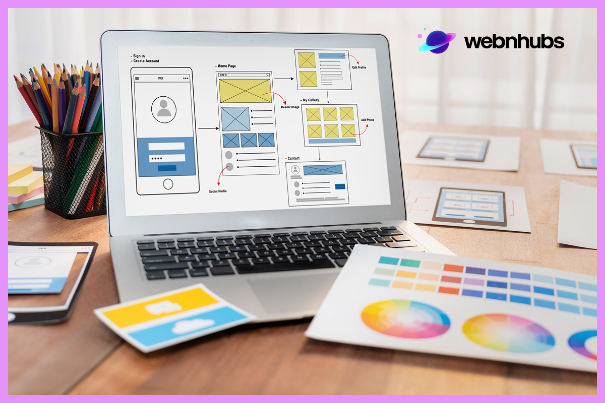
The layout is another element of the graphic design basics that impacts how viewers engage with a layout. It specifies how text, images, and graphics are positioned on a page, screen, or canvas. A good flow structure helps the viewer’s eyes to follow the layout, maintains a good flow and highlights relevant information. Margins, grids and alignment are among the essential assets that the graphic designers always consider when balancing their work. Another way to underline the importance of graphic design is by using effecting layouts that contribute to beautifying the design and make them effective. This is particularly relevant to web design since the usability of layouts is central to web design. By applying layout design rules, the work done by designers can organize to be visually appealing and Understanding the principles of layout enables the designers to come up with work that is attractive and easy to follow.
Utilizing Contrast in Design
Contrast is one of the key components of graphic design basics. Its application helps in achieving contrast, attracting attention, and conducting the viewer’s gaze towards certain areas of a design. With the use of elements like color, size, texture and the shape of the object used, one is able to produce beautiful contrasts. Contrasts that will help you make your design look more fun, attractive and interesting. For instance, a flashy color on a dull background will attract more attention than a dull color on a flashy background. On the other side, small typography alongside small will immediately create the hierarchy of information. Graphic designers make use of contrast to emphasize aspects of the picture, as well as the readability of the design. Use of contrast can pass on the intended message through a graphic design quite effectively. It can help your designs outstand and fascinate the viewers.
The Relationship Between Form and Function

and Its Design Probably one of the most crucial aspects in graphic design fundamentals is the balance between aesthetics and functionality. However, the design is not merely aesthetics; it should also function to convey information to a user. For example, a website with bright beautiful pictures to look at but a poorly designed layout does not meet the goal of graphic design because of the negligence of usability. By figuring out the basic elements and principles, it is easy to harmonize beauty with utility in your design. In other words, there must be a reason behind the selection of each item, and how the items affect both the aesthetic and functional value of the design. If form and function are in synergy and balance, then what you’re left with is an aesthetically appealing design which in addition meets the intended function or application of the design.
White Space: Less is More
One of the most important but often overlooked concepts in graphic design basics is white space. It is the space around the objects and details that makes a significant difference to the overall appearance of a design. White space or negative space adds breathing space in a design which makes a design look more appealing. It enhances readability, visual clarity, legibility and highlight brand tone. In other words, if you leave sufficient empty space around the text, pictures, or other graphic items, you can encourage user interaction. It is a crucial graphic design basics since it creates a balance which leads to an efficient and comforting design. It can be a plain area or a plain background, border around the edges, images or letters that do the work. Designers understands the need to use white space correctly to make the space appear light and free from any clutter.
Consistency in Design
As with any skill, practice makes perfectly applicable to the basics of graphic design. No matter if you are designing corporate identity, advertising campaign or website, continuity of graphic layout is crucial for consistent image identification. Being consistent refers to applying the same colors, typefaces and structures across different platforms to establish powerful brand identity. Graphic design companies consider this aspect in their work so that a particular brand of company and its products such as their logo, business cards, website and face book all bear resemblance in style. Qualitatively, this makes the design more professional, while at the same time enriching the brand image that audiences have: this makes the latter instantly recognizable. In many cases it is important that there is continuity which in the case of design means that there must be coherence in terms of expected outcome hence consistency is key to long term success.
The Importance of Alignment

Alignment is a fundamental part of graphic design that enable designers to keep functional and visual connections in check. Alignment makes layout sense where text, images and graphics neatly arranged in the page giving it a professional look that is easy to comprehend. When applies to any kind of works in print or web/ graphic-designing, proper alignment increases the readability and fluency. The role of graphic design is particularly obvious in cases when alignment is done right since it brings a certain unity of the design which in turn, becomes aesthetically appealing and engaging, and therefore conveys the message which is intended to be delivered, in the best possible way. Getting the alignment right is an essential aspect when trying to create attractive, professional, and high quality, designs that flow well.
How Proximity Enhances Design
In the graphic design elements, proximity is one of the principles that deal with the positions of the objects in the layout. Grouping related items together enhances comprehension and makes the design easier to follow. It helps in creating a more intuitive experience for the viewer. For example, in effective graphic design, placing a headline closer to its related paragraph helps viewers quickly understand the connection. Proper use of proximity ensures that the design doesn’t look cluttered or overwhelming. Proximity provides design clear distinctions between different sections or pieces of information. By organizing elements based on their relationship to one another, you simplify the visual hierarchy. It improves the overall user experience, particularly in complex designs like infographics, brochures, or web layouts.
Importance of Repetition in Design
One of the graphic design basics is the use of repetitiveness that contributes to unity throughout the design. It entails using objects like colors, shapes, font, or texture throughout the design to ensure consistency and reiteration of critical design features. This powerful tool is used by many graphic design companies to create a coherent branding model across different channels. Whether you’re creating a website, a print ad or making a graphic for social media, it is always good to repeat key graphic elements in order to create harmony. There is always a balance or use of repetition in all areas of the graphic design in order to boost the visual appeal of the design. Repetition supplements the overall look of design as well as ensure the cohesiveness of different elements within the graphic design.
Hierarchy in Graphic Design
Hierarchy is among the most fundamental principles in graphic design basics. It is about organizing different objects based on their priority. It directs the viewer’s attention throughout the design and makes sure the most important information is seen first. This is true because designers develop hierarchy through aspects such as size, color, contrast, and position among other items. For instance, in a poster, the title is usually written large than the rest of the information on the poster. This principle is especially helpful for print and digital media since it makes the main points easy to comprehend. it allows the users to immediately get the information without any distortions. The use of a hierarchy is key in graphic design, as it helps to convey the necessary information, both in form and in substance, in the most succinct and efficient manner.
Grids in Graphic Design
Grids are one of the primal geometrical guidelines applied in graphic design basics. They assist in designing rightful and geometric structures with balanced layout. A grid is a network of lines that aids designers in properly positioning objects, and ensuring a stable layout. With the use of a grid, designers are able to make their work cohesive and neatly aligned and professional. This technique is especially helpful in web and print design since several elements need to be placed on a webpage or a printout so that they look good and are easily navigable. In graphic design layout, the use of grids plays a critical role in enhancing content arrangement and flow in design. It is an essential skill to learn and apply grids to achieve professional looking well organized layouts.
The Role of Visual Weight in Graphic Design
Visual weight is the measure of the dominance or prominence of visual items in a design or display. It is one of an important aspect of the principles of graphic design basics. It is one of the most influential concepts through which we can achieve designs’ hierarchy, balance, symmetry, and harmony. Size, color, texture, and shape are all the factors intervene and determine visual weight. When objects are larger in size, simple and have high contrast, they will appear as visually heavier. Likewise, using bold color provides with extra visual weight as compared to dull or neutral colors. It is crucial to know how to divide a design’s visual weight appropriately to keep a design pleasant. With balance, graphic designs get a good sense of order. It helps them efficiently balance the weight with the proper placement of objects or lines within the design.
Texture and Depth in Graphic Design
In graphic design, the term texture refers to the look of the surface or the feel of the design. Applying texture and depth is one of the important fundamental principles of graphic design which creates depth in a design. Again, it could be physical texture wherein texture can be experienced either through the eyes or the touch. Applying textures into a design makes it look real and brings the design closer to reality. It provides the design with more character when put to use. In the same way, depth is made by shadows, layers and the view perspective. This provides designers with different dimensional aspects to work with. Integrating texture and depth into a design can greatly impact the feel of a design by making it look unique. Knowing the ways of how to apply these elements can turn your artwork from two-dimensional and boring to three-dimensional and fascinating.
The Supremacy of Symmetry and Asymmetry
In graphic design basics, it is crucial to consider both symmetry and asymmetry in order to obtain balance and harmony in a design. Symmetry refers to a design that is duplicated or replicated on either side of a given axis. It makes a design seem more controlled and balanced. In contrast, asymmetry means that elements are positioned unevenly and this results in more complex and engaging compositions. Each of these design types is appropriate depending on the context or message that the design wants to convey. It is important to consider creating an interplay between symmetry and asymmetry in design to get a visual appeal.
Importance of Contrast in Typography
The first and very significant attribute of good typography is contrast. The idea of contrast exists where elements with a large degree of dissimilarity are combined. It adds interest, equilibrium, and emphasis in specific kinds of compositions. In graphic design, contrast is one of the graphic design basics which highlights key text in a typographic setting. There are several ways of emphasizing distinction through the typographical means. For example, difference in font size, font type, and font style or even color. For instance, when using a big, black and bold font for a headline, and a smaller, thinner and grey font for the body, the distinction is easily distinguishable. It eases the understanding of the content. This kind of contrast not only makes the materials more comprehensible but also leads the viewer’s attention. Contrast in typography helps to convey important information in clear and simple manner.
The Impact of Visual Harmony

Visual harmony is a key goal in graphic design basics. It ensures to keep all the elements of a design work in harmony to create a cohesive and balanced composition. To achieve visual harmony, it is important to carefully select and arrange elements and place them in an orderly manner. Element such as color, typography, and imagery must put in a way that looks more unified and aesthetically pleasing. When a design is harmonious, it feels complete and balanced. This helps in passing on the intended message by making the design more appealing to the viewer. Graphic design agencies rely on this principle to create work to communicates the intended message without distractions. Mastering visual harmony makes the final output look more professional, neat, and outstanding.
Conclusion
To achieve a flair in graphic design basics, combination of both artistic and technical abilities in designs is a must. Proper knowledge about important fundamentals including color, type, and space can help in generating compelling designs. By developing a strong foundation in this area, designers can create visually versatile and profit-oriented outcomes. It is very important especially when working in graphic related designs for digital purposes, print media, or even for branding purposes. This underlines the importance graphic design for brands and businesses that are more likely to use graphics in near future. Successful designs become a mean of passing concepts and messages in the future. As you continue to refine your talent, do not forget that, to be a good graphic designer, one has to learn from experience and feedback. The key to success is by embracing changes in the course of practice.
