Introduction to Image Resolution
Understanding image resolution is important in creating quality images for both the digital and the paper media. This section gives the reader brief information about image resolution, its role, and how it influences image clarity. Whether you’re a designer or a photographer, knowing the basics of resolution helps in optimizing images for specific outputs. Image resolution is one of the most critical factors that contribute to the success of effective graphic designs. When designers know the difference between PPI and DPI, they can design excellent visuals for both the screen and for print-out. These graphic design basics can enhance your understanding of color theory and resolution settings to create professional and high-quality images.
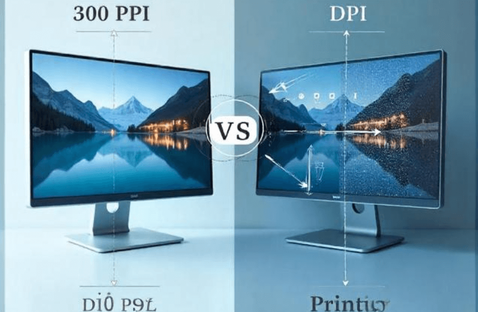
What is PPI (Pixels Per Inch)?
![]()
Pixels Per Inch (PPI) refers to the number of individual pixels packed into one inch of a digital image. When PPI is higher, the picture quality is more detailed, especially if it is showcased on a high-definition screen. For instance, gadgets such as smartphones with Retina displays have a PPI greater than 300. This offers a high level of image sharpness. In digital media, knowledge of PPI is relevant. Making changes to it contributes to the improvement of the user experience. For instance, designers have specific PPI values for crisp visuals on their responsive websites, while photographers apply high PPI settings for elaborate details. PPI can be used for technical purposes but also determines how colors and gradients look. In mastering the principles of graphic design, understanding how to incorporate settings for PPI is important. It helps to produce appealing yet functional designs.
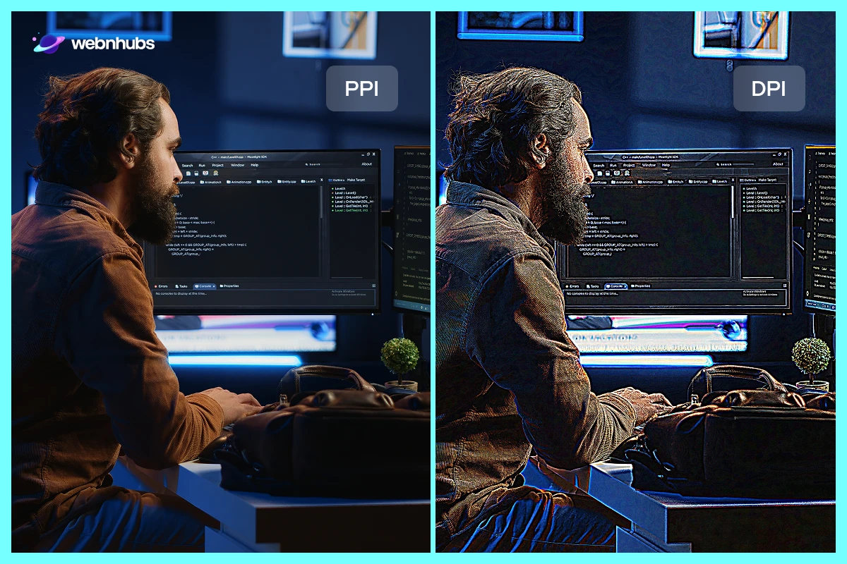
How Does PPI Affect Digital Images?
PPI defines the resolution and clarity of images on digital screens. This means that a higher PPI value results in details image details and sharper gradients. This is important for high-end screens such as the 4k monitors, and high-end smartphones. For example, an image optimized at 72 DPI can be blurred on modern devices while an image optimized at 300 DPI, will be sharp. Designers need to know PPI’s correlation with pixel density and screen resolution to come up with the best visuals. Besides, the distance has a major impact. The higher PPI is required for the nearer distances, and the lower PPI for the farther distances. Thus, designers need to master PPI vs DPI concepts so to get crisp and clear images. It also helps in choosing the proper PPI for various devices to achieve an optimal mix of efficiency and aesthetics.
Understanding DPI (Dots Per Inch)
Dots Per Inch (DPI) is the number of ink dots a printer smears on paper. A higher number will produce finer details and better tonal gradation which is crucial to printing. For instance, graphic printing demands 300 DPI or more to come up with a quality image, whereas, low-quality printing may demand 150 DPI. This displays how printers understand DPI and why one should choose the right setting for the type of print material. Learning about DPI assists in closing the gap between the digital and the physical image layout. This means that the quality of the picture will not be compromised in one format as opposed to the other. Selecting the correct DPI depends on the print material and its likelihood of being viewed from a close distance. Furthermore, DPI is one of the important elements in graphic design basics that allow designers to produce high-quality work.
The Relationship Between PPI and DPI
PPI and DPI have their differences, they are both related and unrelated at the same time. While transitioning designs from digital screens to print media, they are both required. However, PPI is related to digital resolution and DPI to print clarity. Understanding the relationship between the two is vital for designers. It helps them maintain the integrity of their work across different platforms. For instance, an image with 300 PPI is required for printing and 300 DPI to ensure accurate color reproduction and detail. This section delves into practical scenarios where PPI and DPI must align to prepare digital artwork for magazines or posters. Effective management of these settings also avoids common pitfalls like pixelation or poor print quality. By mastering this interplay, designers can create visuals that seamlessly bridge the digital and physical realms.
Common Myths About PPI and DPI
It is common for designers to confuse the concepts of PPI and DPI and be unsure of their applications in design. Some DPI misconceptions include ‘‘the higher DPI means a better-quality output.’’ However, DPI is essential for sharp prints, it doesn’t apply to digital screens, where PPI determines image clarity. Another misconception is that “PPI and DPI are the same.” PPI is used to measure pixel density on the screen while DPI refers to several ink dots in printed material. Failure to understand such terms may lead to blurry prints or loading issues. For instance, the use of a 300 DPI image on a website may result in a large file size resulting in poor image quality. By dealing with such myths, designers can create visuals that look great on both screens and print.
Importance of Image Resolution in Printing
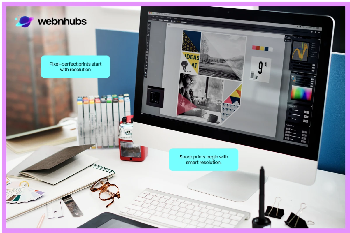
Resolution is an important factor as it determines print quality. Low resolution leads to pixelated and blurry prints which is why high resolution is always a choice. They result in sharp prints with vibrant colors. For example, an ordinary brochure and magazine need to have at least 300 DPI to achieve high quality. Large-format banners may only necessitate 150 DPI as they are viewed from a distance. Managing high-resolution files is a challenge that calls for extra work with file size and format. It requires fine skills to resize images without compromising quality and knowledge about how vector graphics work for scalability. With a firm understanding of resolution settings, designers can fine-tune their work and achieve effective printed media. This helps in understanding graphic design basics, ensuring every project meets industry standards.
How to Calculate Resolution for Print and Screen
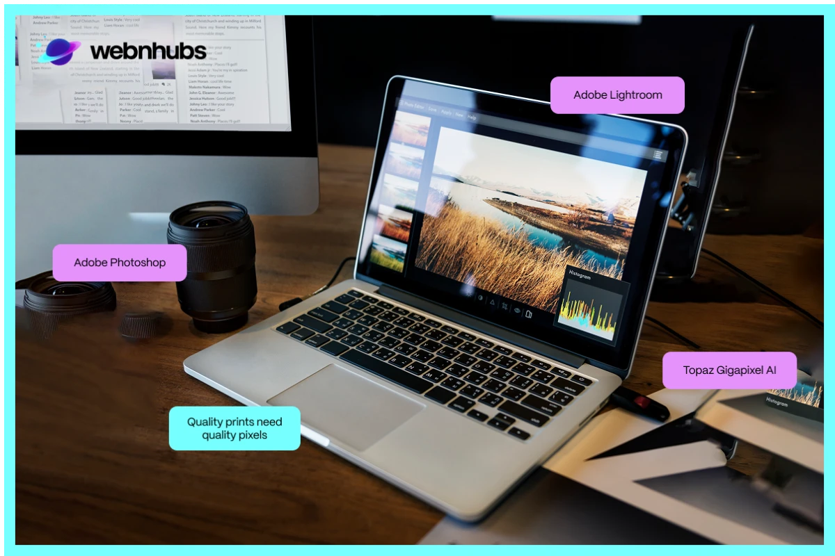
It becomes relatively easy to calculate resolution for print and screen projects knowing how PPI Vs DPI works. For prints, the resolution depends on the size and the quality of the project. For example, printing a high-quality 8×10-inch photo at 300 DPI means the image needs to be 2400×3000 pixels. Similarly, for digital screens, calculating the resolution involves determining the screen’s pixel density (PPI) and size. For example, an image that is 1920 x 1080 on a 15-inch monitor at a 141 PPI density will appear extremely clear and crisp. Software such as Adobe Photoshop makes this task easy. It provides you with a feature to set the appropriate PPI or DPI each time you open a new project. File sizes are another important factor. For example, large formats like .jpeg or PNGs may slow down the site’s loading time or take up a lot of space.
Tools to Optimize Image Resolution
Using the right tools is essential for managing PPI vs DPI settings and creating stunning visuals. If you’re using a website, graphic design software, or any other online platform to create your designs, tools like Adobe Photoshop, Adobe Illustrator, and GIMP are helpful in resizing images for better resolution. It also defines how designs will look on digital screens or print. These tools also aid in achieving an optimal balance of file size and quality of images necessary for effective graphic design. For those who are new to photography, websites like Canva or TinyPNG can resize and optimize images for better quality. With care, these tools assist in creating designs that associate with principles like the color theory to achieve vibrant outcomes. Optimizing PPI vs DPI is key to delivering high-quality visuals that meet modern design standards.
Picking the Perfect PPI vs DPI for Different Media
When it comes to media format, it is important to know that all designs are not created equally. PPI settings must be spot on to achieve clear and colorful images for high-resolution websites. In documents such as flyers or pamphlets, DPI maintains the quality and cleanliness of your work. So, how do you decide? Consider the context in which your design will exist. To achieve a sharp look on the web, choose a web-friendly PPI. It commonly ranges around 72 dpi. For print, ensure that the DPI is at least 300 DPI to receive non-blurry outcomes. This section breaks down the tricky stuff, showing you how to balance PPI vs DPI like a pro. From a laptop screen to a glossy magazine, these tips will serve as a guide for getting it right the next time around.
How Distance Affects PPI vs DPI
Have you ever noticed how a billboard looks extremely alluring from a distance but not when up close? The secret lies in the power of resolution and how we perceive it. Designs seen up close, like photo books or smartphone screens, need high PPI and DPI to stay comprehensive. This is because ‘viewing distance’ alters the concept of ‘resolution’. Inline designs, for example in photo albums or smartphone displays, require high PPI and DPI to remain sharp. However, in cases where the images are viewed from a distance like on posters or banners, it is possible to use low DPI to distinguish individual pixels. Gaining this kind of knowledge can help you save time and energy! These tips can help you design for any audience, whether they’re scrolling through their phone or admiring your work from across the room!
PPI vs DPI: Resolution Tips for Photographers
For photographers, it is crucial to learn and distinguish PPI and DPI to make great visuals. An essential factor is PPI which helps make your photos clear and detailed on a computer screen. A PPI of 72 is usually enough for an online portfolio and social media. If your device has a higher resolution such as Retina, you may want to increase it. When it comes to printing, DPI is another factor that determines the quality of the print image. Graphic designers recommend at least 300 DPI for photo prints, galleries, or any deliverables to clients. Striking a balance between PPI and DPI does not necessarily mean a difficult equation to solve. First, choose whether your image is for the web or print material and then set the appropriate parameters. Also, do not forget color theory as these factors help you improve your photography across the board.
PPI vs DPI in Modern Technology
The debate over PPI Vs DPI has changed significantly because of the modern technology. Today innovations including Retina displays, 4K monitors, and advanced printers have boosted pixel density and resolution capabilities. Any device with a high PPI can provide with smooth user experience and sharp image quality. Likewise, today’s printers have much higher DPI which results in high-quality printing. Designers need to update themselves on how PPI affects pixel density for screens and how DPI works with print resolution. Software such as Adobe Photoshop and Illustrator can enhance designs for these revolutionary technologies. Therefore, it is crucial to keep up with these trends so that the work is in line with modern standards. It is essential to understand the difference between PPI and DPI so that one can design and develop visuals that not only conform but surpass expectations.
PPI vs DPI: Real-Life Examples in Design
It is important to understand the use of PPI and DPI in several real-world design applications. For instance, a website image with 72 PPI makes it loads quickly and is appropriate for responsive design. At the same time, business cards require 300 DPI to make the print look very clear and official. Posters that are to be displayed from a distance, can be printed at low DPI to minimize the file size without losing much quality. PPI is desirable in online photos since high PPI produces sharper images on the web and DPI achieves clear color and specific detail for prints. These examples show you how PPI Vs DPI can improve your work in various media. By adjusting the resolution settings and matching them with the rules of graphic design and color theory, the visuals will be engaging and optimal depending on the situation.
Conclusion
Understanding PPI vs DPI is crucial for anyone practicing design whether as a beginner or an expert. Knowing how PPI impacts digital clarity and DPI on the print quality creates visuals of high quality across media. This way you can work on specific media, from creating a loading speed website to photographs requiring high-quality prints. Adopting modern tools and technologies can keep your designs both contemporary and aesthetically pleasing. In addition, achieving a balance between resolution and file size, focusing on color theory and graphic design basics can enhance the results of your projects. Bear in mind, that PPI and DPI are not abstract concepts. They are useful instruments that help to turn the creative idea into a real project. Spend time to move around, try and test, you will soon notice that your designs are turning into masterpiece professionals.
Frequently Asked Questions
PPI is pixels per inch applied to screens. DPI refers to dots per inch, which is applicable to print. PPI influences the sharpness of an image in the digital displays, and DPI influences the quality of a print. Consider PPI of screens, DPI of paper.
PPI determines the clarity of your image on a screen. When it comes to web use, 72 PPI is the norm–it makes files light and crisp. An excessively high one, will not make it look better on the internet, only more difficult to load.
The recommended value is 300 DPI and it works just fine in print media, delivering sharp and crisp prints. However, some do feel the need to use higher values but it does not nothing but adds in the file size. The quality remains that same so just stick to 300.
Divide the DPI or PPI you are using by the print size (in inches). As an example, 8 x 10 inches at 300 DPI = 2400 x 3000 pixels. Basic mathematics makes designs lean and sane.
One of the biggest myths is that an increase in PPI or DPI necessarily increases quality- it does not. The other error is to confuse them or even neglect them.

Hafsa Hanif is a talented content writer at WebnHubs, specializing in topics such as graphic design, web design and development, logo design, and animation. With her deep understanding of design principles and creative processes, Hafsa crafts engaging, informative, and SEO-optimized content that resonates with readers. Her expertise in SEO ensures that her articles not only captivate audiences but also rank well on search engines, helping businesses boost their online presence through compelling design-focused narratives.
