Look around, the coffee cup laying on your table, your tiny details on your booklet, or even the news app you went through this morning. Everything speaks of graphic design basics.
We believe that only the images we see need designing. But, that’s not true. Whatever we read today is also designed.
Are you thinking what design has anything to do with the piece of writing? Well, the choice of font size and type in content are the graphic design basics.
Graphic design is the art of communicating ideas through visuals. Many of us misinterpret design with beauty. When actually, it is a combination of beauty and functions that push people to feel, remember, and take the desired action.
This graphic design guide talks about the graphic design concepts, graphic design fundamentals, and basic principles of graphic design. What basic graphic design skills one requires to compete with the latest trend makers in the market?
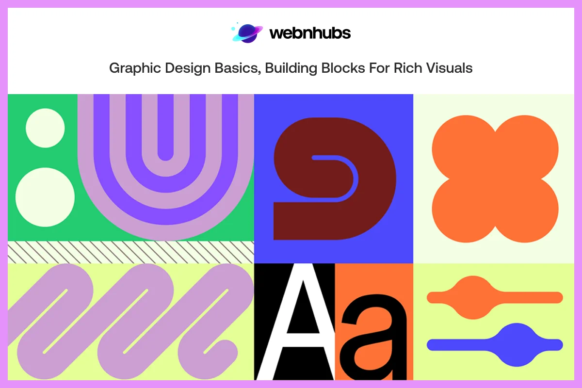
Introduction to Graphic Design Basics
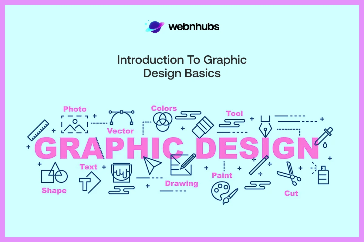
Graphic design is not just about visual art; it is the art of conveying ideas by design. Learning about graphic design requires purpose, be it logos, posters and webpages. Whether the purpose is to serve the audience, to educate, to drive traffic or to convert. you design according to it.
Many of us think graphic design is nothing more than visual communication which is not true. It is about the use of text, images and color altogether to deliver the message. This way, you will set the tone for your target audience to react to brand message a certain way.
A good image can have an impact. But an SEO-optimized content complimenting that image can benefit both your brand identity and your pockets.
Components of Graphic Design Basics
To learn how to design, it is important to understand graphic design essentials. These are the many graphic design elements which designer works with to create a pleasant image.
These include color, line, shape, texture, space, form and typography. Imagine them as the ingredients so the outcomes mainly depend on how you blend them.
Fundamental of Graphic Design
Successfully pulling out an impactful graphic depends on the use of concept and the skills. These are as important as grammar is a piece of writing.
Designers must be aware of the different fundamental of design such as color theory, balance, contrast, composition, and typography. Having the right knowledge and the skillset is what you should look for in a graphic design agency or a professional designer. Only then you can get functional and beautiful designs.
What are the Principles of Graphic Design?
There is a difference between elements and graphic design basic principles. Elements are what you’re using whereas, the principles of graphic design refer to how you use them. Basically, fundamentals of design are the tools and principles are the rules.
The basic graphic design principles include layout, flow, and emphasis. These makes sure that no element of your design goes useless.
Great designs require harmony. Being a beginner, your job is to first get familiar with these basics so that you can design images that evoke the right emotions.
13 Principles of Design in Graphic Design
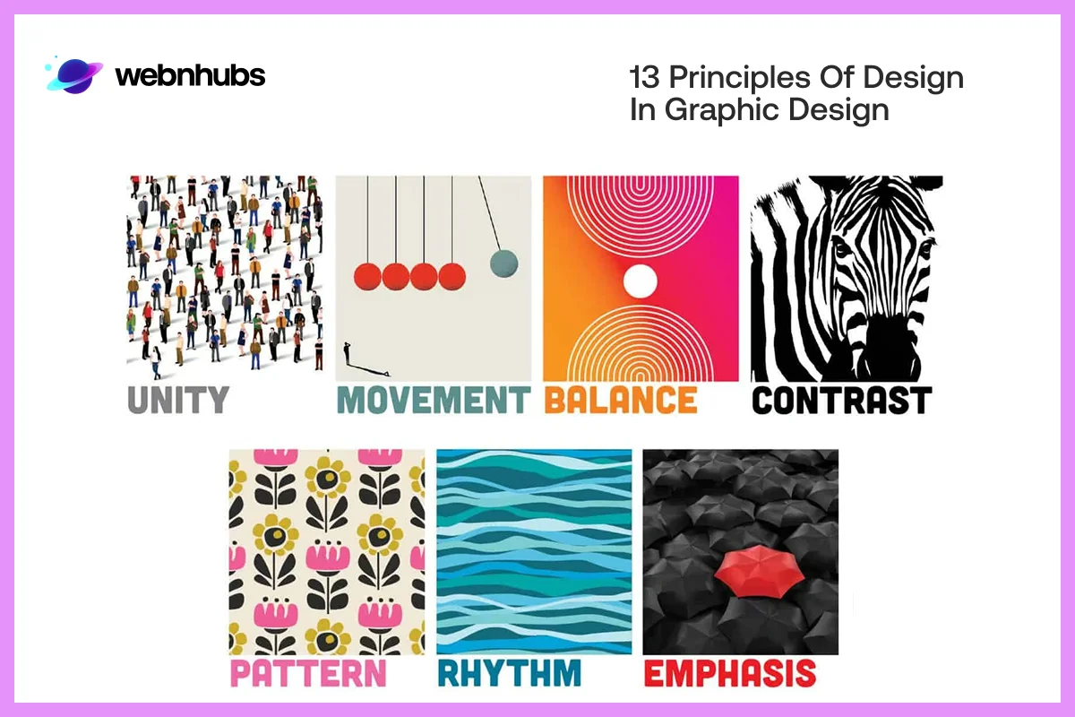
Ever wonder how Apple ads feel so relaxed and balanced and Nike posters always stand out with their slogan? It’s not accident but the science behind design.
There are 8 design principles in graphic designing for beginners’ guide. These include balance, contrast, emphasis, proportion, movement, unity, hierarchy, and repetition.
In this blog, we will discuss 13 different design principles that provide visuals with clean look crisp look.
Balance
Balance has everything to do with putting things in balance so nothing can feel odd or out of place. It is what makes your layout feel stable.
There are two types of balance in a design, one is symmetrical balance and the other is asymmetrical balance.
Symmetrical balance
It refers to when both the sides in the design are mirroring to each other. The left is identical to the right. This is the traditional to achieve harmony in a design. Symmetrical balance has classic feel and it creates trust and loyalty among viewers.
Asymmetrical balance
It is when there is a use of different elements of different sizes or color in a design. These elements are placed in a way that bring harmony to the design. In digital design basics, designers are taught to apply asymmetrical balance to create a sense of diversity.
Example of an Apple Store
All you have to do is look at the Apple website. You will see how all product pages are clean and have white backgrounds. Pictures are placed in the middle with proper spacing. You won’t see that the one side feel heavier than the other.
They have used bilateral symmetry to create a lovely balance that look clean and organized. Customers have their eyes on the product due to the cool and premium look of Apple website.
Contrast
It is contrast that makes key stuff stand out. It allows your viewer to look at the most important information in few seconds. Contrast attracts they eyes towards the most significant info.
Without contrast, the designs lose clarity and become confusing. This is why it is key to add different contrast of color, size, shape or type makes images readable, exciting and energetic.
Example of Spotify Wrapped
Spotify use high contrast color combination to achieve a consistent look and feel. The neon backgrounds and bold text stand out against their black backgrounds.
If you have not used Spotify, go to their app and see the result of using contrast. You will also observe the right contrast between their content and images. Experience how the layout feels vibrant and energetic just like their music.
Contrast basically helps viewers spot the key information. It creates a focal point that audience get naturally drawn to.
Emphasis
Emphasis refers to the direction, where do you want people to first begin. Designers use contrast, color, layout to put emphasis on certain parts of the design.
In graphic design, emphasis is about making few elements stands out among other. When you do this, you drive readers or viewers’ attention to the important message. You can either do it with color or typography.
For example, use it to highlight the CTAs or the H1 or the key images. This is just like guiding a lost person on the right path.
Nike Slogans
The “Just Do It” ad of Nike is all about focus. They use a frame full of strong athlete, with slogan at the center. The design makes your eyes look nothing but “motivation”. Minimalistic use of design elements add simplicity which removes distract from the attention.
Hierarchy
The hierarchy helps provide structure to your design which give people a clue of where to start. It is all about creating a visual as well as the content hierarchy. The headings, size, color, contrast or position of them must have a flow.
The large elements, such as headlines or CTAs must catch eye whereas the minor details connect to the rest. In the absence of a hierarchical structure, you risk losing your point altogether.
NYT Website
Think about the NYT website. The headlines are large and bold, subheadings are medium size and the body text is small. The hierarchy makes it natural for the reader to get the flow of the story.
The whole website looks pretty organized, rational and digestible. This is basically the whole idea of good design hierarchy.
Alignment
Alignment will ensure that your design is clean, professional and user-friendly. It makes all the elements, text, image or button, visually related to another thing.
With good alignment, your readers can move through your design without any difficulty. In its absence, your layout appears clumsy and out of place.
Google Homepage
The homepage of Google is a great example of this. All the elements, including the logo, search bar and buttons, are in the middle of the page. This perfect symmetry brings a sense of harmony. The design looks quite restful, easy and classic.
Proximity
Proximity is simply about putting similar things together. When things are near, our brain thinks they are linked.
Contrary, when they are far, then we think they are different. The principle enhances readability and visual flow. It enables viewers to get a quick grasp on the information.
Instagram Layout
View any Instagram account layout. The profile picture, the name and the bio are tightly arranged at the top, a sign of connection. The posts are shown as a grid below, visually distinct yet belonging to the profile. The proximity used in this way lets the user immediately see the hierarchy of information.
Repetition
Repetition brings coherence and togetherness throughout your work. Repeating colors, shapes, or fonts makes your design look purposeful and unified. It builds brand name. The people begin to identify your work with the repetitive style.
McDonald’s Logo Design Fundamentals
The McDonald’s nails repetition. The arches are golden, the palette is red and yellow, and every touch point is recognizable. You will find it in packaging, ads or billboards. You see how the recurrence of these visual details creates immediate familiarity and trust in a brand.
Rhythm
Rhythm is movement and flow to your design. It is the way viewers eye moves on the page. When you apply repeated variations in spacing, size or pattern on elements, an effect of motion and predictability is produced.
Rhythm in design create strong brand identity because it maintains the interest of the viewers which makes designs alive.
Coca-Cola Ads and Posters
Coca-Cola use rhythm, one of the principles of graphic design basics in their posters and ads. The repetitive use of variation of bubbles, curvy line and texts in movement generate a rhythm.
This connects with flow and let their eye flow from one way to other, however you want to direct it. In most of their ads, you will see how rhythm designs are used to generate a vibrant and refreshing feel.
Movement
The motion guides the eyes of the viewer. When elements are placed in a pattern or in a specific direct, it directs.
Designers use it to form a flow, guiding focus one place to the other using lines, contrast, shapes, and colors. This the kind of graphic design basics which establish hierarchy. Even in static formats, movement can be used to engage the audience in design.
Nike Motion Campaigns
This is brilliantly done in Nike motion campaigns. The use of running athletes, dynamic angles and diagonal layouts make your eye sit across the page. This gives a sense of speed and motivational energy which is Nike brand identity.
Proportion
Proportion is concerned with the size of elements in your layout. It brings balance and does not allow one section to overshadow another, unless this is the purpose. Equal ratios make the whole layout look steady and attractive.
Example of a North Face logo
The North Face logo strikes the right balance between its bold type and the half-dome icon. Both elements do not overshadow each other. The ratio brings harmony and power, which gives adventurous, trustworthy feel of the brand.
White Space
It is the empty space between the design elements that is left intentionally. Designers use white space to allow the elements to have a breathing space. This space can be of any color.
The white space also known as negative space. In design principles graphic design, designers use this to enhance readability, design flow, and maintain balance.
Product Ads of Chanel
The Chanel product ads use the art of white space. See how their product pictures look high-end and classy. The lack of text, focus on images, and space makes design breathe and allow the product to speaks itself.
Variety
Diversity gives excitement. It prevents your brand from going bland. Variety is achieved by combining different elements such as colors, shapes or textures and balance. This is used to make the design interesting and appealing to the eyes.
Remember, excess use of anything make design useless. Too much variety cause chaos but the right amount of will make designs interesting.
Airbnb Branding Style
Marketing and branding of Airbnb shows how variety of elements can work together. Use different photos, different styles of icons, and funny illustrations elevates the design to the next level. This variety portrays their message of being inclusive and belonging to everywhere.
Unity
And the last principle is unity which is the bone that glues everything. It makes sure that every aspect of your design has a connection and a reason. With a matched color scheme, typography, and layout, your design conveys one simple narrative.
Apple iPod commercials
Do you recall the Apple iPod commercials? The figures dancing on top of those bright colored surfaces? Whichever version it was, they all possessed that clean, unified vibe. You would have to be living under a rock to not see one and think, that is Apple.
They played around with contrast, color and imagery, yet never lost that inimitable unity, so the message shouted out loud and clear. Unity in design is basically not only about looking good.
Want to add this vibe into your brand?
Webnhubs graphic design services can help you with that. Believe us, it does make a difference.
Tools to Learn Graphic Design Basics
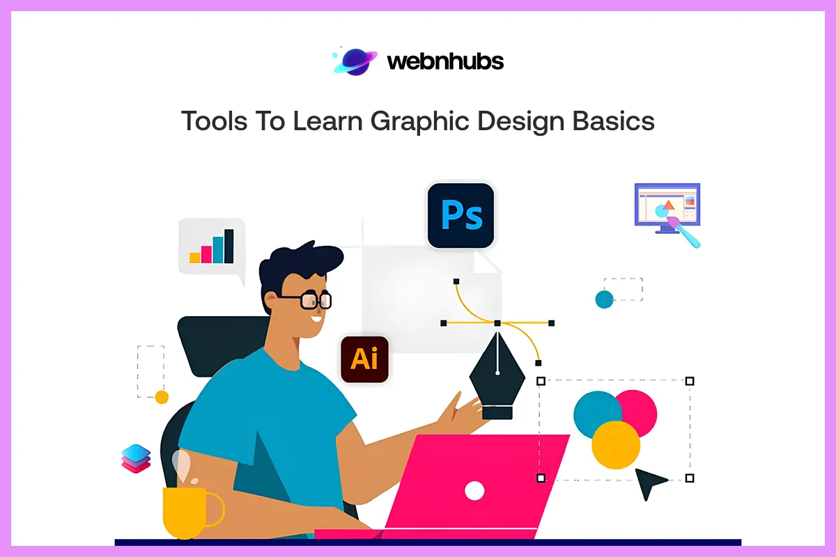
Beginning graphic design? It is important to know at least the basics of each tool. Remember, designers use tools to create compelling outputs. So, you can learn and use them too.
Being a graphic design beginner, Canva is best for use. It allows you to experiment with balance, hierarchy, and emphasis based which is one the best graphic design tips for beginners.
Figma and Adobe XD are ideal for both graphic and digital designs. New comers or graphic design beginners can use these tools to play around with different elements. Elements such as contrast, rhythm, and alignment in actual interfaces.
If you are given an opportunity to work for a brand. Improvise! Use tools such as Adobe Illustrator, Photoshop, and InDesign are best. They provide with a pixel-level control over the color, proportions, and type.
If you want to use motion? The After Effects is best as it teaches how motion and timing affect the way people view things.
Each of these tools are graphic designer essentials. If you’re starting graphic design basics course, starts easy and invest time. Play around with the elements, and see how little changes, like spacing, font choice can change your visual narrative completely.
Top Blunders by Graphic Designers
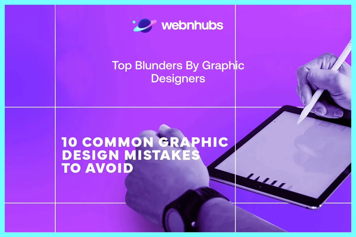
Neglecting the graphic design standards and graphic design guidelines often lead to blunders. With this guide to graphic design, spot the website design mistakes that you should avoid.
Ignoring white space, excessive use of contrast, poor alignment makes your graphic design dimensions look messy or confusing.
By following the graphic designing tips such as use grids, you can straighten things. Use only 2 to 3 typefaces to be consistent and readable. And don’t forget, the white space is never wasted but allow your design to breathe.
When your layout is not working, take a step back to look at your balance and hierarchy. Basic design course tools such as Figma and Canva can make things easy. They allow minor changes to grid and alignment which gives power to the structure and enhance creativity.
How Graphic Design Best Practices Help Business Grow?
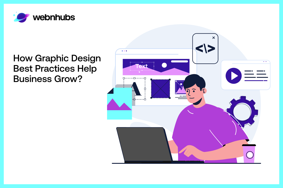
There is a huge role of graphic designs in business growth. Graphics help deliver the message that resonate, inform, and create action. It is every brand touchpoint that builds how people perceive and recall you.
For example, brands like Apple or Airbnb use visuals that are immediately familiar since design is in their blood. It is the way they express value without uttering even a word.
When a brand has a consistent visual identity on packaging, websites, and ads, it makes them credible. A consistent brand identity has as a direct impact on the purchasing behavior.
According to DMI study, Design Value Index (DVI), design-oriented firms such as Apple or Nike show 10-year returns yielding 2.19 times (219%) that of the S&P 500.
Graphic Design Trends in 2025
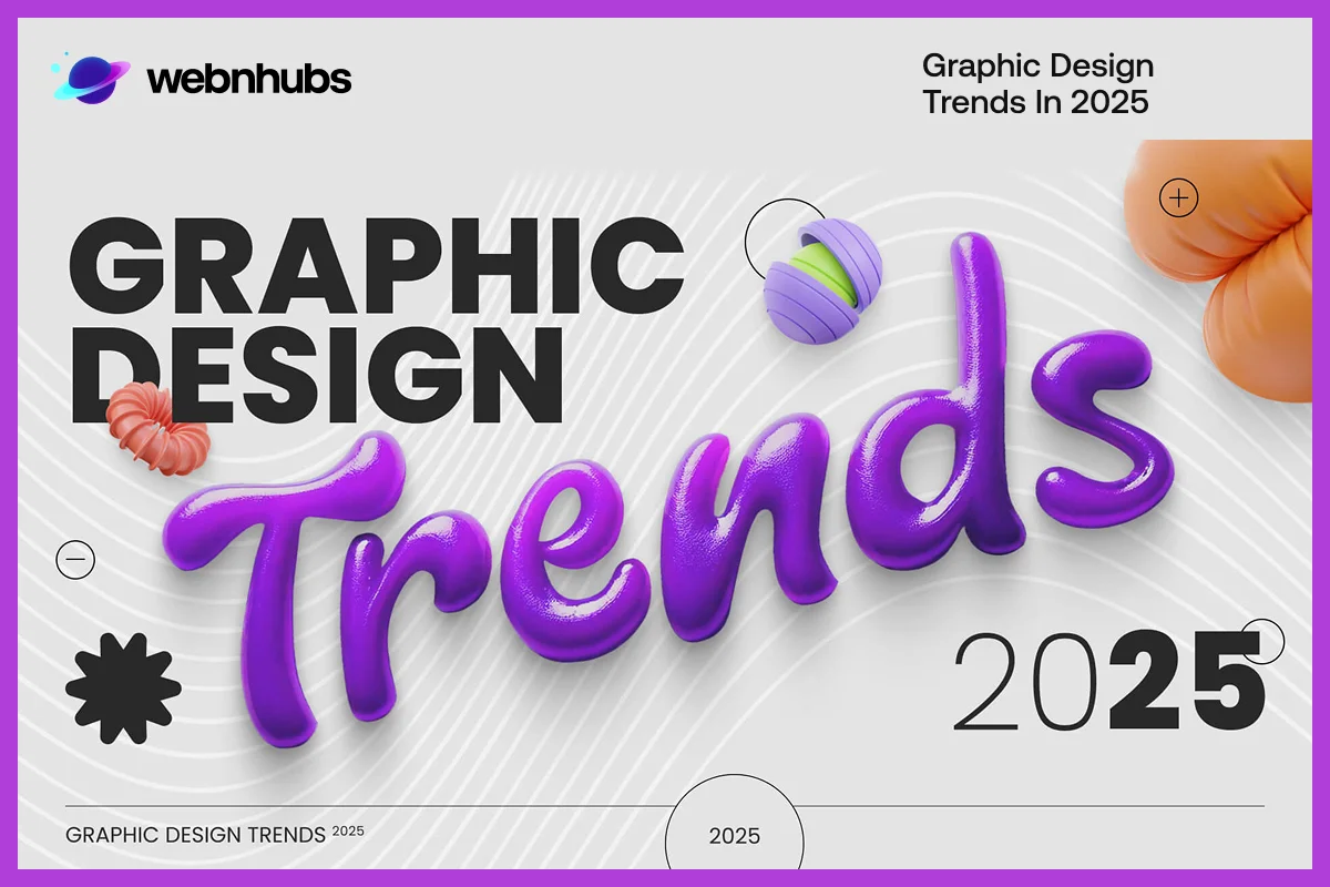
Followings are the seven website design ideas that can help you rule in 2025.
Inclusive Designs
Design is not exclusive to anyone. and it is finally beginning to have an effect on the way things are done by brands. Straight colors, sharp type, varied images are no longer accessories, but necessities.
Accessibility is not a button, it is a design choice, which creates trust and relationship. According to a report by LevelAccess, 89% of businesses improved their UX by introducing accessibility overhauls.
Digital Scrapbooks
Designers are striking nostalgia with a new twist. They are using collage style layouts, textures made of torn papers, and handwritten font to deliver a human touch in digital space.
It is all about connecting memories with the modern world. The human touch and the feelings will always prevail.
Minimalistic designs
It is a matter of minimalism combined with chic. Bold letters, vibrant colors and bizarre textures create a sense of coolness and energy. The payoff? Clean look that one cannot overlook.
Customized Designs
One size fits all graphics are gone. The current brands are customizing everything. Be it a social media post, website, the data and behavioral understanding is in great use.
According to McKinsey, businesses that value personalization can increase revenue up to 40%. By 2025, each design will be customized, narrating a brand specific story to each viewer.
Retro Designs
Groovy vibes are back. Designers are now using 60s and early 2000s mixing fluid forms, wavy type and electric color schemes. It is an appealing eye that feeds their mutual nostalgia, sunny, riotous, all expressive.
Sustainable Designs
The new trend is to create every design with conscience. People want designs that pose no harm to environment. A skilled designers can easily do this with proper research and eliminate waste that is harmful to earth.
This is possible by using modular templates, light weight graphics, and print on command to reduce their space. Know that it is now just a desire for 2025 but a good attitude. An attitude that informs the making and sharing of images with the audience to trust.
3D Designs
Flat design is no longer in demand. Viewers expect more depth, motion, and authenticity. Brands are now leading towards 3D and motion graphics to transform dull images into experiences that amaze and win sales.
Want to upgrade your images?
Start experimenting with these 2025 design trends today or contact Webnhubs now!
Use of AI in Graphic Design

Designs keep on changing, in the next few years, you will see more design evolve. In 2025, brands are warming up the engine. They are using aggressive color, and smarter tools to speak to individuals.
The biggest shift is now AI in design. According to the Business Research Company, in 2024, AI-driven Design Tools market reached 5.54 billion. By 2029, it will increase and reach to 14.92 billion with a rate of approximately 22 percent per annum.
These tools will never rob the creativity of human designers. But will enhance it. AI can be used for suggestions to help designers work on story, emotion, and meaning.
Conclusion
A kick-ass visual identity is only possible with the right graphic design basics. It starts simply with getting the balance and contrast right and then heading to AI tools.
Whatever you do and however you do, get the graphic design basics right.
Doing right means allowing your brand to deliver, resonate and sell. In 2025, design is all about simplicity, accessibility, and actual value.
Whether you are a beginner or a professional, keep trying new things. Keep on learning and keep on creating images that speak louder than words.
Become smarter today with Webnhubs
Looking to master graphic design basics that makes ideas count?
We have experts at Webnhubs that can provide your brand with a fresh kick.
Frequently Asked Questions
Begin with five major principles, i.e., balance, contrast, alignment, hierarchy and repetition. These will alone clean up your designs, make them easier to read and, at the same time, more professional.
You can start with the easiest one which is either Canva or Figma to learn about layout and composition. Once you are aware of them, you can move to Abobe Illustrator or Abode XD. These are professional level tools that provide you with more creative control.
The most common mistakes are overcrowding designs, font overuse, and bad alignment. Have a simple design, maintain a steady distance, and ensure the readability of your design also.
Things that seem subtle like trying out a trendy background like a gradient or a t-shirt with bold typeface, but still keeping your core items traditional and well-known.
Print favors precision and color accuracy (CMYK), digital favors clarity and interactivity (RGB), and motion provides movement and pacing to maintain attention.

Hafsa Hanif is a talented content writer at WebnHubs, specializing in topics such as graphic design, web design and development, logo design, and animation. With her deep understanding of design principles and creative processes, Hafsa crafts engaging, informative, and SEO-optimized content that resonates with readers. Her expertise in SEO ensures that her articles not only captivate audiences but also rank well on search engines, helping businesses boost their online presence through compelling design-focused narratives.
