- What is Web Dimension?
- Why Does Website Dimensions Matter?
- Key Factors that Influence Website Dimension Choice
- User Experience
- Designing for Multiple Screen Sizes
- Content Layout
- Browsers
- How Website Dimensions Are Measured
- Pixels (px)
- Ems (em)
- Rems (rem)
- Percentages (%)
- Viewport Units (vw, vh)
- Absolute Units
- Common Web Dimensions for Different Devices
- Web Dimensions for Mobile
- Web Dimensions for Tablet
- Web Dimensions for Desktops and Laptops
- Recommended Screen Dimensions
- Factors to Consider When Choosing Your Website Size
Ever stared at a website that just feels… off? Maybe the text runs off the screen on your phone, or images look stretched and pixelated on your laptop. That frustrating feeling is often due to one thing: improper website dimensions.
Think of website dimensions as the foundation of your digital home. So, if you do it wrong, even the most beautiful design elements will be as clumsy as elegant furniture crammed into a misshapen room!
Here at WebnHubs, we’ve seen plenty of lovely designs go to waste because they didn’t fit the new, multi-device reality correctly.
The truth is, getting your web page dimensions right isn’t something technical on your to-do list—it’s the secret sauce that makes your site look professional and refined on every single screen.
No matter whether you’re a beginner in designing or a seasoned developer, this guide has all the information you require regarding website dimensions explained in simple, easy-to-understand language.
So, let’s begin!
What is Web Dimension?
Web dimension refers to the set of specifications that govern the look of your site on various devices. Not width and height, but all the way up to the spacing between objects.
Think of it as your site’s floor plan, governing the manner in which your content flows, your pictures are displayed, and your navigation functions.
Unlike print media with fixed dimensions, websites must adapt to countless screen sizes while maintaining visual harmony.
Understanding web dimensions means grasping both the fixed aspects (like pixel measurements) and the fluid elements that allow your site to respond intelligently to different viewing environments.
Don't let dimensional issues cost you customers!
Book a consultation with our responsive design specialists.
Why Does Website Dimensions Matter?
Website dimensions matter because they directly impact user experience, bounce rates, and conversions. So, it’s safe to say, that it plays a huge role in shaping web design.
After all, as per ResearchGate’s report, “94% of first impressions are web design-related, with proper sizing and spacing being key factors in how users perceive website quality.”
A poorly dimensioned site creates friction—text becomes unreadable, buttons get too small to tap, and layouts break.
When visitors struggle to navigate your site, they leave. Search engines also prioritize mobile-friendly sites with proper dimensions in their rankings.
Aside from functionality, correct dimensions establish a visual hierarchy, guide the flow of your content, and communicate professionalism.
In a more mobile-first world with people constantly hopping between devices, accurate dimensioning is no longer a luxury.
Instead, it’s a requirement of maintaining your brand consistency and getting your message out to your audience regardless of how they’re finding your site.
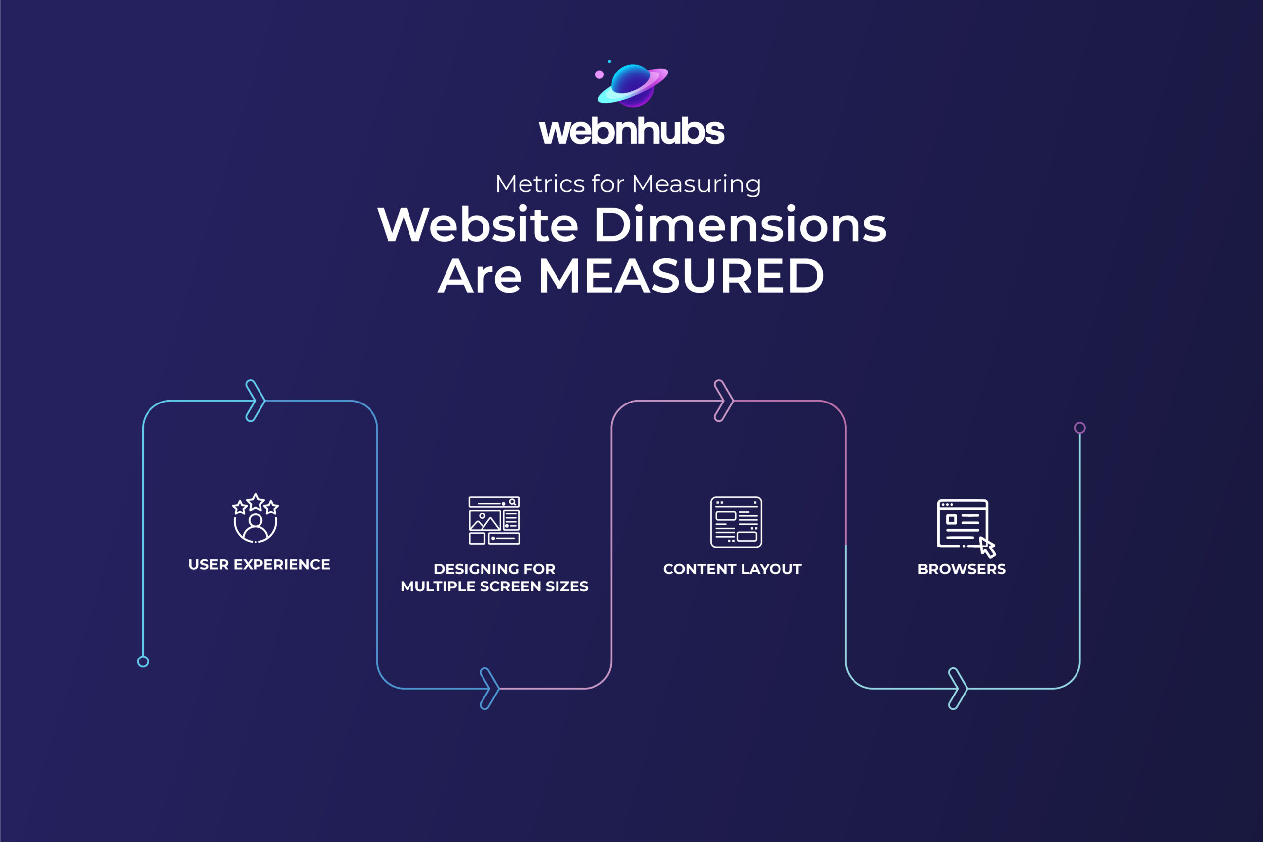
Key Factors that Influence Website Dimension Choice
Multiple factors control website dimensions to offer a convenient browsing experience. From user behavior to adaptability on screens, each factor plays a part in usability as well as visual appeal.
Let’s discuss how user experience, responsiveness of screens, content organization, and browser compatibility affect such decisions.
User Experience
User experience is the cornerstone of dimension decisions. Every pixel matters when crafting an interface that feels intuitive rather than frustrating.
Think about how your thumbs naturally reach across a phone screen or how your eyes scan a desktop layout. Dimensions that force users to pinch, zoom, or squint create friction that drives visitors away.
Studies show you have just seconds to make a good impression—dimensions that feel “just right” keep users engaged longer. The sweet spot? Elements large enough to interact with easily but not so large they dominate the experience.
Remember, dimensions aren’t just about fitting content on screens—they’re about creating spaces where users intuitively know how to navigate and interact.
Designing for Multiple Screen Sizes
Gone are the days of designing for one or standard screen sizes! Websites these days must shift fluidly across devices without compromising their essence—like a chameleon that never forsakes its essential self.
This isn’t about adapting the content to fit on a phone; it’s about designing for different situations.
A three-column desktop layout might become a single column on mobile, with navigation transforming from horizontal to a hamburger menu.
The trick is identifying which elements deserve priority at each size. Smart designers establish dimension relationships rather than fixed measurements—when your headline is twice the size of the body text on the desktop, maintain that ratio on mobile for visual consistency.
This dimensional ballet requires planning but delivers experiences that feel custom-tailored to every device.
Content Layout
Content layout is where dimensions get personal—it’s about arranging your specific content in a way that breathes properly across devices. Dense text needs more white space to remain readable on smaller screens.
Images that sit side-by-side on the desktop might stack vertically on mobile. Navigation that spans horizontally on larger screens might collapse into a dropdown on smaller ones. The golden rule?
Content should dictate dimensions, not the other way around. When planning layouts, consider content hierarchy first—what must users see immediately versus what can be discovered through scrolling?
Proper dimension planning ensures your most important messages receive the right amount of visual real estate regardless of device, maintaining their impact from billboard-sized monitors to pocket-sized screens.
Browsers
Browsers are the unpredictable variable in the dimension equation. Chrome, Safari, Firefox, Edge—each renders your carefully planned dimensions with subtle differences.
What looks perfect in one browser might shift a few pixels in another, potentially breaking your layout. This browser diversity requires building flexibility into your dimensions—rigid pixel-perfect designs often crumble across browsers.
Modern CSS approaches like Flexbox and Grid provide powerful tools for creating layouts that maintain their integrity across browser variations.
Don’t forget to test! Browser developer tools let you preview how dimensions behave across different environments.
The reality is that browser inconsistencies will never completely disappear, so dimension planning must include tolerance for slight variations without compromising the overall experience.
How Website Dimensions Are Measured
Website dimensions can be defined using various measurement units, each with its own advantages.
Developers can create flexible and responsive designs with ease by grasping key concepts of these units and layouts.
Let’s look at the different ways web dimensions get measured:
Pixels (px)
Pixels are the digital world’s atoms—the smallest units of measurement on screens. When you set something to “300px wide,” you’re telling browsers to use exactly 300 tiny lightpoints regardless of screen size.
Sounds straightforward, right? Well, it gets tricky with high-density displays like Retina screens, where one “CSS pixel” might actually use multiple physical pixels. That’s why pixel-perfect designs sometimes break!
Pixels shine for precise elements like borders or when you absolutely need consistent sizing. But beware of pixel-only designs—they’re rigid and don’t adapt well to different devices.
Think of pixels as your website’s measuring tape—essential for precision work but not always flexible enough for every situation.
Ems (em)
Ems are the chameleons of web measurements—they change size relative to their parent elements. Named after the width of the capital letter “M” in typography, one em equals the current font size.
If your paragraph’s font is 16px, then 1em within that paragraph equals 16px. Set a heading to 2em? It becomes 32px. This creates a beautiful cascading relationship throughout your design. The magic happens when users resize text—everything scales proportionally!
But ems have a quirky side: they compound. Nest elements within elements, and those ems multiply based on each parent, sometimes causing unexpected sizing.
They’re perfect for creating harmonious typography systems but require careful planning to avoid the “snowball effect” in complex layouts.
Rems (rem)
Rems (root ems) solved the compound problem that made designers tear their hair out when using regular ems. Unlike standard ems that reference their parent element’s size, rems always reference the root element—typically the HTML tag’s font size.
This creates consistency throughout your design while maintaining scalability. Set your root font size to 16px, and 1rem equals 16px everywhere, regardless of nesting.
Need everything bigger? Just change that root value! This makes rems perfect for creating coherent sizing systems across complex websites.
Many designers use a hybrid approach—rems for layout dimensions and spacing to maintain proportions across the site while keeping regular ems for typography where that cascading relationship still makes sense.
Percentages (%)
Percentages are the relative superheroes of web dimensions—always calculating their size based on their container. Set a div to “50% width,” and it’ll occupy half its parent’s width, whether that parent is a tiny phone screen or a massive desktop monitor.
This fluid approach creates naturally responsive layouts that expand and contract with available space. Percentages shine for creating flexible column systems and maintaining proportional relationships between elements.
The catch? Percentage heights can be tricky since they need a defined parent height to calculate against (and parents often take their height from their children—a chicken-and-egg problem!). Master percentage-based dimensions for layouts that feel naturally at home on any screen size.
Viewport Units (vw, vh)
Viewport units revolutionized responsive design by directly referencing screen dimensions rather than parent elements.
One viewport width equals 1% of visible screen width and one viewport height equals 1% of visible screen height. Incredible opportunities emerge because of this. Imagine text scaling subtly alongside screen size and headers occupying roughly 80% of visible width.
The beauty is their directness—no cascading calculations or parent dependencies. There are interesting variants too: vmin (smaller of vw/vh) and vmax (larger of vw/vh) for maintaining proportions regardless of screen orientation.
The main gotcha? Mobile browsers sometimes handle viewport units inconsistently when their interface elements appear/disappear.
Still, they’re powerful tools for creating designs that feel perfectly proportioned to each unique screen.
Absolute Units
Absolute units bring the physical world’s measurements to digital spaces. Inches (in), centimeters (cm), millimeters (mm), points (pt), and picas (pc) all reference real-world distances rather than screen properties.
While this sounds ideal for print-to-web consistency, they’re actually digital outliers! The problem? “One inch” on the screen rarely matches one physical inch due to varying screen densities and sizes.
These units shine primarily when creating print stylesheets or when you need specific physical dimensions for specialized applications.
Most web designers avoid absolute units for screen layouts entirely, reserving them for print-specific styles where physical measurements matter.
Their rigid nature makes them poorly suited for responsive design—the opposite of what most modern websites need!
Want a website that looks perfect on every device?
Let our dimensional experts create your responsive masterpiece.
Common Web Dimensions for Different Devices
Different devices require varying web dimensions to optimize user experience. Regardless of whether you’re creating for desktops, tablets, or phones, the proper dimensions ensure readability and accessibility.
Now, let’s examine the standard website size phones, tablets, and desktops.
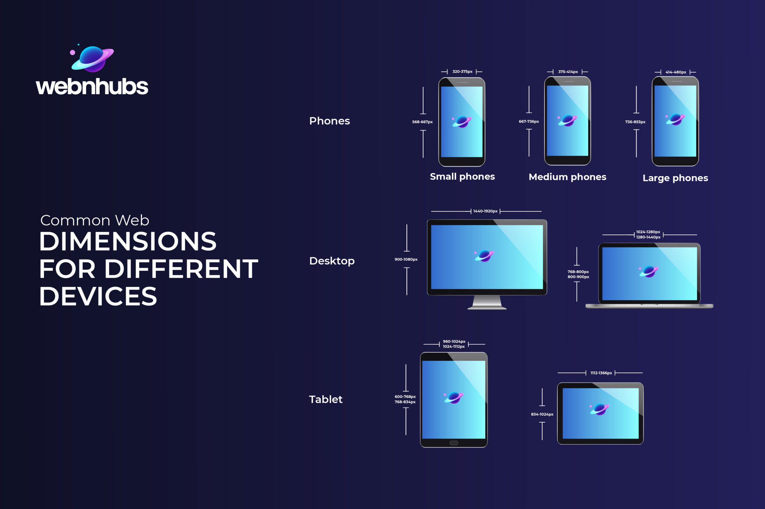
Web Dimensions for Mobile
Mobile dimensions are critical as most web traffic now comes from smartphones. Designing for these smaller screens requires careful consideration of touch targets, simplified navigation, and focused content presentation.
Mobile users on the go commonly have variable connectivity and typing with their thumbs, rather than fine pointers.
Good design on the phone concentrates on the information needed, keeps text readable without zooming, and makes interactive objects easily tappable.
Here is the dimension size chart for mobile devices:
| Device Size | Width | Height | Example |
|---|---|---|---|
| Small Phones | 320-375px | 568-667px | iPhone SE and older Android phones |
| Medium Phones | 375-414px | 667-736px | iPhone 8, iPhone X, Google Pixel |
| Large Phones | 414-480px | 736-853px | iPhone Plus models and Samsung Galaxy S25 Ultra |
Web Dimensions for Tablet
Tablets occupy the middle ground between phones and computers, offering more screen real estate while maintaining touch interaction.
Users typically hold tablets closer than laptops but farther than phones, affecting how they interact with content.
Tablet users often engage in more immersive browsing sessions, making them particularly important for content-rich sites, online stores, and media platforms.
Designs should leverage the additional space while maintaining touch-friendly elements.
The dimension size chart for tablet devices is as follows:
| Device Size | Width | Height | Example |
|---|---|---|---|
| Small Tablets | 600-768px |
960-1024px
|
Kindle Fire and iPad Mini |
| Medium Tablets |
768-834px
|
1024-1112px | Samsung Galaxy Tab and iPads |
|
Large Tablets
|
834-1024px
|
1112-1366px
|
iPad Pro in portrait mode and Larger Android tablets |
Web Dimensions for Desktops and Laptops
Desktop and laptop dimensions offer the most space for content display and complex interactions. Users typically interact via mouse and keyboard, enabling more precise navigation and interaction patterns.
These larger screens allow for multi-column layouts, expanded navigation options, and more detailed content presentation.
While mobile optimization often takes priority, desktop experiences shouldn’t be neglected—they typically drive higher conversion rates and longer session times for many businesses.
The following is the dimension size chart including the standard website width and height for desktops and laptops:
| Device Size | Width | Height | Example |
|---|---|---|---|
| Small Desktop Monitor |
1024-1280px
|
768-800px
|
Small laptop screens and small desktop monitors. |
| Medium Desktop Monitor |
1280-1440px
|
800-900px
|
Standard laptop screens and desktop monitors |
|
Large Desktop Monitor
|
1440-1920px
|
900-1080px
|
Large desktop monitors and large laptops |
| Extra-Large Desktop Monitors | 1920px+ | 1080-2160px | Ultra-wide monitors and 4K display monitors |
Recommended Screen Dimensions
The following are the best mobile, tablet and, desktop screen sizes so you can tailor your web design to these to ensure your website looks pixel-perfect at all times:
- Mobile: 375×667 or 360×640
- Tablet: 1024×768.
- Desktop/Laptop: 1366×768 or higher
Factors to Consider When Choosing Your Website Size
A web page size significantly affects its layout readability and overall performance. Several factors impact this decision noticeably, including content type, update frequency, and the number of pages.
Designing a remarkably effective website typically involves grasping these key aspects thoroughly beforehand.
-
Type of Content:
The nature of your content directly influences ideal website dimensions. Image-heavy portfolios benefit from wider layouts that showcase visuals, while text-focused blogs need readable column widths.
Video content requires dimensions that maintain proper aspect ratios across devices. Interactive elements like maps or complex forms need space to breathe on larger screens while remaining usable on mobil.
Always let your specific content type guide your dimensional decisions rather than forcing content to fit predetermined sizes. -
Frequency of Content Updates:
How often you update your site affects dimensional planning. Frequently updated sites need flexible frameworks that accommodate varying content lengths without breaking layouts.
News sites or blogs with daily updates benefit from modular designs with elastic dimensions that expand or contract based on content volume.
Consider how different content types might enter your site over time—will future updates include new media formats requiring different dimensional approaches?
Build dimensional flexibility into sites expecting regular content evolution.
-
Number of Pages:
Page quantity impacts dimensional strategy significantly. Small sites might use consistent dimensions across all pages, while larger sites often need dimensional hierarchies.
This means wider layouts for important landing pages and narrower dimensions for detail pages.
Navigation complexity increases with page count, affecting header dimensions and menu structures.
Multi-page sites leverage dimension systems instead of page-by-page specs to preserve visual consistency as users navigate through your site with varying content requirements between areas
Best Practices for Responsive Web Design
Building responsive websites requires utilizing suitable frameworks and effective layout strategies daily. A smooth and user-friendly experience across different devices is ensured by implementing these best practices.
Let’s dive into essential techniques like responsive frameworks, media queries, and layout choices:
-
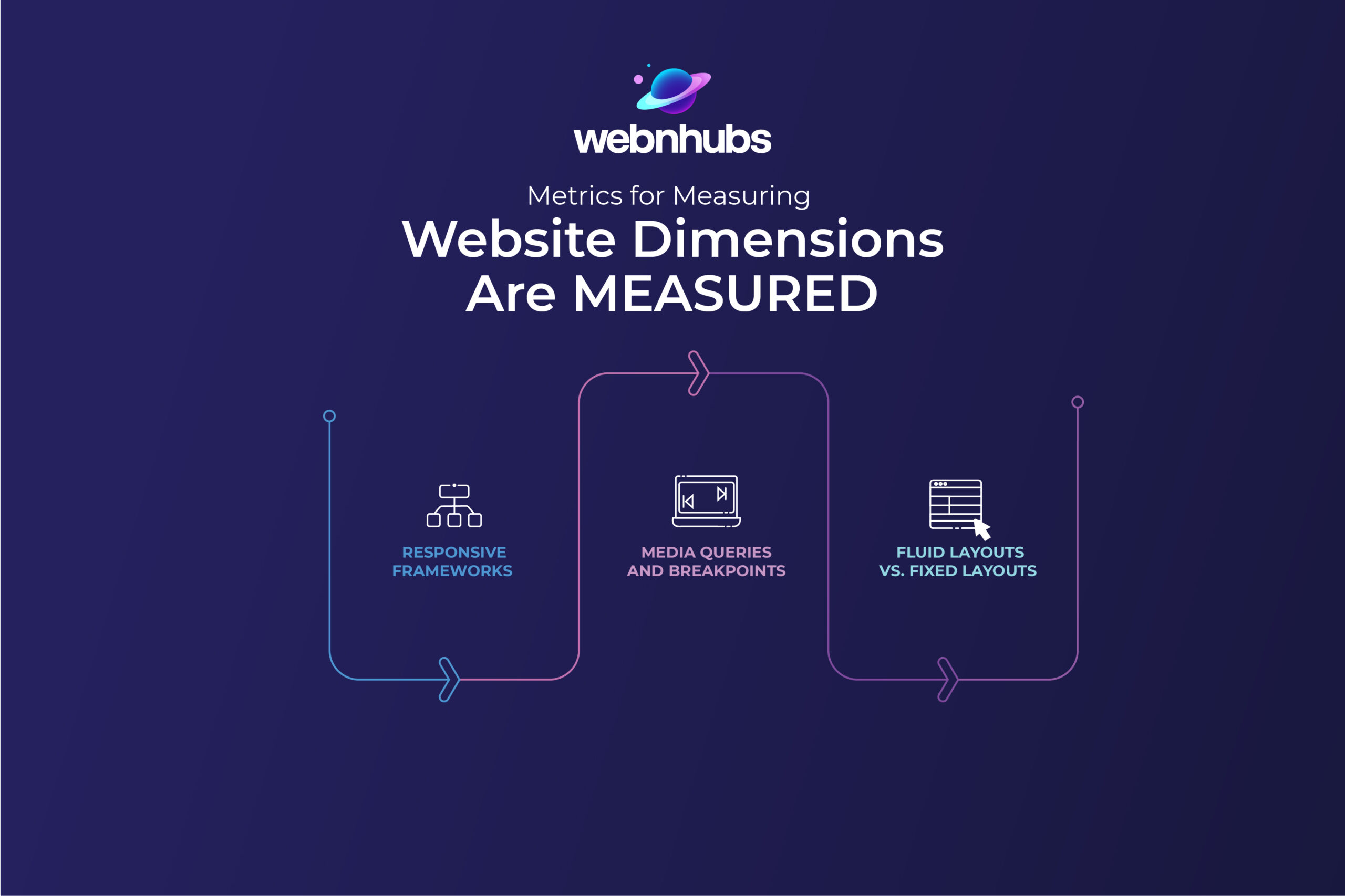
Responsive Frameworks
Responsive frameworks like Bootstrap, Foundation, and Tailwind CSS provide pre-built dimensional systems that save enormous development time.
These frameworks include grid systems with carefully calculated breakpoints that handle complex responsive behavior automatically. Think of them as dimensional scaffolding—they handle the mathematical heavy lifting while you focus on design.
The best frameworks offer customization options to match your brand needs without sacrificing responsive integrity.
While purists might argue for custom-built solutions, modern frameworks have evolved beyond their “cookie-cutter” beginnings.
They now offer lightweight, modular components that can be selectively implemented.
For most projects, leveraging these battle-tested dimensional systems makes more sense than reinventing responsiveness from scratch—just be sure to customize enough that your site doesn’t scream “template.”
-
Media Queries and Breakpoints
Media queries are the dimensional wizards of CSS, detecting screen characteristics and applying different styles accordingly.
They’re the magic behind elements that transform as users switch devices. Strategic breakpoints—the dimensional thresholds where layouts shift—require thoughtful planning beyond just targeting specific devices.
Rather than focusing exclusively on standard device sizes, observe where your specific design starts to break and set breakpoints there.
The classic “mobile, tablet, desktop” trinity is evolving toward a more nuanced approach with 5-7 breakpoints handling edge cases like ultra-wide monitors and foldable devices.
Remember that media queries aren’t just for layout changes; they can fine-tune typography, navigation patterns, and touch targets.
The most elegant responsive designs use breakpoints strategically, where content needs help adapting, not as rigid boundaries.
-
Fluid Layouts vs. Fixed Layouts
Fluid and fixed layouts represent two philosophies of dimensional control. Fluid layouts use percentage-based measurements, allowing content to expand and contract organically with screen size—like water filling different shaped containers.
This adaptability creates seamless experiences across devices but can sometimes result in awkward line lengths or spacing at extreme sizes.
Fixed layouts maintain consistent pixel dimensions regardless of screen size, offering precise control over presentation but requiring users to scroll horizontally on smaller screens—a major usability problem.
Modern approaches often blend both techniques: fluid containers with fixed maximum widths prevent content from becoming too stretched on large screens while maintaining adaptability for smaller devices.
This hybrid approach preserves design integrity while accommodating device diversity—giving you dimensional boundaries without sacrificing responsiveness.
Key Guidelines for Image Sizes
Website design is image-intensive both in terms of looks and performance. Proper image sizing and positioning allow it to have fast loading times and visual consistency.
Let’s explore key considerations like image placement, display size matching, and techniques for responsiveness.
Image Placement
Strategic image placement dramatically affects how dimensions behave across devices. Consider how images interact with surrounding elements as screens resize—full-width hero images might maintain their impact across devices, while sidebar images may need to be repositioned on mobile.
Dimension planning should include decisions about when images stack versus remaining side-by-side, when they should resize proportionally versus being cropped, and how they’ll integrate with text flow.
Background images require special dimensional consideration, often needing different focal points for mobile versus desktop. Also, techniques like CSS object-fit and picture elements allow precise control over how images behave dimensionally.
The goal isn’t just fitting images onto screens but maintaining their visual relationship with content across all dimensions, preserving their storytelling impact regardless of device.
Matching Display Size
Matching display size means sending appropriately dimensioned images to each device—a balancing act between quality and performance. High-resolution images look stunning but can dramatically slow load times, while over-compressed images save bandwidth at the expense of visual impact.
Responsive image techniques like srcset attributes and size definitions tell browsers which image dimensions to load based on device characteristics.
This dimensional intelligence means mobile users aren’t downloading desktop-sized images unnecessarily.
Consider display density too—retina screens need images with double the dimensions to appear sharp. The dimensional goal is always appropriate quality without performance penalties.
Tools like WebP format and lazy loading further optimize this balance, ensuring that dimensional decisions enhance rather than hinder the user experience across all devices.
Adding Techniques for Responsiveness
Beyond basic responsive design, advanced techniques can fine-tune dimensional behavior. CSS Grid and Flexbox enable sophisticated layouts that adapt intelligently without excessive media queries.
Container queries—a newer CSS feature—allow elements to respond to their parent container’s dimensions rather than just viewport size, creating “Russian doll” responsiveness that works regardless of where components are placed.
Aspect ratio boxes maintain proportional dimensions for videos and interactive elements across devices. Consider implementing content-aware image cropping that preserves the focal point regardless of dimensions.
JavaScript can enhance responsiveness by monitoring size changes and adjusting functionality dynamically.
These techniques create nuanced dimensional adaptability—like elements that not only resize but fundamentally reorganize based on available space, delivering experiences that feel deliberately designed for each screen rather than merely squashed to fit.
Recommended Image Dimensions for Desktop and Mobile Devices
Image dimensions are key to building and maintaining a great website.
That is why the table below gives the recommended image dimensions for websites on mobile phones and desktops:
| Website Image Type | Desktop Image Dimensions (W x H) | Mobile Image Dimensions (W x H) | Recommended Aspect Ratio |
|---|---|---|---|
| Background image | 2560 x 1400 pixels | 360 x 640 pixels | 16:9 |
| Hero image | 1280 x 720 pixels | 360 x 200 pixels | 16:9 |
| Website banner | 1200 x 400 pixels | 360 x 120 pixels | 3:1 |
| Blog image | 1200 x 800 pixels | 360 x 240 pixels | 3:2 |
| Lightbox images (full screen) | 1920 x 1080 pixels | 360 x 640 pixels | 16:9 |
| Thumbnail image | 300 x 300 pixels | 90 x 90 pixels | 1:1 |
Ready to dimension your website for success?
Get a free website dimension audit to identify improvement opportunities!
Why Choose WebnHubs to Create Visually Stunning Websites with Perfect Dimensions?
At WebnHubs, we don’t just build websites—we craft dimensional harmony across all devices. Our WordPress development team obsesses over the pixel-perfect details other agencies overlook, ensuring your site feels custom-tailored whether viewed on a smartwatch or ultrawide monitor.
We blend technical expertise with design intuition, transforming dimension challenges into opportunities for standout experiences.
Unlike template-based solutions, we analyze your specific audience’s device preferences and optimize accordingly.
Our dimensional strategy extends beyond launch, with ongoing analytics to adapt as technology evolves.
When you partner with WebnHubs, you’re not just getting a responsive website—you’re getting a dimensional masterpiece that makes competitors look flat by comparison.
Wrapping It Up
Mastering website dimensions isn’t just about technical specifications—it’s about creating digital spaces where users feel at home regardless of their device. Throughout this guide, we’ve traveled from basic pixel measurements to sophisticated responsive techniques, all with one goal: helping your website adapt gracefully to the incredibly diverse digital ecosystem. Remember that perfect dimensions aren’t universal—they’re perfectly matched to your specific content, audience, and business goals. What works brilliantly for a photography portfolio might feel cramped for an e-commerce store.
The most successful websites aren’t those that rigidly follow dimensional rules, but those that thoughtfully apply dimensional principles. As screen technology continues evolving—from foldable phones to virtual reality—dimensional fluidity becomes increasingly valuable. By building flexibility into your dimensional approach now, you’re future-proofing your digital presence against whatever screens tomorrow brings. Ready to create a website that feels perfectly at home on any device? The dimensional expertise at WebnHubs is just a click away
Frequently Asked Questions
Your website size depends largely on your target audience and device compatibility factors surrounding specific content types. Generally a responsive layout features a full width of 1440px for desktops ensuring smooth adaptation on smaller screens like tablets.
The responsive design of websites boosts SEO by making websites mobile accessible which enhances overall user experience, and reduces bounce rates. Google prioritizes mobile-first indexing so mobile-optimized websites rank higher in SERPs.
A website’s optimal dimension largely depends on user needs and its content. A pretty cool approach involves utilizing responsive design with a flexible grid system. Typically a desktop width ranges from 1280px up until 1440px and mobile designs must accommodate narrower widths of around 360px up to 428px. Scalability and fluid layouts matter greatly for seamless cross-device compatibility nowadays.

Sultan Hanif is a seasoned wordsmith, who brings technology trends and innovations to life through his words. A tech-savvy gamer with a passion for all things football, Sultan blends his technical knowledge with creative storytelling to empower businesses and individuals alike.
