- What is an Abstract Logo Design?
- What Does Abstract Logo Do in Branding?
- Key Components of an Abstract Logo Design
- Advantages of an Abstract Logo Design
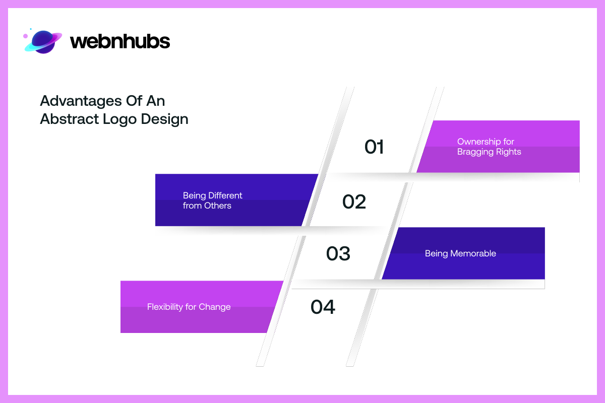
- Ownership for Bragging Rights
- Being Different from Others
- Being Memorable
- Flexibility for Change
- Best Practices for Designing An Abstract Logo
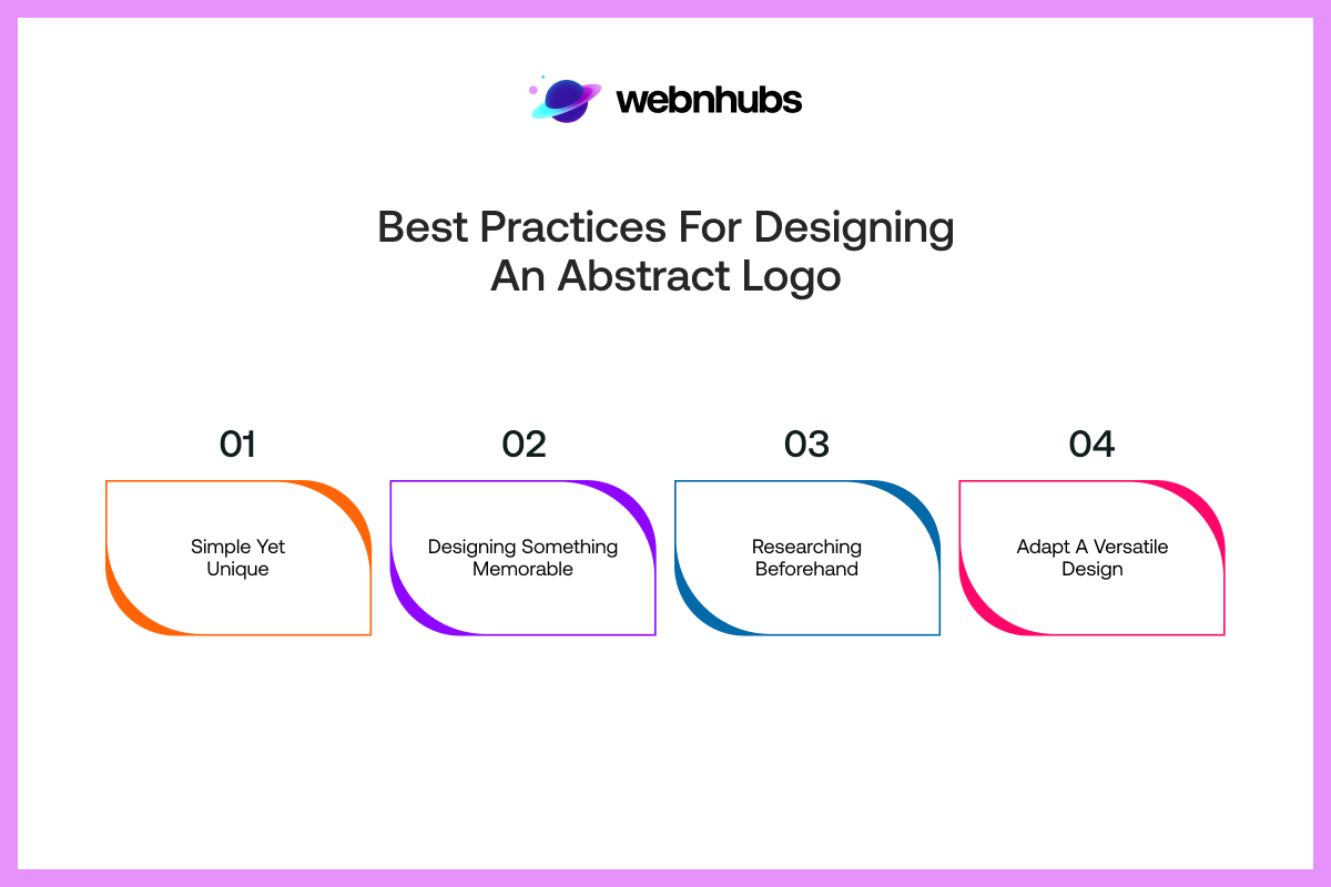
- Simple Yet Unique
- Designing Something Memorable
- Researching Beforehand
- Adapt A Versatile Design
- Things to Avoid When Designing an Abstract Logo
There are many forms of art designs, from Impressionism to surrealism, sculpture, to visual arts, and whatnot. However, not all types of art are used for paintings.
Some pieces of art, like abstract designs, are used for branding purposes, specifically brand logo designs. Abstract logo design evokes the same feelings and thoughts that their painting counterparts do.
And that is why brands use abstract designs mainly for their logos to get the same effect with their branding visuals.
This is a creative way to create a brand identity that is memorable and instantly recognizable. And in many ways, this form of art has now become the standard for going about creating brand logos.
So, what is a abstract logo, and more so, what are some of the famous companies that use abstract mark logos?
To find out all the answers, I will discuss all about abstract logo design as well as talk about the do’s and don’ts of designing an abstract logo.
So, without any further ado, let’s get right into it.
What is an Abstract Logo Design?
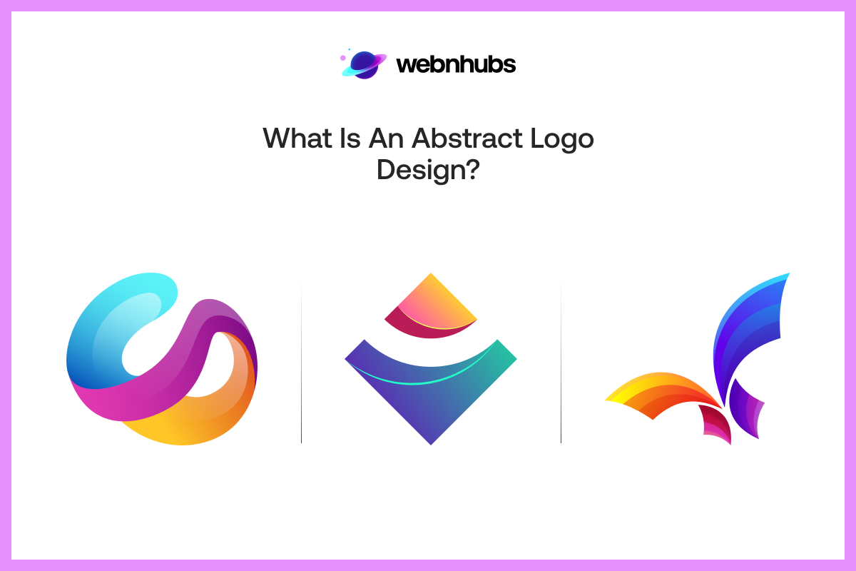
Before I go any further, let’s first address the elephant in the room. What is an abstract logo? For starters, abstract logo design, as the name suggests, is a logo that uses abstract designs.
Now, as for the abstract design itself, it is a style of art. This style uses various elements such as lines, as well as shapes, colors, and textures. The abstract logo design goes with the same approach.
It uses geometric shapes, lines, color palettes, and rhythm to represent a brand’s identity. This is a creative way that Graphic Designers use to create visual designs for a brand.
An abstract logo conveys ideas and evokes a feeling or concept associated with the brand through a visual shape instead.
An abstract logo does not show a recognizable object or mere images like conventional logos do. Instead, it draws viewers with just a simple design that happens to use shapes and colors.
What Does Abstract Logo Do in Branding?
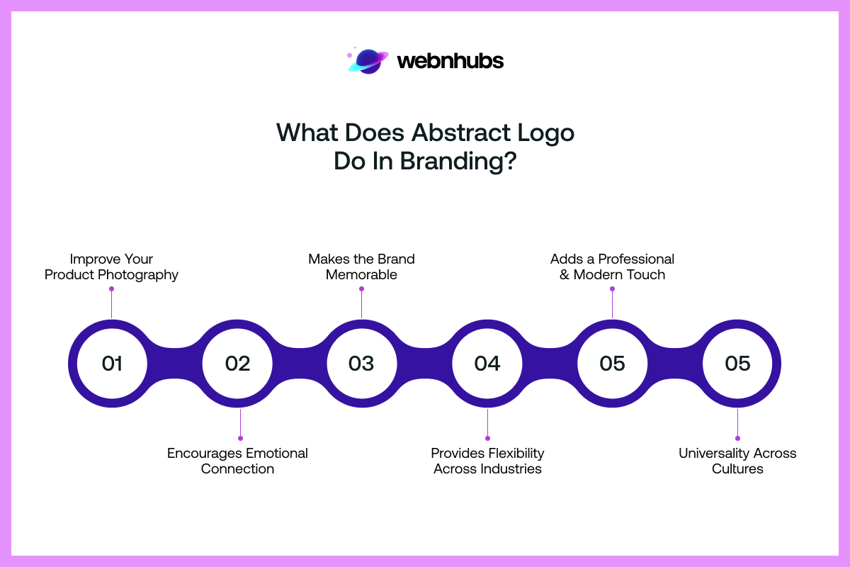
Now that I have discussed the abstract logo marks definition, let’s look at what they do. Well, abstract logos do a lot more for a company, both from a business and branding perspective.
Unlike wordmarks and descriptive logos that just spell brand names, abstract logos play an all-rounder in terms of branding.
The reason and meaning behind abstract marks is that these logos create and convey a feeling in the audience. It creates a feeling without informing people about your line of work to an extent.
The idea of an abstract logo is to convey a concept that is associated with your brand. And it must do so all while being flexible.
That means the logo can adapt to the change in your business offerings as you start venturing into new markets.
These logos can evolve with your company. More so, these logos are about representing a brand’s identity and vision while being subtle.
And that is one of the reasons why many companies are using an abstract logo mark these days.
These abstract company logos are then eventually used across all their channels, including their Stationery Design.
Key Components of an Abstract Logo Design
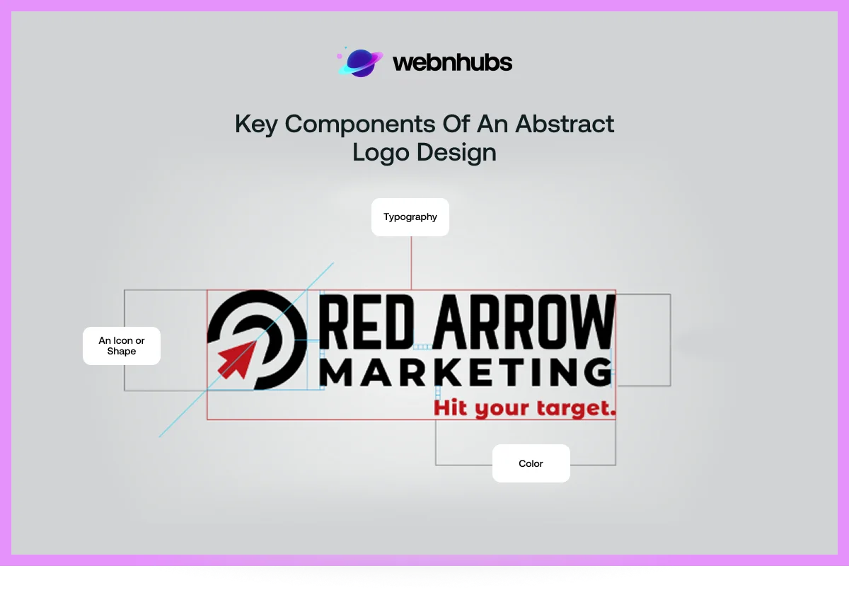
There are three main components of abstract logo designs. These are as follows:
- An Icon or Shape: An abstract art logo uses a geometric shape or an icon to convey a feeling or concept associated with a brand. This logo might be a subtle shape or a line, something that is easy to identify. One of the perfect abstract mark logo examples of a shape abstract logo would be the Nike Swoosh or the What Would You Do logo of the TV show of the same name.
- Color: The other component of an abstract mark logo is its color. Brands use the concept of color psychology and choose colors for their logos accordingly. A logo can convey a whole lot of feelings with just its color. And it does that without having to directly tell customers what a brand’s nature of work is.
- Typography: While not compulsory, the third component of a logo abstract is typography. Even though wordmarks are different types of logos, many abstract logos combine wordmarks to make their brand easy to identify. This is done by startups that are just getting their foot in the door. And as those firms grow with time and become popular, they remove the wordmark and stick just with the logo.
Advantages of an Abstract Logo Design
There are a handful of reasons why brands use abstract logos. And most of these reasons have to do with the benefits that these logos bring to the table.
More so, these benefits are why many firms from the Fortune 500 use these logos. As per Exploding Topics’ Report, “More than 61% of Fortune 500 firms use abstract logos that contain a wordmark and an icon.”
So, let’s take a look at what these advantages are that every other firm seems to be using an abstract logo design:
Ownership for Bragging Rights
When a brand grows and becomes a multinational business chain, it almost becomes a part of pop culture.
This popularity is not only associated with the brand but also with its logos. Your logo becomes a trademark.
And you can only imagine the number of businesses lining up to pay for your logo just so they can use your brand logo as theirs.
But this is where you have the bragging rights.. And that, my friend, is something no one can take away from you.
And if they do so without your permission, then you can always use that trademark infringement lawsuit card and take legal action against them.
Being Different from Others
Every form of art means something. Abstract art is just like Doodles in many ways. These logos have their own meanings, just like doodles have Doodle Meanings.
And just like doodles, they are a unique type of art as well. Therefore, using abstract logo design is a great way to convey emotions while being different from others.
Being Memorable
You can instantly tell what the brand is just by looking at its logo, if it is a popular one. Take logos of Nike, Toyota, or PlayStation, for example.
You can tell which brand sells mobile devices and gadgets, which one sells cars, and which one sells gaming consoles.
The reason for this, you might ask? Well, these logos are pretty recognizable. And it is because people remember them.
And just as a brand becomes popular and memorable, its logo inherits the same traits.
Therefore, being memorable is a pretty good reason to go with an abstract logo design.
Want Your Logo to Stand Out From Others?
Our Design Experts Craft Abstract Logos that Capture Attention
Flexibility for Change
Abstract logos are the best type of logos if you have high ambitions for your brand. What I mean by that is that if you’re looking to change your business offerings in the future or explore new market sectors, then you will need to change your brand identity for that.
And for that, abstract logos are easy to change and can adapt to your brand transformation.
Best Practices for Designing An Abstract Logo
Now is the time for the dos and don’ts of designing an abstract logo. First, let’s start with the best practices, which are as follows:
Simple Yet Unique
While being a form of art, an abstract logo should be simple. This means that when designing one, you must not go overboard with its design. You must keep its style, tone, and mood simple.
However, simplicity does not mean refraining from representing your unique brand idea or giving customers food for thought. You can do both by keeping simplicity at the heart of your logo’s design.
Designing Something Memorable
A logo should always be something that’s worth remembering. A memorable logo sticks in people’s minds, right after they lay their eyes on it for the first time.
And if people remember it, they can instantly recognize it when they see it again. This not only makes your logo memorable but also your brand.
So, a logo should always represent a multitude of ideas that connect them to your brand and make it memorable.
Researching Beforehand
A logo should be a reflection of a brand. It must represent the brand’s ideas and convey emotions and feelings tied to the said brand.
Therefore, when designing a logo, it is a must to understand the notion of your business and incorporate it into the logo.
You must research color psychology and which shapes convey the message that you want to convey with your logo.
This bit will allow your logo to convey the message as you intended. More so, it will ensure your logo is perceived clearly by your customers.
Adapt A Versatile Design
One thing you must get right is that you must make sure your logo is adaptable. That means you cover its overall feature and make it adaptable for various media platforms.
You must make your logo’s voice suitable to go with different themes.
Things to Avoid When Designing an Abstract Logo
Now, let’s look at the don’ts of designing an abstract logo. So, the following are the things you should avoid in your logo:
Going Overboard With Design
One thing you cannot do with your logo is go overboard with design. That means you must not overload your logo with design bits.
You must avoid overdetailing it with too many symbols or long typography. The purpose of an abstract logo is to showcase boldness of thought and brand identity.
So, to avoid design clutter, you must stick to the bare minimum and let its creativity shine and take center stage. Another way you can avoid design suffocation is by using White Space.
Copycatting Other Brands
Remember the trademark infringement lawsuit I talked about earlier? Yeah, you don’t want to be on the receiving end of that by copying someone else’s logo.
Sure, some brands might have logos that you would love to use for your brand. But you cannot copy other brand logos, never ever.
What you can do instead is use the same idea behind symbols and color psychology to create a logo that looks totally different from theirs.
Being Too Simple
Avoiding design suffocation doesn’t mean you make your design too simple. You have to maintain a balance between going overboard with design and being too simple.
To avoid oversimplicity, make sure your logo does not look too void and lacks the life and energy of a good design.
When you remove extra bits to aim for simplicity, make sure you do not remove too much so that it looks like a letter with just one shape.
Choosing Wrong Colors
A logo’s colors have a big effect on the message it conveys. For instance, the green color represents eco-friendliness, whereas the red color conveys strength and power.
That is why you cannot go wrong with the colors of your logo. You must choose the colors that reflect the nature of your business and convey the message you want your brand to convey to its audience.
5 Famous Abstract Logo Design Examples
Now let’s look at some of the famous abstract logos of well-known brands. These abstract logo examples can serve as inspiration.
You can get abstract logo ideas by looking at these logos, and you can take notes to create your own logo.
Therefore, the 5 abstract logos examples are as follows:
1. PlayStation
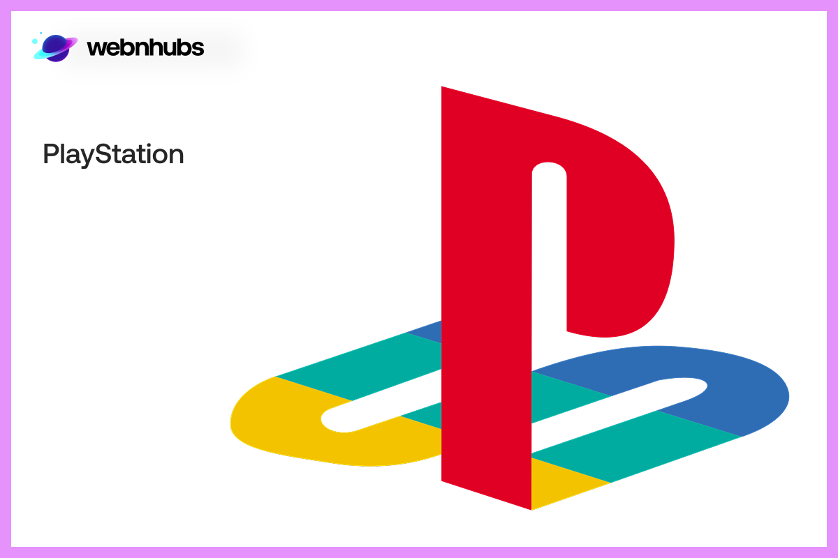
The first famous abstract logo I will start with is PlayStation’s logo. If you are a gamer like I am, then you will know that PlayStation’s logo means much more than being a brand mark.
It is an epitome of gaming and everything related to the discipline. The logo itself features two letters in the form of typeface.
The typeface contains a letter “P” overlying on top of an “S” lying flat. At first glance, the design looks like a bunch of curved lines.
But when you look deep, you notice the creativity behind the logo, and that is how the logo becomes memorable to you and millions of people worldwide.
More so, the logo features colors that are used in the controllers of PlayStation consoles. This is how PlayStation associates its brand identity with its logo.
2. Mercedes Benz

A car logo that you can recognize as soon as you lay your eyes on it is that of Mercedes Benz’s. The 3 pointed stars are just as iconic as the automotive brand itself.
And if you are a petrolhead, then you know what I’m talking about. The logo also features a wordmark.
As for the three pointed stars in a circle, each point stands for something. In no order, the stars represent land, sea, and air. This is the message that the brand wants to convey with its logo,
3. Microsoft
Microsoft’s abstract logo design is a perfect example of using shapes and colors to a great effect.
Whenever you see these four squares in four different colors, you know it is the logo of a tech giant known as Microsoft.
These squares are put together in a way that it looks like a window in an old home. More so, the different colors of the square cover different aspects of the brand.
4. Nike
Nike’s logo is one of the simplest logos you can come across. But at the same time, its logo is also one of the most famous.
That is because it uses just one shape, that of a checkmark with a wordmark. However, the Nike Swoosh is in many ways more iconic than the shape itself.
And Nike has used it so brilliantly that you can use just the shape itself without the wordmark, and people would recognize the logo. It is safe to say Nike’s logo is one of the best examples of an abstract logo.
Looking for a Logo that Speaks Volumes About Your Brand?
Webnhubs Designs Abstract Logos That Inspire Trust and Recognition.
5. Adidas
Last but not least is Adidas. Adidas does just what Nike does by using a shape with a wordmark. However, Adidas uses three lines in different sizes.
These three lines almost look like a mountain and have become a trademark for all sporting goods from the brand.
However, Adidas first started off with a completely different logo and has redesigned its logo nine times now. It does, however, still use some of its old logos in its new products.
Get Started With Webnhubs to Create Your Abstract Logo Design

It is pretty much clear now that abstract logos are the way to go for your brand. But designing it is not as easy as it seems.
And this is where Webnhubs comes in, a professional Logo Designing agency. They are an abstract logo maker who are masters in their craft.
Webnhubs has a team of skilled and creative designers who can abstract a logo just the way you envisioned it for your brand.
Creating a logo is not as simple as using an abstract logo generator. Instead, they use their creativity and skills to design it according to your brand.
They create logos for your brand and can create a logo of abstract for website design as well.
More so, they make sure that the logo conveys the message with shapes and colors that you want it to convey.
Whether you want a simple “Do You logo” or an abstract website design logo, we have got you covered.
Summing It Up
That is for this blog on abstract logo design folks. We’ve covered pretty much everything in this blog, from abstract logo definition to examples and dos and don’ts of designing one. We hope that the pointers we shared in this blog can help you create the right logo for your brand. As you know, the logo is much more than the visual itself.
It is about the message they convey and the feelings they evoke that make them memorable. And if you want to create such a logo for your brand and need help doing so, then you can count on Webnhubs for the job. They are a professional logo design agency that is an expert in the field of designing logos. So, partner with Webnhubs and create the logo that makes your brand memorable.
Frequently Asked Questions
The abstract logo utilizes shapes, forms or patterns rather than literal imagery. It embodies the spirit of a brand symbolically and visually.
It is flexible, distinctive and memorable. Abstract logos assists brands to be unique and up to date across cultures or industries.
Pay attention to the psychology of colors, harmony of elements, and the meaning. Each form must be consistent with the personality and message of your brand.
Please, make it simple, scalable, and versatile. Don’t make it too complex and don’t use a lot of color that would blur the brand.
Yes – such logos as the swoosh by Nike or the globe by Pepsi are iconic examples. Both communicate without the use of literal images.
