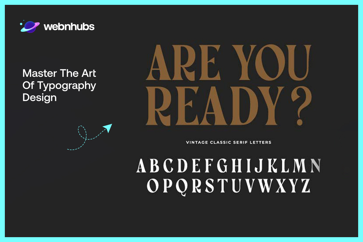
Potential customers often leave a website in under three seconds without knowing exactly why. Bad typography design is usually the reason, even when nothing looks technically broken, the content loads fine, and the product images look fine.
They leave anyway, because somewhere on that page, the letters themselves are working against them, crowded together, mismatched, and straining to be read. Their brain decides to leave before conscious thought even catches up.
That is typography design working against a business. Done well, nobody would have noticed it was there at all. Typography design is never just about selecting fonts. It carries messages, stirs feelings, and leads a reader through text without them ever feeling led.
This blog talks about what actually makes typography work. Furthermore, how to choose and pair fonts with intent, and where typography carries real weight in web design, branding, and everyday graphic work.
Typography Design: A Brief History
Typography design has evolved right from manuscripts to typographic writings. It has come a very long way from Gutenberg’s invention of the printing press. Since then, the field of typography has developed from the painstakingly handwritten lettering of early books to modern types.
Earlier typography was restricted to hardly a dozen or more fonts, but today there are thousands of fonts to use. Now, designers can use several fonts and tools to create typography that is both functional and aesthetic. It is one of the most significant tools in effective graphic design, branding, advertising, internet design, etc.
Typography is more than just choosing or designing a font from scratch; it is about letting fonts function. It can deliver information, influence perception, and enhance user experience. With the increased relevance of graphic design in the market, typography has made its position due to the number of typefaces.
Core Principles of Typography Design
Legibility and Readability
People mix these two up constantly. Legibility is about the letters themselves. Can you tell an “e” from a “c” at a glance, without squinting?
Readability is a different question entirely: does a full paragraph actually flow, or does the eye get stuck? A font can ace one and completely fail the other. Plenty of cool fonts are legible letter by letter and still feel miserable to read in bulk.
An estimated 15 to 20% of the global population lives with dyslexia or other reading difficulties (Haze, 2026). So, this isn’t just an aesthetic preference. For a fifth of your audience, bad legibility is a real barrier, not a minor annoyance.
Hierarchy
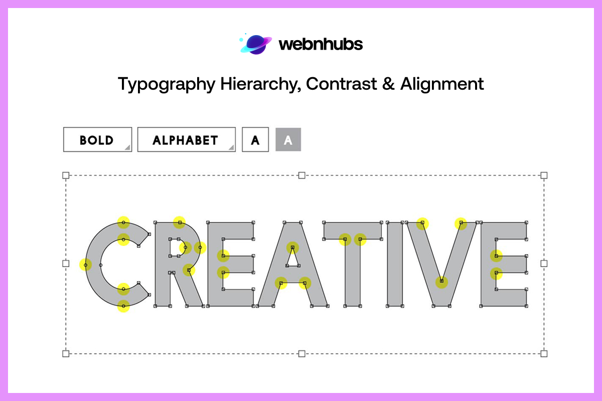
Some things on a page need to be seen first. That’s hierarchy, plain and simple: big bold headline, then subheading, then body text, then whatever’s least urgent. Skip this and everything competes for attention at once. Most web visitors skim anyway, so hierarchy is often doing more work than the actual writing.
Contrast
Two nearly identical typefaces sitting next to each other just look like a mistake. Push size, weight, or color apart on purpose instead. That’s contrast, and it’s what gives the eye somewhere obvious to land.
Consistency
Same fonts, same spacing, same style, page after page. Do this and a site feels put together. Skip it and even good individual pages start to feel like they don’t belong to the same brand.
Alignment
Left, right, centered, or justified, the specific choice rarely matters much on its own. What actually breaks a layout is switching between them mid-document for no real reason.
Spacing and Kerning
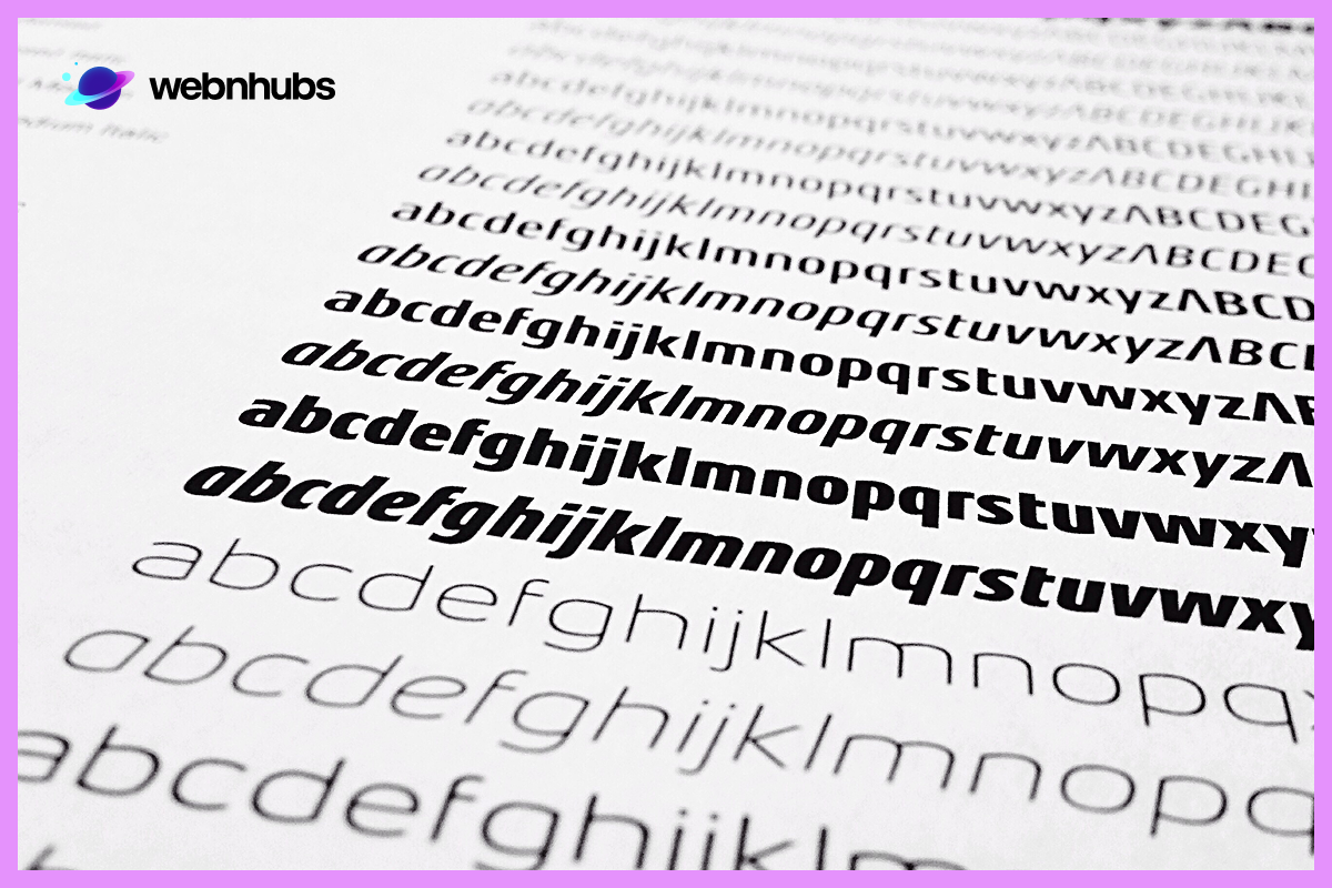
Kerning between letters, tracking between words, and leading between text lines all determine the general look of a piece of typography.
Spacing is also an important aspect of a layout’s overall appearance, since poor kerning or line spacing can make even the best-designed fonts appear cluttered and hard to read.
Color
Color does two jobs at once. It affects contrast, which is a legibility issue, and it sets a mood, which is closer to branding. A muted, dark palette tends to read as serious or premium, while brighter colors feel more energetic and casual.
White Space
Empty space isn’t wasted space. Room around and between lines of text gives a design somewhere to breathe, which makes it easier to scan. Text packed in edge to edge tends to feel overwhelming, no matter how good the font itself is.
Line Length
Lines that run too long force the eye to hunt for where the next one starts. Lines that are too short chop reading into constant small jumps instead. Somewhere in the 50 to 75 character range tends to sit right in between.
Need Readable, On-Brand Typography?
Create typography that matches your brand and keeps your content easy to read.
Choosing Fonts in Typography Design
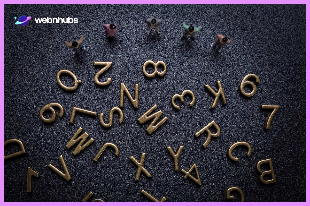
Font selection sounds straightforward until you’re actually facing down a list of thousands, classic serifs, modern sans-serifs, decorative styles, all competing for the same slot in a project. So how do you actually pick one?
Context Matters
A font must be congruent with a message, not just as an isolated entity. Serif fonts are more suited to formal settings and can often sound more authoritative, while sans-serif fonts can appear more modern and would be more suitable for minimalist web designs.
Function Over Form
Never choose a font purely for its look, however glamorous or exciting it seems. The primary focus should be utility. If content is going to run in article format, legibility should always take priority over aesthetics.
Font Pairing
Two fonts working well together can add real depth to a design, whether it’s a poster, a website, or anything mixing multiple typefaces. The trick is enough contrast to create interest without the pairing feeling disconnected. A bold, distinctive header font next to a simpler body font is a combination that tends to just work.
Consider the Brand
In the case of branding and custom logo design, typography should embody the personality of the brand. It can be rounded or simple sans-serif, but it should go with the overall brand message.
Typography In Web Design
Typography design is truly an essential element of web design. In 2006, designer Oliver Reichenstein famously said that web design is 95% typography, meaning that most of the information on the web is in writing (Reichenstein, 2026).
This is a number that is meant to be a provocation rather than an accurate count, but it is quite apparent how integral text is to any digital experience.
Web typography differs from print design in one key way. Print typography behaves predictably once it is set, while web typography must perform well across different screen sizes, devices, and browsers.
This makes designing for interfaces, especially on mobile devices, a balancing act between beauty and functionality, one of the reasons this is a core part of our web design services at Webnhubs.
Here are some important considerations for web typography:
Responsive Typography
When it comes to web design, typography should be responsive. A laptop may be used to view the same page, followed five minutes later by a phone, and typography must remain unchanged and usable on both the laptop and the phone.
A useful approach to this is to use em text size or rem size instead of pixels. That way, text won’t display at the same size for everyone, even when users zoom in or resize their browser window or change their own settings.
Readability on Screens
Reading on a screen differs from traditional reading. But in web design, readability is a serious concern. Humans don’t read a web page from left to right, as they do in print.
To make the reading easier, it is advisable to use readable fonts, adjust the line spacing, and keep the background and the text in strong contrast.
Font Load Time
The font load time is another aspect that web designers should take into account. Although designers can select unusual or more decorative fonts, they must take into account their impact on load time.
This is all more important on mobile. As for the average page load time, it’s approximately 8.6 seconds on mobile devices versus 2.5 seconds on desktop devices, and almost half of users predict that a web page should load in two seconds or less (Alexandrea, 2026).
Unique, custom fonts can be a huge help in a company’s branding, just as they can make a site load much slower. Nothing is worse than having an entire page load and fonts appearing wrong.
If you encounter this problem, two good sources of free web fonts, including Google Fonts and Adobe Fonts, can help improve the performance of a site.
Struggling to Balance Speed and Great Typography?
Get web typography that loads quickly while maintaining a polished, professional look.
Marketable Font Types Used in Graphics
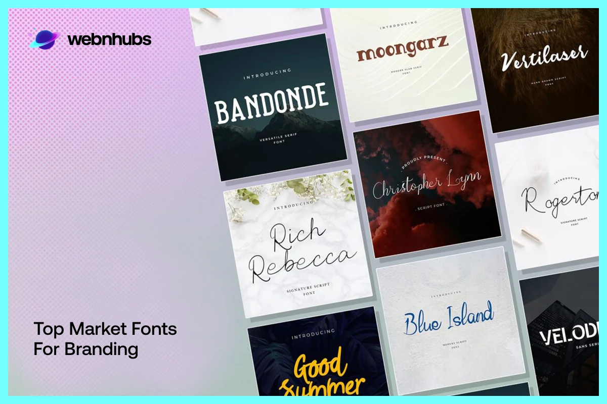
There are a handful of fonts that have been used across decades in graphic design, and one has to wonder why. Basically, it comes down to versatility. There are fonts that stay legible and updated at almost any size.
Helvetica
Helvetica is often treated as the default font, and it’s easy to see why. It has no unnecessary flourishes, just clean lines and balanced spacing.
That plainness is actually the point because Helvetica doesn’t draw attention to itself; it lets a logo or headline take center stage instead of competing with it.
Garamond
Centuries old and still not dated. It’s a constant favorite among publishers. There’s something about how it sits on a page that it never feels hurried, but only considered, and that quality matters more in print than most people realize.
Futura
Circles, triangles, straight lines, Futura is nothing more, after all, than letters dressed up in geometry. Bauhaus designers adored it for exactly that reason, and that’s why brands who are looking for a modern or sensible look still reach for it today.
Baskerville
Thick strokes set deliberately against thin ones. That contrast gives Baskerville a gravity most fonts don’t have, which is probably why it turns up in documents that need to feel serious without stating it outright.
Bodoni
Take Baskerville’s contrast and push it to theatrical extremes. It’s a favorite of fashion magazines. A headline set in Bodoni doesn’t whisper.
Use of Typography in Custom Logo Design
Typography design is an important part of developing custom logos. As one of the earliest forms of branding, the logo is heavily influenced by typography.
Our logo and branding design work often starts with exactly this question, what should the type say about the brand before anyone reads a word of copy? Here’s how typography influences custom logo design:
The Power of Simplicity
It is worthy of note that some of the most recognizable logos in the world are developed based on simple text. Nike, Google, and Coca-Cola don’t require complicated images to convey their brand message as they employ typography.
A good font design with a minimalistic font style is more memorable and can achieve greater recognition of the brand in any means of communication.
Custom Typography for Branding
Most companies spend a lot of money on creating unique fonts for a logo. Small fonts add the element of branding, and it is easy to pitch a custom font against a competitor in a crowded market.
This not only aids in leaving a memorable brand image behind with the intended audience but also assists in being consistent with all promotional items.
Typography as a Logo
Sometimes, even the font of the text is used as the identity emblem. Some companies, for instance, VTU brands, rely only on typography to convey their brand images.
In such designs, aspects including the font used, the kerning, and the spacing help determine the sturdiness and distinctiveness of the logo.
Typography Principles in Graphic Design
Typography is one of the greatest assets that designers can use in effective Graphic Design. It can establish a background for a design, draw a reader’s eye to specific information, and reinforce the message of a design.
For example, a resume has a few seconds to grab someone’s attention and prompt them to read the rest. That usually isn’t the experience on the webpage; it’s the font that makes it easy for readers to process content.
The same goes for brand, editorial, and advertising; bad typography can sink even a good message.
Let’s look at why typography is so important:
Visual Hierarchy
Size, weight, and color tell a reader’s eye where to go first. In a slide deck especially, that order can be the whole difference between a point landing and getting lost two bullets down.
Mood and Tone
Fonts carry emotion whether anyone means for them to or not. A cursive script feels playful. A blocky sans-serif feels serious and controlled. Neither is right or wrong; the mistake is choosing one that fights against what the brand is actually trying to say.
Consistency Across Platforms
None of it holds up without consistency, though. The same type on a website, a brochure, and an ad is what makes a brand instantly recognizable instead of something a customer has to double-check.
Conclusion
Typography isn’t really about arranging letters. It’s about getting an idea across, and getting a feeling across alongside it.
Whatever you’re building, a website, a logo, anything with words on it, give the text a voice of its own instead of treating it as filler.
Good design balances form and function, always. Experiment with weight, style, and pairing, but keep the actual audience in mind while you do it.
The best typography rarely announces itself. It just makes reading feel easy and lets the message do the rest.
Ready to Keep Your Typography Up to Date?
Stay current with evolving font trends and create designs that keep your brand looking fresh.
Let Webnhubs Perfect Your Typography Design
Typography design shapes more than appearance. It builds trust, sharpens focus, and keeps a brand consistent across every web page, logo, and marketing piece a customer encounters.
If your typography feels inconsistent or hard to read, that’s worth fixing now, before it costs you engagement.
Webnhubs can help create typography that fits your brand and works across every platform. Contact us today to discuss your next project.
Frequently Asked Questions
Typography is the skill of arranging letters, fonts, and characters in a way that is both attractive and functional. Consistent typography plays a key role in building a strong brand identity, which makes it one of the most important elements of graphic design.
Start by considering your brand and product, and decide on the tone you want to convey: professional, creative, fun, simple, or modern.
Having a clear goal makes font selection much easier. For instance, serif fonts tend to convey professionalism, sans-serif fonts create a more modern look, and script fonts work well for a creative feel.
Legibility refers to how easily individual letters and characters can be distinguished from one another, which depends on the font’s design.
Readability refers to how easily a full block of text can be read, which depends more on factors like spacing, line length, and contrast. A font can be highly legible on its own but still hard to read if it is poorly spaced or sized.
Typography plays a key role in keeping users engaged with a web page by ensuring that text remains legible and readable at every screen size. Well-executed web typography also supports usability and gives a design a more professional, polished feel.
Limit a project to two or three typefaces, keep spacing consistent throughout, and ensure strong contrast between text and background. Together, these practices keep a message clear and easy to follow.

Hafsa Hanif is a talented content writer at WebnHubs, specializing in topics such as graphic design, web design and development, logo design, and animation. With her deep understanding of design principles and creative processes, Hafsa crafts engaging, informative, and SEO-optimized content that resonates with readers. Her expertise in SEO ensures that her articles not only captivate audiences but also rank well on search engines, helping businesses boost their online presence through compelling design-focused narratives.
