
Web designing is a field that is wide open and creative minds use different approaches to designing websites.
Whether it is going for minimalism, using flat design, applying material design, or using contrast to a good effect for that matter, the opportunities for creativity are endless.
Yet out of all the methods and practices in web design, none stands more true and vital than white spaces. White space, as the name would have you believe, isn’t actually white.
So, don’t let it fool you! Instead, it is an empty area within a web design that is free from text, images, or any other design element.
Using these spaces right will help you create minimalism and strike a perfect balance in your design.
This, in turn, improves the overall user experience. So, how do you use white space in the right way? More so, why should you use it in the first place?
To find out all the answers, we will discuss everything about white space in design in this blog.
So, without any further ado, let’s get right into it.
What is White Space?
White Space, also known as “negative space” is one of the 13 basic web and effective graphic designing principles.
It refers to the empty and blank spaces around all the other elements. These elements are text and images within a web design.
Any area of a design that is not taken up by an element is considered a white space. As opposed to what the name suggests, white spaces are not always white.
This space can take any color as it’s the background of a design. But it can only do that when it’s free of the elements that a user sees on a web page. These are images, graphic illustrations, text, and shapes.
In theory, this empty space is a lot like the air that we breathe. Just like the air, white space is invisible to the naked eye.
But despite that, both are still there and always present. White spaces are used in every kind of design. This includes web design, graphic images, book pages, food packaging labels, or any other design for that matter.
This design is always ever so present that in most cases it goes unnoticed. However, when used right, the white space can bring a design to life.
In such cases, the white space can almost become so dominant to the point that it becomes hard not to notice it.
What is White Space Used For?
The main purpose of a white space is to separate elements from each other. This way, users can focus on each design element.
But, at the same time, white space can add symbolic meaning to a design if you use it to aim for minimalism.
White spaces are used to allot spaces and create layouts for images and illustrations. So, all in all, it helps balance the page’s design and organize content blocks and visual elements.
All of this improves the visual experience for the user and makes the web design look good.
Origin of the Term “White Space”
It’s not clear who exactly came up with the term “white space.” Having said that, there are a few parties that can be attributed to coining the term “White Space.”
These are Chinese artists and calligraphers of the 20th century. Many believe they are responsible for bringing this term into fashion.
The reason was that they didn’t want to waste the empty spaces on the white rice paper they worked on.
More so, it became their practice to work on a white canvas and use white, and empty spaces. They referred to it as designing the white.
The artists believed that these empty spaces added a sense of understanding to the entire picture. They thought it conveyed information through a lack of imagery.
The emptiness opened room for imagination and interpretation. Ever since then, these white spaces have become a standard for print design.
More so, as years went on, people started using white spaces more and more to aim for minimalism in design. Hence, white space became part of the modern web design trends.
Types of White Spaces
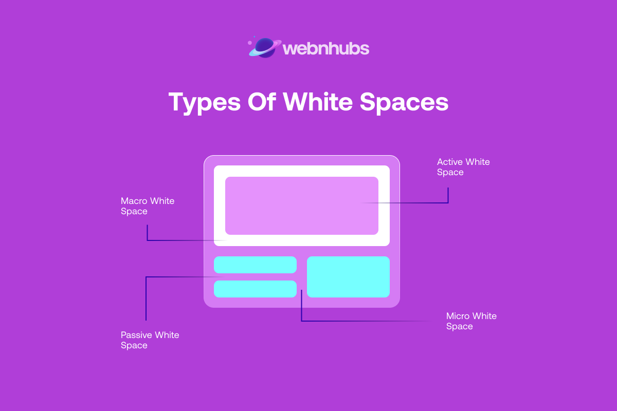
Generally speaking, there are two main types of white space in design that define space based on size. However, if you dive deeper then you get two more types of white spaces used intentionally or occurring naturally.
Therefore, these four types of white spaces are as follows:
1. Micro White Space
As the name suggests, micro whitespace refers to small gaps and empty spaces between elements.
Micro whitespace is a vital part of design. It improves the legibility and readability of content.
More so, it makes sure the visual elements like images in a grid or a pattern are clear. It saves them from looking cluttered.
Micro white spaces come in handy for these visual elements. That is because when designing a photo gallery for the website, micro white spaces separate the images.
This way, all images are displayed separately. They do not look like one giant, single image, which most likely will confuse the viewers.
As for the elements, micro white space is found between the following elements:
- Letters
- Words
- Lines of text
- Paragraphs
- Navigation links
- Content in a grid
- Images
- Form fields
- List items
- Spaces between options in a menu
2. Macro White Space
On the other hand, there is a macro whitespace. It refers to larger gaps and areas of empty space in a web design.
Macro white space is found mostly around and between major layout elements. These include the spaces between content blocks and the margins of a website.
This space acts as the backdrop for just about every element, be it content blocks, images, or other designs on the web.
As we know, website layout is key to an intuitive interface that is easy to navigate. That is why the macro white space in design helps facilitate that.
Its main purpose is to make the website layout easy, clear, and easy to understand.
As for the elements between which macro white spaces are found, they include:
- In the margins of a website
- Spaces between content blocks and sidebar
- Space between the logo and the menu in the header
- Between sections on a page
- In hero images
- Space around images
- Space around CTA buttons
3. Active White Space
The other way in which the white space in web design can be categorized as is when white spaces are used intentionally or if they occur naturally.
In the case of the former, the spaces that are added intentionally to separate or highlight elements are called active white spaces.
These empty areas are used deliberately to enhance the structure of a page. This way, it becomes easier for the user to navigate the site.
More so, active white space helps in the flow of the web traffic. With active white spaces, the goal is all about guiding the user through the process or page’s content order until they set their eyes on the content that matters.
If used right, active white spaces can be a great contributor to higher conversions.
4. Passive White Space
Passive white spaces are those white spaces in web design and typography that are created naturally.
These gaps are found between words as well as around static objects like logos. As for their goal, passive white spaces work a bit differently from active white spaces.
The goal of adding passive white spaces is to enhance a layout’s aesthetics as opposed to guiding the user through a flow or content order like active white space does.
These empty areas are used for aesthetic purposes as well. For that, the size of these spaces can be controlled, whether a space is big or small.
However, passive white spaces will be there between elements regardless of whether someone places them or not.
Importance of White Space in Web Design
Let’s get down to the business end of things and talk about the thing you are here for in the first place; the importance of white space in design.
To understand white space’s importance, let’s discuss the reasons below why it is a must to have white space in your design arsenal:
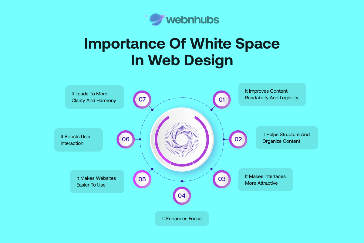
It Improves Content Readability and Legibility
The first and foremost reason for using white space in design is to improve eligibility and readability of content.
To put it simply, white space in design makes the content much easier to read and digest. It does that by separating blocks of content.
And it doesn’t matter what type of content it is, whether it’s a short bit of text, a lengthy and detailed blog post, or a description of a product for that matter, the content should be readable for comprehension.
Many website owners think that font size influences readability and helps draw attention to the content. While it is true, but only to some extent. However, white spaces play a much bigger role, mainly the gaps around letters, words, and paragraphs.
They are the Dark Knight and the underrated players that help make it easy to read the content. More so, these spaces bring attention to the content that matters.
White space in content removes all the distractions and makes the text easier on the eyes. This way, you will not overwhelm the reader with a barrage of information.
Instead, it breaks the content blocks into chunks that are easy to digest.
Otherwise, words that are too tightly crammed together in a content block, or are too widely spaced apart for that matter, can be hard to look at, let alone read.
It Helps Structure and Organize Content
Most websites have a lot of content and they keep adding quality content for content marketing purposes.
However, the quality of the content will be of no use if the content is not structured and organized properly.
That is why white space in design helps structure and organize content by breaking it into different pages as well as sections.
This works akin to a Content Management System, albeit the former is a system and the latter is just a white space in design. However, both can be used to organize content.
Adding a space around a content block puts emphasis on the importance of the content. More so, it helps it relate to the elements around it.
In a way, white space in design not only organizes content but organizes every element on the entire page. It does that by grouping or separating these elements.
All of this helps elements relate to one another better. As per proximity design principle, elements that are placed together are seen as a single unit instead of different parts.
When you apply the principle to white space in design, it makes it easier for viewers to process the information on the page in a more logical way.
More so, it helps viewers differentiate whether an element or a content block is a single unit or a separate element.
Need Web Design that Converts?
Let Our Experts Help You Implement White Space.
It Makes Interfaces More Attractive
A website’s first impression is its last impression. So, with no compromises, that impression needs to be spot-on and picture-perfect.
When a user visits your website for the very first time, they need to be met with a welcoming experience. The website must give them a sense of comfort.
You can achieve this feat only when your website nails the design bit. And it can do so when it uses white space in design perfectly to create the right contrast between content and space.
As for the ratio, it’s up to you to decide how much white space, or how less for that matter works for you.
Also, keep in mind that too much simplicity can lead to your website looking empty and your brand without value.
So, finding the right balance is key to nailing the white space in design. The right balance will make your website look attractive in the eyes of visitors.
It Enhances Focus
White space in design shifts focus away from the unnecessary things to the things that you want the visitor to see but only if used right.
It is always a bad idea to bombard visitors with too much content. That is because it can overwhelm them and make them not want to visit your website again.
Forget focus, you might start to struggle to land web traffic if you throw too much content at users that makes it hard for them to focus on the thing that matters.
So, if you want visitors to make the decisions you want them to make, you will need to give them space to focus on what they are looking at instead of diverting their attention all the time.
You can do this by adding white space in each area of your design. That is because it will give enough room for users to sit back, breathe, and make decisions in a relaxed way.
It Makes Websites Easier to Use
One of the most important website and graphic design principles is that the elements need to be positioned and spaced correctly to make the website easier to use.
A website that feels clunky, or is overloaded with design elements and is not easy to use is bad news.
So, white space in design makes a website easy to use by adapting to user psychology. A person always expects some form of space or empty area on a web page that indicates the separation of an element.
White space in design makes interfaces and user journeys easy to understand and follow. Whether it is the spaces around links, CTAs, images, or content blocks, users get confidence in clicking, and scrolling with precision,
It Boosts User Interaction
Visual hierarchy in web design is just as important as content hierarchy. When you place elements in the right order and with the right spacing between them, it makes it easy for the user to find the information they are looking for.
This way, when white space in design, mainly in the header navigation menus, buttons, and footer of a website, can make users easily find them and click on them.
All of this improves user interaction. Imagine a website that is overloaded with information. It will make it difficult for users to find the thing they are looking for.
If they can’t find it, they won’t click on it or take action, as simple as that. User interaction matters the most in Landing Pages that convert.
These pages have the right white space in the logo, navigation bars, content body, CTA buttons, and contact forms to let users interact with the website and take the action you want them to take.
How to Apply White Space in Your Web Designs

Now that we have discussed the importance of white space in design, let’s take a look at how you can apply them in your website designs by following the following tips and best practices.
Aim for Visual Hierarchy While Positioning Elements
Visually hierarchy is a must in web design and you can achieve it with white spaces. White spaces not only separate or group content and elements but they also arrange and position them in the right order.
Using white space in design can allow you to direct the user’s attention and shift it to the important parts of your page.
This way, you get users to focus on things that matter the most. You can establish a visual hierarchy by implementing the Z-layout strategy.
It means, users start from the top-left and move their eyes to the right corner before shifting their vision down to the center then to the bottom left side of the page, and then finally to the bottom right side.
Therefore, you can place elements in that order and place the main content in the center area while adding CTA buttons at the bottom end of the page.
Use the Right Formatting for Content
Content formatting is key not only from a design perspective but also for content marketing campaigns as part of Web Marketing Strategies.
That is why you will need to use the right spaces for line and paragraph spacing to make the content visually appealing and easy to read.
You will need to keep the paragraphs short, to improve presentation and group ideas together.
Also, you can increase the spaces between letters to make headlines and titles big so that they can grab attention easily.
As for the spacing between lines of text, we suggest you aim for 130-150% spacing of the size of your font.
Also, keep the spacing to 1.15 between paragraph lines to make sure the content is easy to read.
Sort Content and Objects Where It Makes Sense
Sorting elements out on a page is what white spaces do the best. So, if you want to implement white spaces, you will need to carry out a logical grouping, meaning you will need to categorize elements, images, and content sections where they make the most sense.
This goes hand in hand with the element’s order and organization. However, you will need to do it logically.
For instance, you will need to organize items such as product images and place them with the product names as opposed to putting images in one section and listing product names in a different section.
You will need to arrange and group elements that are related so that they make sense together.
Focus on Clean and Minimal Design
The best way to put white spaces into practice is by avoiding cluttering the design and overloading things up.
The less information a web page has, the more white space in design it has and the easier it is to navigate. Users prefer limited information that matters as opposed to unnecessary stuff that has no purpose or value at all.
Therefore, you will need to use minimum design elements to create a sleek, clean, and minimalist design that is free of all the clutter.
However, if the heavy content dominates your design, then you can use more white spaces to create a visual hierarchy and make content the center of attention:
Use Vibrant Colors While Applying White Space
Keep in mind that white space does not mean using only white color. The white space is an empty area between elements and it can be of any colour.
So, when you are designing a page, get creative with colors and add the ones that go with your brand guideline and image. More so, you can add patterns, texture, and even a background image to create a white space.
But it can only work if the colors or patterns stay behind the scenes and make the elements and content the center of your design.
Most website owners just prefer to use a white image in the background for the white space as it creates a good contrast with the different elements on the page and makes the design pop.
5 Best Examples of White Space in Web Design
We have covered almost everything about white space in design. However, we need to take a look at some of the best examples of white space in web design to truly understand how white spaces work.
More so, the following examples can serve as an inspiration for you to use white spaces in your design.
Pittsburgh Zoo & PPG Aquarium Logo
![]()
The website of Pittsburgh Zoo does a good job of placing the right white space over its logo. At first glance, it looks like a tree but when you get up close and look into it, you see a lion facing a gorilla.
That my dear friend is white space which this website uses perfectly to create a logo that is one of a kind. This is just one of many ways that you can use white space to make your website unique and memorable.
Apple Product Focus
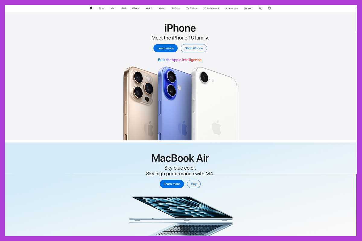
Of course, Apple, the leader in smartphone and tech, had to have a feature in this segment.
Apple needs no introduction as everyone knows about the brand and its logo is one of the most recognizable logos in the world.
However, its website lets its products sell themselves without adding a ton of information. This lack of information other than a copy and CTAs leaves empty areas.
These areas are white space in design and they leave the stage for the product to shine, draw the visitors’ focus, and sell itself. This is yet another example of using white space right in web design.
Twigs Paper
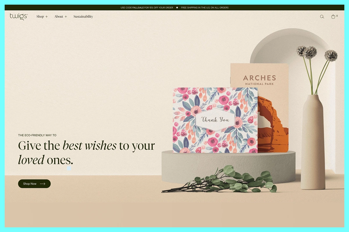
The eCommerce website of Twigs Paper uses white space in design to great effect and creates an online shopping experience that feels and looks welcoming.
More often than not, eCommerce websites seem to get carried away with designs. They often clutter them with endless products and price tags.
However, Twigs Paper does a great job of minimizing that thanks to whitespace used in text, images, and typography. All of this makes the entire website look balanced and easy to navigate.
Gsoft
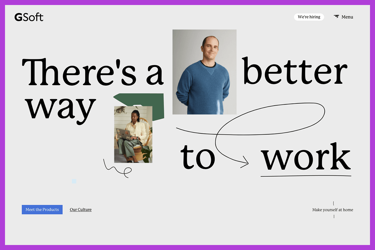
Just like Twigs Paper, Gsoft’s website is a marvel for aesthetic brilliance and is a textbook perfect example of how minimalist a website should look.
Gsoft achieves this feat with none other than white space in a design that separates elements beautifully and highlights important parts perfectly, whether they are large typography or floating images for that matter.
More so, we must hand it to their design team who not only used white space in the design to perfection but also used the softest colors to make the design look calm and easy on the eyes.
Ready to Design Your Website?
Discover How Our Experts Can Enhance Your Website.
The Sea We Breathe
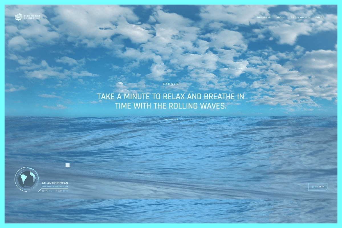
Last but not least is the Blue Marine Foundation’s website, The Sea We Breathe. The name of this might seem like a movie. To be fair from the visual perspective, it looks nothing less than a movie.
That is because this website uses white space in design perfectly and it does in a different way to other websites.
This means that this website uses full-size images that take over the entire screen and give the effect of a white space with a background image.
You might think, white spaces are not the focus, but the elements are, right? Correct, but the white space in this instance is the effect that the full-screen images create and the image itself is the website’s center of attention. Creative, right?
As for the elements, the website uses minimal text and with heading at the front and center, which makes the website look stunning and easy to use,
Why Choose Webnhubs to Design Websites With White Space?
When it comes to using white space in design, Webnhubs is the master of it. Our Web Design Agency understands the basic and effective graphic designing principles to design websites that look stunning.
And at the heart of these principles, lies the use of white space in design, which we have perfected to create a website that looks sleek, minimal, and visually appealing.
So, if you want to create and design a website that sells products online or offers services using white spaces, we can help you design one using your color theory and brand image.
You can partner with Webnhubs and watch us make your website achieve design and aesthetic brilliance.
Final Thoughts
That is white space in web design in all its glory and that’s all we have to talk about in this blog. We hope you can understand what is white space as well as the importance of using white space in design by reading this blog.
More so, we have listed some key tips and practices as well as examples that you can follow to use white space in your design as well. However, if you need help from experts, you can partner with Webhnhubs for your web design project. We will make your website look stunning using white spaces.
Frequently Asked Questions
White space boots the site’s readability, draws attention to key elements and creates a balanced, aesthetically pleasing design. Content gets ample breathing space as it subtly navigates users organically through the layout with gentle guidance pretty effortlessly.
White space enhances user experience significantly amidst cluttered interfaces. It remarkably reduces clutter and boosts comprehension of content significantly while improving focus. White spaces lend sites a sleek appearance making them easy to navigate and visually pleasing almost every single time.
White space and negative space essentially refer to the same thing in design contexts. Both describe empty areas between design elements intentionally left blank enhancing layout and readability with a dash of visual equilibrium.
Analyze areas feeling crowded or really tough to decipher carefully from the start. Inspect margins and padding around text images and other elements carefully between various graphical components and surrounding whitespace very precisely. The layout that feels overwhelming or inconsistent likely needs more white space for clarity and flow.

Sultan Hanif is a seasoned wordsmith, who brings technology trends and innovations to life through his words. A tech-savvy gamer with a passion for all things football, Sultan blends his technical knowledge with creative storytelling to empower businesses and individuals alike.
