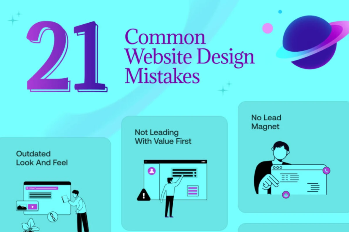
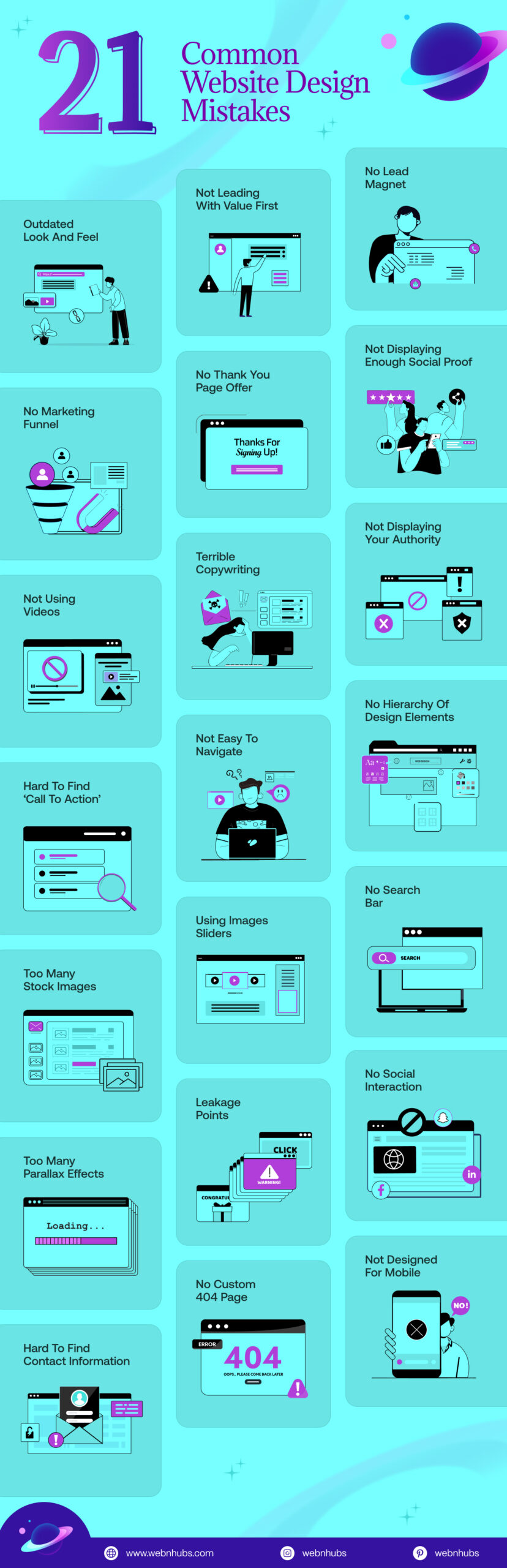
- 21 Common Web Design Mistakes To Avoid
- 1. Slow Loading Speed
- 2. Non-Responsive Web Design
- 3. Not Optimized for Mobile
- 4. Lack of Search Bar
- 5. Not Enough White Space
- 6. Using Many Stock Images
- 7. Not Using Videos
- 8. Not Easy to Navigate
- 9. An Undefined Target Audience
- 10. Too Much Text
- 11. Text That Can’t Be Scanned
- 12. Bad Copywriting
- 13. Unclear Messaging
- 14. Fixed Font Sizes
- 15. Generic Calls-To-Action (CTAs)
- 16. Lack of Marketing Funnel
- 17. Outdated Look and Feel
- 18. Cluttered Interface
- 19. Templated 404 Page Design
- 20. Unchanged Color of Visited Links
- 21. Elements That Look Like an Advertisement
- Tips to Make Accessible Website Design
A bad web design makes a website as good as dead, both figuratively and literally. While other elements do play their fair share of roles in making a website stale, none plays a bigger role in a website’s failure than its design.
In essence, a website’s design can make or break a website. After all, what good is a website, if its design is clunky and the visitor cannot navigate it properly in the first place?
Such a website will most likely never see that user come back. But how do you avoid making a website design look and feel bad?
Well, the golden rule is if it ain’t broke, don’t fix it! And in this case, if the design ain’t bad, then it’s probably good.
So, it’s all about not getting your web design wrong, and if you can manage to do that you can pull off a design that rocks.
That is why we will look at 21 web design mistakes that you need to avoid at all costs in this blog.
If you can steer clear of these design mistakes, then you can truly create a beautiful website design.
So, without any further ado, let’s get right into it.
21 Common Web Design Mistakes To Avoid
The following are the 21 common web design mistakes that you need to avoid at all costs to make your website look and feel special:
1. Slow Loading Speed
One of the most common website design mistakes is slow loading speeds. No one enjoys waiting, especially on the internet.
If your site is slow to appear, visitors get impatient and leave without even seeing it. A slow site is often the result of big pictures, excessive effects, or poor coding.
Just imagine waiting in line for a long time, irksome, isn’t it? To make sure you keep your site visitors happy, it needs to appear in under several seconds.
Use smaller images, remove extra stuff, and make sure your code is clean. Fast websites don’t just keep people around, instead, they also rank better on Google. So speed really does matter!
2. Non-Responsive Web Design
A non-responsive website doesn’t adjust to different screen sizes. That means it might look great on a computer, but turn into a mess on a phone or tablet.
There was a time when people used to think about Website Screen Size. But that time is long gone and now people browse the web on all sorts of devices.
That is why your site should function flawlessly on pretty much every one of them. Visitors will probably bail if they have to repeatedly pinch to zoom and scroll sideways just to read some mundane text.
Responsive design accommodates various screen sizes effortlessly making it ridiculously easy to use on pretty much any device.
They work like super comfy tees that can fit pretty much anyone and are kinda like remarkably versatile garments worn by people of all shapes. So make sure your site is ready for all screens.
3. Not Optimized for Mobile
A lot more people use phones to browse the internet than computers. You’re really missing out big time if your website lacks mobile friendliness.
A mobile-optimized site loads super fast on small screens and looks really good. More so, it proves ridiculously easy to navigate.
Visitors will bounce if buttons appear tiny on a smartphone, the text is difficult to read, or elements are scattered helter-skelter everywhere.
They won’t stick around to figure it out. Mobile optimization has catapulted from being merely a desirable bonus to an outright necessity these days.
Ensure your website loads rapidly on mobile devices and functions equally effectively on phones and desktops with a touch-friendly interface.
4. Lack of Search Bar
Yet another one of the top web design mistakes is a search bar or a lack thereof. Just imagine walking into a huge library with no way to search for books. You’d be lost, right?
Visitors feel just like that when your website lacks a search function. A search bar allows people to find stuff quickly whether they need a product, blog post, or a contact page.
Without it, they get frustrated pretty fast having to click through heaps of pages. Having a search bar makes your site user-friendly and saves time for everyone.
It is small but does make an important difference. So, ensure it is easy to locate and easy to utilize.
5. Not Enough White Space
White Space isn’t just “empty space” instead, it’s like a breathing room for your website. When everything is crammed together, it’s hard to read or focus.
White space makes elements stand out and makes it easier to read your content. Imagine margins in your notebook, you must have room around your notes to keep things tidy.
If you have spaces on your site that appear too busy, individuals will get confused and depart. Having spaces among text, images, and sections makes every aspect appear more tidy and serene.
Don’t be afraid to utilize white space, it truly makes your design appear cleaner and more professional.
6. Using Many Stock Images
Stock photos can come in handy, but they make your site look fake and dull if you have too many.
People can tell when a photo is generic or was used on another site. It feels cheesy to see the same picture in ten different commercials, your site needs to be unique.
You can make it special by having real photos or custom illustrations via Graphic Design. Use photos of your own team, merchandise, or workspace.
You’re establishing trust, and they can tell you’re an actual entity. A handful of sincere, decent photos is infinitely better than many generic, cheesy stock photos.
7. Not Using Videos
One of the most important web design mistakes to avoid is not using videos. Videos help explain stuff clearly and are a pretty enjoyable way to get the point across in a quick fashion.
Not using videos on your website might cause you to botch an opportunity to vibe with site visitors pretty badly.
A quick video can illustrate just how something works, tell the story about you, or feature reviews from customers.
Everyone enjoys watching videos since they don’t have to read lots and lots of text to make the point.
Moreover, videos keep site visitors around longer! You’re missing out on a fab way to grab attention big time if not using videos.
Also, keep the videos concise, to the point, and helpful and you’ll see a difference rather quickly.
8. Not Easy to Navigate
Users will abandon ship fast if they can’t navigate around your site. It is one of the web design mistakes that you need to avoid at all costs.
That is why your website oughta feel easy to navigate rather than feel like going through a maze.
Menus should be simple and easy to spot, with labels that make sense. If someone wants to find your contact page, it should only take one or two clicks, not five.
Keep things organized, and group similar pages together. And make sure to always have a home button, so visitors can begin again whenever they want to.
People tend to feel empowered using websites with intuitive navigation and they often stick around longer exploring various sections thoroughly.
9. An Undefined Target Audience
Without a clear target audience, your website just won’t cut it for pretty much anyone. Sites created for “everyone” often end up resonating with “hardly anyone” at all.
Prior thinking is crucial before creating a site and figuring out who exactly will be visiting it is pretty vital.
Are they youngsters or possibly entrepreneurs and parents too? What exactly are they searching for over there?
Knowing your audience pretty well enables you to pick the right words and super-relevant content that resonates with them effectively.
Your website will feel random and confusing without a clearly defined audience. Keep some ideal visitors in mind and it will help your site sound pretty great and look reasonably fabulous as well.
10. Too Much Text
Large chunks of text can be akin to a word wall, and no one is interested in reading off a word wall.
If your site is word-laden, people become bored or overwhelmed and leave. Short and concise is the way to be.
Use small paragraphs, bullet points, and spacing and headings to separate things. That way, it is easy for people to scan and locate their information.
Remember, your website isn’t a school essay. Instead, it’s a place to share clear, helpful info. Say only what you need to, and save the rest for a blog post or download!
11. Text That Can’t Be Scanned
Most people don’t read every word on a website, instead they scan it. That means they quickly look over the page to find what they need.
If your text is one big chunk without headings, bullet points, or bold words, it’s hard to scan. People will feel lost and give up. Good web content with a Content Management System should be easy to scan.
Highlight crucial information and break content into shortish blocks with pretty clear subheadings occasionally around really key points.
Envision your page as a bite-sized morsel quickly grabbed rather than some gargantuan feast that satiates for a really long time. Visitors quickly find stuff they need in scannable text and it makes them pretty happy as well.
Make Your Website Stand Out for the Right Reasons.
Avoid Common Web Design Errors with our Professional Help.
Make Your Website Stand Out for the Right Reasons.
Avoid Common Web Design Errors with our Professional Help.
12. Bad Copywriting
Copywriting means the words on your website. Poor copywriting does just as much harm to a site as bad web designs do.
A copy that is not written right can confuse readers or leave them bored. If you make mistakes in writing, sound too automated, or can’t get across in plain English, people won’t trust you.
You must write a copy that is easy to read, friendly, and to the point. You don’t use elaborate phrases, use the right ones.
Moreover, keep your message clear and helpful. Also, proof for spelling and grammatical errors. Effective copywriting establishes trust and keeps readers interested in you.
13. Unclear Messaging
When people come to your site, they should get what they came for pretty quickly. If you’re not clear, they’ll be thinking, “Wait, what is this site about, anyway?” That is not good.
You must have a Landing Page with a compelling headline, a concise intro, and plain language that states who you are, what you have to offer, and why it is important.
Don’t overuse industry terms or attempt to be clever. Just speak plain language! Imagine talking to a friend and explaining your website in one sentence. If your message makes sense to them, it’ll make sense to visitors too.
14. Fixed Font Sizes
People with vision issues or using different devices may struggle to read text on sites stuck in rigid font sizes.
Fixed font sizes keep text static regardless of circumstance and that doesn’t work well for lots of people. Others might prefer to zoom in or employ accessibility tools.
They won’t be able to read it if your text won’t resize. Instead, employ flexible (responsive) font sizes that resize based on the screen.
That way, your site becomes quite more readable for everyone on phones, tablets, and desktops. Accessibility matters greatly and readable text plays a rather significant part in all this.
15. Generic Calls-To-Action (CTAs)
A call-to-action (CTA) instructs people on what to do next, such as “Buy Now,” “Sign Up,” or “Learn More.”
But if you’ve got boring, generic CTAs, you won’t get noticed. “Click Here” does not exactly get people excited.
Effective CTAs must be specific, helpful, and clear. Let people know what they’ll get and why it is important.
For instance, “Get Your Free Trial” or “Start Planning Out Your Dream Website” is so much better than plain “Buy Now.”
Moreover, make sure to make buttons prominent using colors and good placement. A compelling CTA leads people through your site to take action.
More so, such CTAs are needed more than ever as retail eCommerce sales are set to reach well over US$4.3 trillion in 2025 around the world as per Statista’s Report.
And this figure is going to get bigger and bigger as the years go on. So, a string CTA is what will help grab some of that cash for your website.
16. Lack of Marketing Funnel
A Website Marketing funnel is akin to a pathway that leads people step by step, from discovering you to joining you as a customer.
Without it, individuals can come to your site without having any idea what to do afterward. That is a major opportunity missed!
You must provide people with beneficial content every step along the way. Newcomers, for instance, might be interested in reading a post, whereas repeat visitors might be ready to enroll, subscribe, or make a purchase.
A good site softly guides them from “browsing” to “let’s go!” Without it, your site floats around aimlessly. So, provide it with a definite course to follow.
17. Outdated Look and Feel
If you’ve got a site that appears old like it’s from the 2010s, people take notice in a bad way. An outdated design and branding can make your enterprise appear woefully behind the times, even if you offer excellent goods and services.
Visitors expect sleek websites having smooth scrolling and mobile-friendly designs with super nice fonts.
Outdated styles and clunky layouts on your site might scare people off pretty quickly with old-school colors being super off-putting.
A new, updated look communicates that you’re paying attention and that you’ve got an active, credible business.
Just as fashion does, web design must get something of a facelift every couple of years to keep it fresh.
18. Cluttered Interface
A messy site is like a messy room, too many things all over the place! If visitors see way too many buttons, pictures, pop-ups, or text, they will get overwhelmed and take off.
Keep your site simple and tidy, and have good spaces between things. Get rid of anything you don’t absolutely need.
Use easy-to-read menus, keep the fonts and colors few, and have one main topic on each page. Visitors can think more clearly and find things easily when your site is tidy and well-arranged. Less is more, specifically, less design.
19. Templated 404 Page Design
A 404 page shows up when someone tries to visit a page on your website that doesn’t exist. Most websites simply employ plain default text like “404 – Page Not Found.”
But that is missing out on the opportunity! A really fun 404 page can keep people on site rather than making them bail quickly for another webpage elsewhere.
Try adding a friendly message or links to other pages like your homepage and maybe a search bar. You can make it humorous or tailor it to match your brand’s offbeat style.
This way, you can show that you care about visitors even when they wind up lost somehow and stumble upon a deliberately crafted 404 error page.
20. Unchanged Color of Visited Links
This right here is one of the most common web design mistakes. If links remain unchanged after being clicked, it makes it tough for visitors to recall where they’ve already wandered.
This can make your site confusing, especially if there are many links to browse through. Changing link colors after visitation really helps users keep track of stuff they’ve already explored quite thoroughly and effectively.
Many users have grown accustomed to this functionality and might find your website awkwardly navigable or downright difficult to navigate.
Making visited links look different (like turning purple instead of blue) helps people navigate faster and feel more in control.
21. Elements That Look Like an Advertisement
Last but not least and one of the most common website errors is a site that looks and feels like an ad.
If portions of your site resemble advertisements, even if they aren’t, they may be skimmed over. That is simply because we are accustomed to bypassing advertisements when we are surfing the net.
Therefore, if your key content, buttons, and banners appear flash, you can be sure people will scroll over them.
Refrain from blinking animations, bright colors, and bizarre pop-up windows. Be simple, neat, and natural. Let your true content not resemble an advertisement.
You want to establish trust and get people to be interested in the things that count your message! Therefore, you don’t want it to resemble an unwanted ad.
Tips to Make Accessible Website Design
While it’s mostly about avoiding web design mistakes, it’s also about making a website accessible.
Well-designed websites facilitate browsing and interaction with online content pretty easily for people including those having various disabilities.
You can make your website design accessible by doing the following:
Optimize for Perceivability
Ensure users can plainly perceive your content even with visual or hearing impairments or unusual sensory processing abilities.
Here are several simple things you can do to assist:
- Include Alternative (alt) Text: Alt text helps people using screen readers understand what your images show. It also loads when images fail, keeping your content meaningful for all users.
- Use a Strong Color Contrast: High contrast between text and background makes it easier to read. Avoid light gray on white or similar combos that strain the eyes.
- Make Your Website Accessible to Screen Readers: Screen readers turn text into speech for blind users. Use clean HTML, and proper headings, and skip unnecessary images to keep everything screen reader-friendly.
Optimize for Operability
Your website must be easy to use for folks unfamiliar with mouse navigation. Therefore, improving operability involves tweaking the following aspects:
- Create a Clear Navigation Structure: Implement simple menus and rational page organization so that customers can quickly locate whatever it is they are searching for without becoming lost or bewildered.
- Implement Keyboard-Only Navigation: Ensure users can thoroughly navigate your site entirely using just keyboard inputs without relying heavily on mouse interactions normally. This is for people unable to operate a mouse or interact with a touchscreen effectively thereby facilitating alternative interaction methods.
- Avoid Rapid Blinking or Flashing Content: Fast-flashing visuals trigger seizures or cause extreme discomfort. Keep animations smooth and gentle to ensure your site feels safe for everyone.
Want a Website that Works Smarter, Not Harder?
Let Our Team Fix Design Mistakes Before They Cost You Visitors.
Optimize for Understandability
Your content should be easy to read and your layout should be logical. Here’s how to make things more understandable:
- Write Clear & Straightforward Content: Use short sentences, and simple words, and avoid difficult terms. Craft your message carefully so it’s readily comprehensible for people across various age groups and diverse reading proficiency levels.
- Implement a Logical Website Structure: Organize pages in a manner that makes decent sense and implement a fairly logical structure for your website. Group similar stuff together under clear headings guiding visitors through your website with categorization.
Why Choose Webnhubs to Avoid Common Web Design Mistakes?
Webnhubs understands how frustrating a crap website can be for users and business owners alike.
That is why, our Web Design Agency prioritizes creating fast websites that look pretty modern and remain surprisingly easy for users to use.
Our team doesn’t merely track trends but follows best practices ensuring your site avoids web design mistakes like sluggish loading times or lack of mobile support.
We take time to get to know your goals, target market, and brand voice, so not only does your site look fantastic, but it works fantastically as well.
You’ll get a professional, easy-to-use site from Webnhubs, one that keeps site visitors around longer, has them taking action, and returns time and time again.
We design purposefully, so your business can grow confidently online.
Final Thoughts
So, there you have it folks! Those are the 21 web design mistakes that you need to avoid at all times. After all, your site is often your business’s first impression on people so make it really count! Steering clear of common design mistakes such as slow loads, messy pages, or difficult-to-read text can greatly impact visitor engagement very positively on your website.
A good website isn’t just about looking nice, it’s about being clear, fast, and surprisingly easy to use on mobiles. Keeping these simple tips in mind pretty much helps create a vastly superior experience for pretty much everyone when building or revamping sites. And if you need help, Webhubs is here to guide you. We build smart, user-friendly websites that work. Don’t settle for “just okay.” Instead, let’s make your website something visitors will love.
Frequently Asked Questions
Bad typography, slow loading, cluttered layouts and poor navigation are on the top of the list which annoy customers and reduce sales.
It is mainly because nowadays people have access to mobile phones and they use it to browse literally everything. Even if they are using other means, the website needs to be responsive on all platforms to gain better engagement and conversions.
It puzzles the visitors causing them to exit sooner. Clarity of menus and logical structure will enable users to quickly and easily get what they want and keep longer.
They make your site look cold and lost. Take original photos or create personal graphics to gain trust and be unique.
The first and the foremost is to test your design before publishing. That’s one way to remove any errors in the initial stage which save both time and effort. Take reviews and feedbacks to fine tune your design. It tells you a lot not just about the design but how people can perceive it when it goes online. Also, redesign when the design feels outdated or getting no engagement. There are new trends available, you can change your design according to those or add unique elements to it according to your creativity. Last but not the least, keep your design responsive and accessible to all.

Sultan Hanif is a seasoned wordsmith, who brings technology trends and innovations to life through his words. A tech-savvy gamer with a passion for all things football, Sultan blends his technical knowledge with creative storytelling to empower businesses and individuals alike.
