For a lot of people out there, the process of how to design a flyer may sound easy. But then comes a moment where they stare a blank sheet of paper and wonder why nothing looks good.
According to Oppizi, 89% of people remember receiving a flyer, even 45% of them keep it as a reference.
It means, if your flyer is not making it to the press, that’s not because of poor objectives but lack of plan and poor design.
Those who don’t know how to design a flyer end up adding too much text, use too many fonts, or disregard clarity. The result? A flyer poster, which is looked at, perhaps, and thrown away.
In this guide, we are going to discuss how to design flyer that last.
First Things First, What Are Flyers?

The first step in how to design a flyer is knowing the purpose behind it. More than how, it is what are flyers that a person should know.
In simple words, it is a one page, either printed or digital document that talks or say advertise a product, service, event, or any idea.
We see flyers everywhere but not everyone knows how to design a flyer and how much science goes behind it.
A successful flyer can be of any shape and size. These outer things don’t matter, what matter is the purpose. It should be crisp, with a focused message that inspires people to take an action.
How to Design a Flyer in Simple Steps?
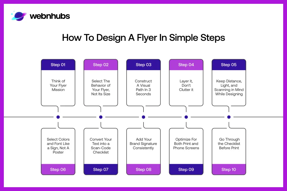
Step 1: Think of Your Flyer Mission
This is the step which most people skip. Before you reach a template, or a design tool, write one sentence that explains the objective of your flyer.
It is not about what’s there on the flyer but what it should make people do. This could be, ‘Visit our website.” Free session, scan the QR code. Call us before Friday to receive 20% off.
It is that one sentence that will be the point of reference of all the decisions you will make in future. When that one mission in one single sentence does not reflect to what’s there on the flyer, you fail.
In a good flyer design, every design element counts as each one has its own role. The idea is to make it
Step 2: Select The Behavior of Your Flyer, Not Its Size
This is what the majority of how to design flyers guides don’t teach you. The size of your flyer does not matter as much as its behavior. By behavior means, how the flyer gets people attention or engages with them.
There are three main flyer behaviors to consider:
Traffic-puller
You see it often pinned to notice boards, stuck on walls, placed in busy streets. They are supposed to work even from a distance. There should be minimal text, big images, and maximum contrast.
Hand-outs
They are given directly to someone at an event, a café, or door-to-door. These can have a little more detail as the individual already has it in his/her hand.
Digital echo
You see them posted on WhatsApp, Instagram stories, or through email. These must be readable on a small screen, and must be visually attracting to make people stop scrolling.
Every behavior is different in terms of spacing, the amount of text, position of your QR code or contact information. A digital marketing flyer and a promotional flyer are both completely different but they might advertise the same thing.
Step 3: Construct A Visual Path In 3 Seconds
You only have about three seconds to make somebody care about your flyer. It is no metaphor, but rather the way human attention operates. Instead of creating a layout and hoping that people will understand it, you must create a visual way to the eye that will lead it automatically.
The best graphic design flyer layouts follow one of two patterns:
Z-pattern
In this kind of patterns, the eye first travels right to left. Then, down to the right, and finally left to right. This kind of pattern is good with text-intensive flyers.
F-pattern
This is the kind of the reading pattern in which the eye passes over the top first and then down the left side. It is good on vertical layouts where the headline is prominent at the top.
The goal is to make sure that the visual path goes this way, first eye hook, then supporting information and then last, CTA.
Also, it is also important to do a squint test. For this, print a copy, move back two meters and narrow the eyes. If you can read the key message, it means the visual path works. Otherwise, you need to move something.
If the visual path passes the squint test, you message will do nothing but make it difficult for people to ignore your flyer.
Step 4: Layer it, Don’t Clutter it
One of the biggest mistakes people make while learning how to make a good flyer is trying to fit everything into one flyer. Add significant information but if some of it is competing with the most important once, lose it. When learning how to design a flyer, it is important to keep in mind that the flyer as whole should be readable.
There is one rule, called layering. One must use it by the books.
Layer 1: Offer + CTA
Place offers and CTA together, as Layer 1 in big bold fonts. It should look like the most important, most noticeable text. The key information that you want people to remember even after a single glimpse.
Layer 2: Supporting Information
Add supporting details like date, time, place, price or benefits in medium-sized text. These will be noticed by people who took interest in the Layer 1.
Layer 3: Brand Details
Then comes brand information, a simple yet clean logo, Web address, social media handles, or any legal or privacy statement. These must coexist but not compete with the other layer. Keep the font of Layer 3 tiny.
In case something does not fit in any of these three layers, remove it. That is how the finest flyers designers in the whole world, keep their flyers clean, readable, and effective.
Step 5: Keep Distance, Light, and Scanning in Mind While Designing
A flyer is a real-life object. It must be readable in broad daylight, or as a picture in a phone. Even if it’s on billboards with rival flyers, it must outshine.
When learning how to design a flyer, make sure you design for audience, not for yourself.
Your advertising flyer must pass these readability tests:
- It should be readable as headline in bright outdoor light or 1 meter distance.
- The QR code or phone number must be visible and should not be place on the bottom?
- The layout must work even as a thumbnail when you see it on phone
Also, see what color combination works. For example, dark blue on pale yellow works but dark red on brown doesn’t.
According to Nielsen Norman Group study, a person takes about 10 to 20 seconds to decide whether the content is worth paying attention to or not.
Step 6: Select Colors and Font Like a Sign, Not A Poster
This is one of the mindsets that can make a significant difference when you are learning how to create a flyer: consider it a road sign, not a gallery poster. The reason why road signs are effective is that they employ one or two colors, single clear font and no decorations. They are meant to convey in a hurry and this is what a good flyer design should do.
Follow these rules:
Consistent Brand Colors
There should be a single color on headline and CTA. For background, try to go choose neutral colors, it could be white or light gray.
Smart Font Pairing
Do not complicate by using too many font styles. You can choose two per flyer. This may seem an unharmful mistake but it is a really important matter in how to design a flyer. Keep one bold for headline, and for the body text, use a single San-serif style.
Aim for Readability, Avoid Scripts or Decoration
It seems pretty cool and fun to add ornamental signs or fonts but they make flyer difficult to read. Avoid using script or adding decorative signs. They do look good on mood boards but on flyers, they don’t serve the purpose.
If you aim to achieve this, you learn half the process of how to design a flyer. Just like how you keen you are with print design or while choosing which business card design services, or print design services can provide you with better outcomes, flyer design works the same way. It is these little choices that make your brand look familiar and reliable over time.
| Note: Using too many colors is one of the most common mistakes in flyer design. It does not make the flyer more interesting; but difficult and cheaper to look at. For designer, restraint is one the important design skills to have. |
Step 7: Convert Your Text into a Scan-Code Checklist
No one reads a flyer the same way they read an article. People scan it, instead of reading so make sure you follow the rules mentioned below.
One main heading that does not exceed 8 words. Make it sound like a question or a benefit but never too descriptive.
Add 3 to 4 bullet points but they must be concise, with tiny icons beside them.
Having one CTA that is action oriented, specific, cause urgency is important. For example, something like, ‘Scan to book your free session’ or ‘Call now, only 10 spots left’.
Any guide you read on how to design a flyer will discuss the importance of response rate or engagement. When you add lengthy paragraphs, they hurt or often kill response rates. The best way to make a flyer effective is by considering each word as a dollar.
Step 8: Add Your Brand Signature Consistently
The best flyers in the world serve one purpose, which is to create recognition. It’s like when someone looks at your flyers, even for a second, they find you familiar. This is possible without the need to add more content.
These are three easy methods of adding a brand signature:
- One small icon or mascot repeated in two corners of the flyer.
- Light brand or texture that can be noticed only when one is close by – adds depth and does not distract.
- A brief question-based headline which becomes your voice: ‘Too busy to cook? Let us bring hot food to your door.’
This is especially important if you’re working with a flyer design company or looking to hire graphic designer for ongoing work. It is consistency in your custom logo design that you add in your flyer design which creates trust with time.
Step 9: Optimize For Both Print and Phone Screens
The modern kind of flyer that we have nowadays work well on both print and digital screen. The purpose is to provide the same experience, be it pinned on a wall, or photographed as a cool billboard to look at. Your design must be compatible everywhere.
This is how to nail it:
- Use large, bold font that is easily readable on both print and as a phone thumbnail.
- Make the layout but make sure it does not look cluttered. Even if sent as a photo, it must look twisted with cut out important information.
- Position your QR code where it is still scannable.
- Test it by printing on A4, taking a photograph of it in a regular indoor light and also see if the key information is readable at 50% zoom.
Remember, a flyer that works on one format is a flyer doing a half-hearted job. It should be mobile friendly as well.
Get the professionals involved.
Our flyer design services provide print ready designs that work.
Step 10: Go Through the Checklist Before Print
This is a checklist to go through before your email or post anything to print or post online. It only consumes five minutes, and you can save yourself the type of errors that are costly and humiliating to rectify later.
Pre-press checklist
- The flyer needs to have one clear goal, check if the flyer reflects it.
- Write a maximum of 6 to 8 but short text lines.
- Place the QR code or any key contact in a normal A4 size.
- Use high contrast, always check the outdoor light effects and accessibility.
- Place brand logo and colors but make sure they don’t block the main message.
- Proofread twice, find any kind of errors, modify, and then check again for clarity.
- For printing, use 300 DPI, color mode is CMYK for print, and RGB for digital.
- Last, do the distance test. For this, step away, squint, and see if all layers are readable.
Print Flyer or Digital Flyer, What Do You Want?

Well, you may want or need most likely both. However, they are not alike. Planning to create one version, hoping it to work on both formats may lead to average results.
Print Flyers
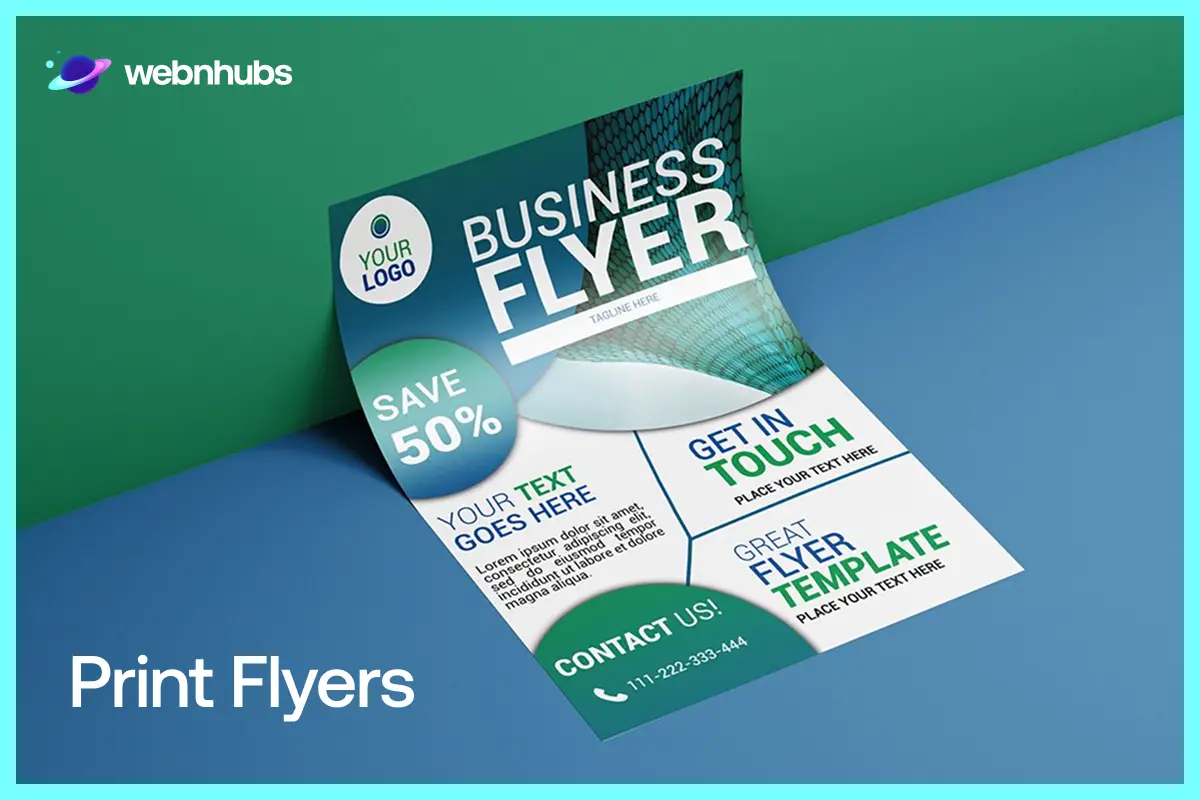
Use few text, large visuals, and high-impact CTA. Always optimize, no matter what. This is going to help you achieve success. Imagine your flyer poster on a notice board or a hand-out at a busy event. How it looks? Bad? Design it again.
Digital Flyers

Here, you can add clickable links, or a little more information. In digital flyers, layout is very important, it must look well both horizontally on billboards or vertically on phone screen.
The wisest thing you can do is create your core design once, and let it fit different formats. Keep the same offer, the same brand, the same message, just modify the spacing, the text size, and the position of CTA.
Quick Industry Tweaks, Different Words, Same System
One framework is applicable in any industry. You just have to adjust it and keep into practice:
Local Restaurant

First, in Layer 1, lead with the offer of the limited time. It could be ‘Free dessert this weekend only’ or ‘Mouth-watering food photography’ to hook the eye. Include a QR code that will link to the menu or reservation page. Put down the contacts and location in Layer 3.
Fitness Studio

The headline should stress the free trial. For example, ‘Your first class is on us’. Then for day, date and time, use bold fonts but put it in Layer 2.
You can also add one single yet bold CTA: ‘Book your spot, limited availability’. If you find more white space to fill without exhausting the design, add testimonials or before/after result as trust signals.
Real Estate

Start with a benefit, it is going to lure the audience. You can also add a headline that directly addresses the issue of the reader. For example, ‘Sell faster’, ‘Keep more’ or ‘No hidden fee surprises.
It is very important to add clear and real photos of the property. Also mention the location and the contact details of the agent in Layer 2.
The layout remains unchanged, only the words vary. That is the benefit of having a system. Whether you are creating a flyer yourself or outsourcing it, take care of the things above.
Tools for Designing Flyers
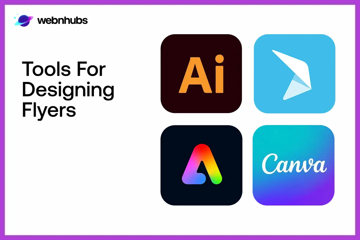
You do not have to be professional graphic designer in order to produce good results when it comes to designing flyers.
Canva
It is a popular option among flyer designers. It has thousands of free and paid templates that can be tailored to any industry or event.
Adobe Express
To add a modern touch, Adobe Express is best. It has multiple features and drags-and-drop ease. Now, you can make use of an AI-assisted design experience that can make your workflow much faster.
Microsoft Word
To those who want to remain in their comfort zone, Microsoft Word is surprisingly is best. It is easy to use, with basic, clean flyers design option. You also get different templates and text boxes to edit according to your likings.
CorelDRAW
If you are working on something complicated or brand-intensive, CorelDRAW does wonders. It provides with advanced, professional-quality tools through which you can enjoy complete creative control.
Conclusion
Majority of flyers do not fail due to poor design. They basically fail because of poor direction. In this guide, we discuss how to design a flyer that attracts attention, convey the message in seconds.
You post flyers because you want people to take an action. Here, CTAs play an important role. Be it a promotional, or a marketing flyer, the basics of how to design a flyer remain same.
Go with the following checklist. First, define your mission then start working on the visual direction. After that, starting layering the content.
Like any other design, flyer design is not supposed to look pretty. It is supposed to convey the purpose behind designing one. Make sure, your flyer message lands and your target audience acts.
Sick of Flyers That Fall on Deaf Ears?
In case designing is too much for you or your last flyer didn’t work out, explore our flyer design services. Not only premium but also affordable. We create flyers with strategy, audience and conversion in mind. Contact Now!
FAQs
Your one-sentence mission. Make up your mind about what you want people to do with the flyer before you consider colors, fonts or layout. All other things are based on that one decision. A flyer that lacks a purpose is decoration. An advert with a flyer attached to it will always outdo anything that appears twice as polished yet lacking the strategic planning behind it.
Minimum possible. Try not to add more than 6 but short text lines. You can go up to 8 only if really needed. A single headline (up to 8 words), 3-4 brief bullet points and one obvious CTA. Long paragraphs are not read on a flyer, they are ignored. In case you feel that you have too much to say, then you know that your offer would be to be simplified first before your design does.
First thing first, use no more than one brand color in headlines and CTAs. For background, use a neutral color, either white or light gray. Then comes font pairing, two fonts are enough. One will be bold for the headline, and for body text, stick to clean Serif font.
It is not a wise choice to add any script or decorative fonts. They may look pleasing on mood boards but on flyers, they make things cluttered.
Apply the two meter squint test. Print your flyer, take two steps back and squint. You are fine, as long as you can read the headline and locate the CTA. Otherwise, make your font bigger, set your contrast better or your layout straight forward. Also check it on real-life lightings – out of the door sunlight is a very different affair as compared to a studio monitor and what seems to be fantastic on the monitor may fade away totally when placed on a wall in a bright light.
Well, first, it must have a strong heading or visual hook. Then a clean and clear headline to inform audience about the thing you’re offering. You can also start with a benefit, an urgent offer. Then comes the third important element which is adding supporting details like the date, time, location, pricing or any important information. On fourth, but the most important of all, is CTA. This will lead the readers to take an action. Fifth and last, adding consistent brand identity elements such as logo, colors, and contact information.
Take away any of these and the flyer will not be a success. Anything that is added outside of these five can easily clutter the whole design.

Hafsa Hanif is a talented content writer at WebnHubs, specializing in topics such as graphic design, web design and development, logo design, and animation. With her deep understanding of design principles and creative processes, Hafsa crafts engaging, informative, and SEO-optimized content that resonates with readers. Her expertise in SEO ensures that her articles not only captivate audiences but also rank well on search engines, helping businesses boost their online presence through compelling design-focused narratives.
